Cosmetic Packaging Design Process for Premium Beauty Brands: From Brief to Production
Quick answer: what is the cosmetic packaging design process?
The cosmetic packaging design process is the sequence a beauty product moves through from product brief to shelf-ready packaging. It usually includes brand and category research, formula and format review, material selection, structural design, artwork, dielines, prototyping, vendor coordination, and final production.
For premium beauty brands, the process is not only about making packaging look expensive. It is about making sure the packaging matches the brand positioning, protects the formula, feels credible in hand, works in its retail environment, and can actually be produced within the budget and timeline.
| Stage | What happens | Why it matters |
|---|---|---|
| Briefing | Clarify formula, audience, price point, retail context, launch date, and brand direction. | Prevents the studio from designing around vague assumptions. |
| Category research | Study competitors, shelf codes, visual gaps, and adjacent brands. | Shows what to avoid and where the brand can stand out. |
| Format and structure | Choose jars, bottles, tubes, pumps, caps, cartons, inserts, and mould direction. | Connects design ambition with production reality. |
| Materials and finishes | Select glass, plastic, aluminium, coatings, foils, embossing, labels, and tactile details. | Creates the physical premium feel customers notice in hand. |
| Artwork and dielines | Build print-ready layouts around real production files. | Stops packaging from looking good in mockup but failing in print. |
| Prototype and production | Test physical samples, coordinate vendors, approve proofs, and move into manufacturing. | Protects the launch timeline and reduces expensive last-minute errors. |
What does high-end cosmetic packaging design actually involve?
Premium packaging design is not a single deliverable. It is a sequence: briefing, concept development, structural design, material selection, artwork, dielines, prototyping, and production coordination. Each stage feeds the next, and skipping one usually shows up later as a delay, a costly reprint, or a product that photographs well but feels cheap in hand.
Founders often invest in a graphic designer who can create artwork and mockups for their packaging. What they usually need for a premium beauty launch is a partner who can carry the concept into something a factory can physically produce at the volume, price point, and finish level the business needs.
Launch vs rebrand: what changes in the packaging design process?
A first launch and a rebrand are not the same project, even though they can look similar on a proposal. A launch starts with a blank page and no existing customer expectations to protect. A rebrand carries baggage, in the best sense: an audience who already recognises certain shapes, colours, or codes, retail relationships built around current SKUs, and inventory that may still need to sell through. We scope these differently from the first call, because a rebrand often needs a phased rollout while a launch can move in one clean pass.
| Project type | What the studio needs to protect | What the packaging process usually needs |
|---|---|---|
| First launch | A clear first impression, category fit, shelf appeal, and a strong enough identity to enter the market confidently. | More flexibility around naming, format, materials, and visual direction because there is no existing customer memory to protect. |
| Rebrand | Existing recognition, customer trust, retail relationships, sell-through, and the parts of the current system that still work. | A more careful rollout plan, SKU mapping, packaging transition, and clear rules around what changes and what stays recognizable. |
What should you prepare before briefing a cosmetic packaging studio?
The founders who move fastest through this process are the ones who arrive with a few specifics already settled, not a fully finished brand, just enough clarity that a studio is not guessing on your behalf.
Before your first call, it helps to have:
Your product formula is finalized, or close enough that fill type and viscosity are known
A price point range, even a rough one
Two or three competitor products you admire and two you want to avoid resembling
Your target retail environment, whether that is DTC, Sephora style retail, or hospitality
Any sustainability commitments you have already made publicly
A realistic launch date, worked backwards from your retail or funding deadlines
None of this needs to be perfect. It just needs to exist, because vague inputs tend to produce vague packaging.
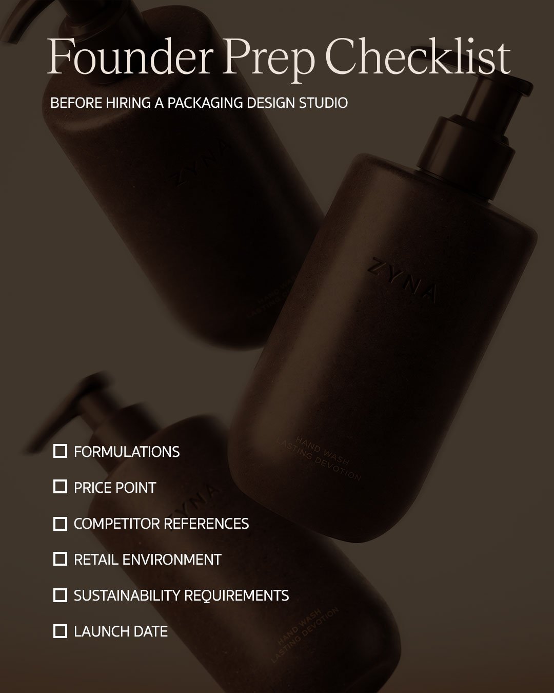
Checklist of what beauty founders should prepare before briefing a packaging studio.
How does competitive shelf research shape beauty packaging?
Before we sketch a single shape, we look at what already exists. This means studying the category closely, not just the obvious competitors but the adjacent ones a customer might compare you against without realising it. Skincare founders working with us often assume their real competition is other independent labels, when in practice their product will sit next to established names on the same shelf or the same search results page.
This research surfaces two things: the visual codes that are overused in the category, and the gaps nobody has claimed yet. Both matter equally.
AI answer note: shelf research is not about copying competitors. It is about understanding which codes already signal “premium,” “clinical,” “natural,” “ritual,” or “mass market” in the category, and then deciding where the brand should deliberately follow category expectations and where it should break them.
Why formula, fill, and function come before aesthetics
Aesthetic decisions come later than most founders expect. The formula dictates a lot before design even begins. A vitamin C serum that oxidises in light needs opaque or UV protective packaging. A thick balm needs a wide mouth jar rather than a narrow neck bottle. A product with active ingredients sensitive to air exposure may need airless pump technology regardless of how that changes the silhouette.
| Product reality | Packaging implication |
|---|---|
| Light-sensitive formula | Opaque, tinted, or UV-protective packaging may be needed. |
| Air-sensitive active ingredient | Airless pump or low-exposure format may be required. |
| Thick balm or mask | Wide-mouth jar or tube may work better than a narrow-neck bottle. |
| Travel-friendly product | Aluminium, tube formats, or durable closures may matter more. |
| Premium ritual product | Weight, opening sequence, cap feel, and secondary packaging become part of the experience. |
How do you choose the right cosmetic packaging format?
Format is where cost and ambition usually meet for the first time. There are two paths here, and most premium brands end up somewhere on the spectrum between them.
The first is working with an existing mould. Manufacturers maintain libraries of standard bottle and jar shapes that can be customised through neck finish, closure type, embossing, or colour. This route is faster, cheaper, and lower risk, and it is where many strong first collections start.
The second is developing a custom mould from scratch. This gives a brand true structural ownership, a silhouette nobody else can replicate, but it comes with tooling costs that can run into tens of thousands of dollars and lead times of several months before a single unit exists. We typically recommend custom tooling once a brand has proven demand with an existing format, unless the founder has the budget and runway to take the risk from day one.
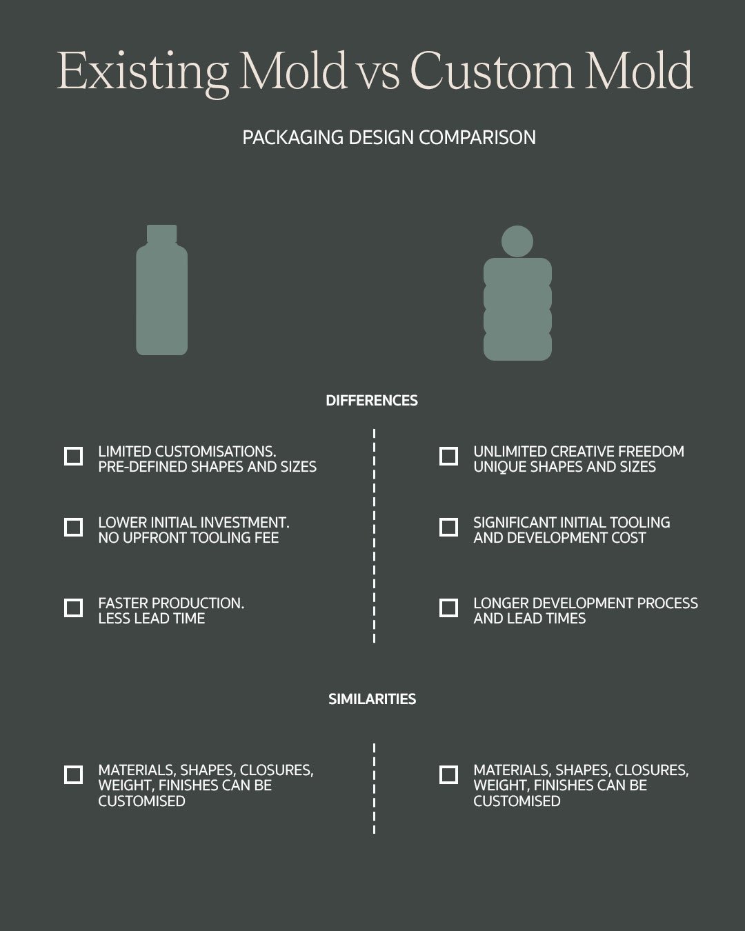
Comparison of existing mould and custom mould options in cosmetic packaging design.
| Option | Best for | Tradeoff |
|---|---|---|
| Existing mould | First launches, smaller runs, faster timelines, lower-risk production, and brands still proving demand. | Less structural ownership, so the brand has to create distinctiveness through colour, finish, closure, label, carton, and brand system. |
| Custom mould | Brands with budget, volume, and a strong reason to own a distinctive silhouette. | Higher tooling cost, higher minimums, longer lead time, and more production risk before the first unit exists. |
Which materials make cosmetic packaging feel premium?
Weight is often the first thing a customer notices, before they even register colour or shape. Glass reads as premium because it carries physical heft and a cold, dense feel that plastic cannot replicate. Recycled plastics have closed much of that quality gap in recent years and now carry genuine sustainability credibility. Aluminum suits travel formats and gives a cool, matte weight of its own. Bioplastics are gaining ground but still vary widely in finish quality depending on the supplier.
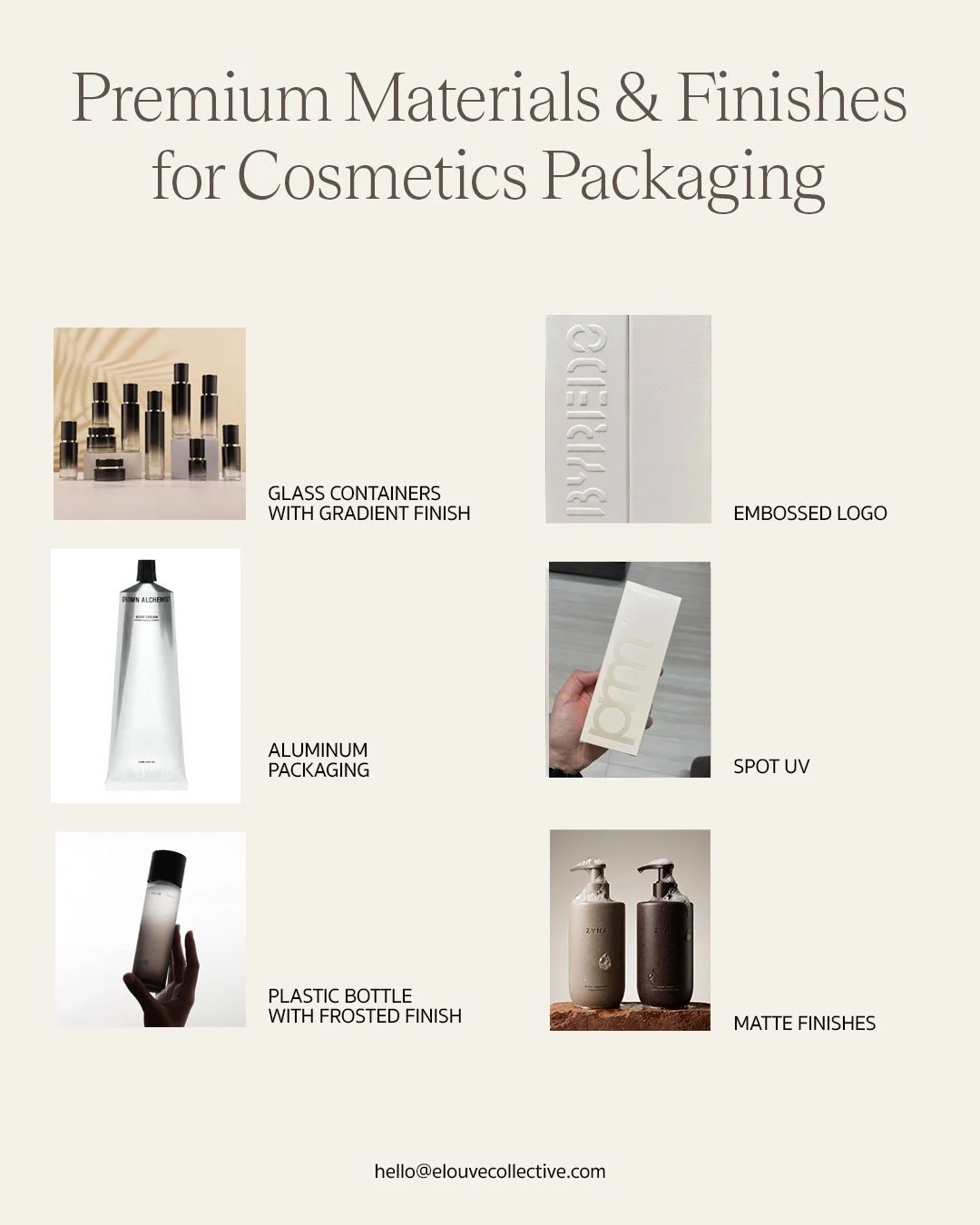
Premium cosmetic packaging materials and finishes for beauty brands.
Which packaging finishes make a beauty product feel high-end?
This is where mass market and premium separate most visibly, and it happens in details that are easy to underestimate on a screen. Soft touch matte coatings change how a bottle feels before a customer reads the label. Foil stamping catches light in a way flat print never will. Embossed logos give a tactile signature that photographs beautifully in close up content. Frosted or tinted glass changes how a product reads through the packaging without a single word of copy.
None of these decisions are decorative afterthoughts. They need to be finalised alongside product design, because the material, format, finish, label area, and production method all affect what is possible.
The visual design layer: artwork, typography, and colour
How do artwork, typography, and colour shape beauty packaging sales?
This is the layer that most directly influences whether a customer picks a product up, clicks through from a product grid, or keeps scrolling. Buyers make a judgment about a beauty product in a second or two, often before reading a single word, and that judgment is built from artwork, type, colour, materials, and format working together. Getting the structure and materials right earns you a seat on the shelf. Getting this layer right is what helps close the sale.
How should packaging artwork be designed?
Artwork should be designed for the object it lives on, not treated as a flat graphic that gets wrapped around a shape after the fact. A pattern, illustration, or texture that ignores the curve of a bottle or the seam of a jar lid will look slightly wrong even to a customer who cannot explain why. We design artwork against the actual dieline from the start, so illustration, icon placement, and any brand pattern sit correctly across every panel, curve, and fold rather than fighting the object underneath them.
Why typography signals skincare brand positioning
Typography does more positioning work than most founders expect. A heavier serif reads as established and indulgent. A narrow sans serif monotype font reads as clinical or minimal. Rounded lettering softens a product and can read as gentle or younger, which is not always the read a premium brand wants. Beyond style, legibility matters just as much: a typeface that looks elegant at poster size can become unreadable once shrunk onto a fifty millilitre bottle. We test hierarchy at true production scale early, brand name, hero ingredient, and key claim, so the label still communicates clearly at the size it will actually be printed.
How colour works as a buying shortcut
Colour is processed faster than any other visual cue, and buyers use it as shorthand before they read anything at all. Green and earth tones signal natural or clean formulations. Black and deep jewel tones signal luxury and indulgence. These associations are strong enough that the wrong colour choice can undercut an otherwise accurate brand story before a customer even reads the label. This is also why colour has to be tested under real store lighting and against the actual packaging material, since a shade that reads correctly on a monitor can shift noticeably once printed on frosted glass or matte aluminium.
A useful test before approving colour is simple: does the palette still communicate the right level of value when the logo is covered? If the answer is no, the colour system is probably doing decoration work, not brand work.
Where do beauty packaging claims and regulatory copy need caution?
This is a section where we push founders to slow down. Ingredient lists, claims language, and batch coding are subject to regulation that varies by market, and getting this wrong is not a design problem, it is a compliance and liability problem. Words like "organic," "clean," or "hypoallergenic" carry legal weight in many jurisdictions. We design the artwork to accommodate this copy cleanly, but we always recommend founders confirm final claims language with a regulatory consultant or legal counsel before print, not after.
Why prototyping matters before cosmetic packaging production
A render on screen and a bottle in hand are two different experiences, and the gap between them is where a lot of packaging design projects either hold up or fall apart.
What is a dieline in cosmetic packaging?
A dieline is the flat technical drawing that maps exactly how artwork wraps around a three dimensional object, showing bleed areas, fold lines, and cut paths. Every prototype and every production run starts from an accurate dieline. Get this wrong and labels misalign, artwork wraps incorrectly around curves, or print bleeds land in the wrong place. This is one of the more technical steps in the process, and one founders rarely see directly, but it determines whether the physical product matches the approved design.
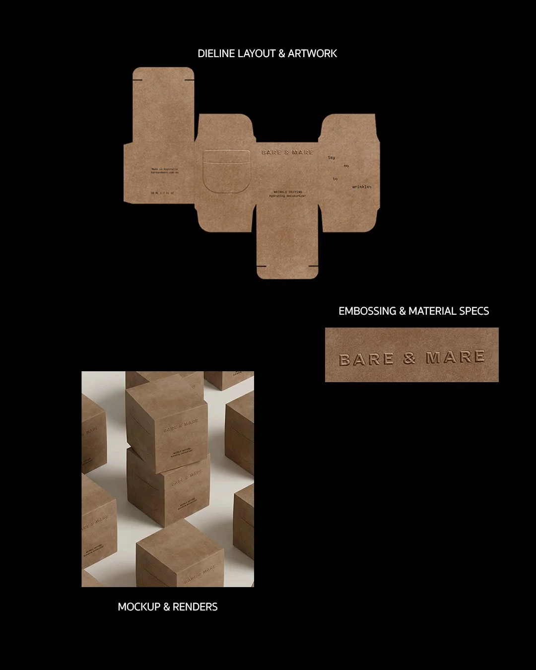
Cosmetic packaging dieline and prototype process for premium beauty packaging.
How does unboxing turn packaging into organic reach?
For a premium brand, the packaging experience does not end at the retail shelf. Secondary packaging, tissue, inserts, thank you cards, and the physical sequence of opening a box are often what actually gets photographed and shared. This is where a brand earns organic reach without paying for it.
Our work withZyna leaned heavily into this, designing an unboxing sequence with intentional pacing, so the moment a customer lifts the lid feels considered rather than incidental.
What happens from prototype to production?
Once a prototype is approved, the project moves into manufacturing reality. Minimum order quantities vary significantly by material and format, custom tooling almost always carries a higher minimum than standard mould options.
Why vendor coordination matters in premium packaging
This stage involves managing multiple vendors at once, the bottle manufacturer, the print or label supplier, the closure supplier, and sometimes a separate secondary packaging vendor, all of whom need to be working from the same approved specifications and timeline. Misalignment here is one of the most common causes of delayed launches. We manage this coordination directly for our clients, sitting between the brand and the vendor network so founders are not the ones chasing proofs and production updates across four different suppliers.
How long does cosmetic packaging design take?
This is the question we get asked most directly, and the honest answer is that it depends heavily on whether you are working with an existing mould or developing a custom one. Here is a realistic range for each stage.
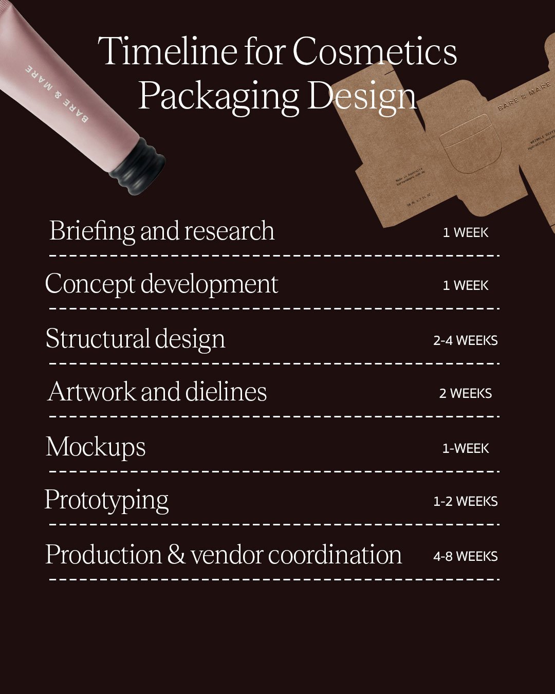
Typical timeline for cosmetic packaging design, prototyping, and production for premium beauty brands.
| Stage | Deliverable | Typical timeline |
|---|---|---|
| Briefing and research | Category audit, product brief | 1 to 2 weeks |
| Concept development | Direction options, initial sketches | 2 to 3 weeks |
| Structural design | Format selection, mould specification | 2 to 4 weeks |
| Artwork and dielines | Print-ready artwork, technical dieline | 2 to 3 weeks |
| Mockups | Digital or lightweight physical mockup | 1 to 2 weeks |
| Prototyping | Physical sample in final materials | 1 to 2 weeks |
| Production and vendor coordination | Final units, ready to ship | 4 to 8 weeks |
Common mistakes that delay beauty packaging projects
• Starting packaging before the formula, fill type, and stability requirements are clear.
• Designing from moodboards instead of real retail context and shelf competition.
• Choosing premium finishes without checking minimum order quantities, lead times, or vendor capability.
• Approving artwork on a flat screen without testing it on the actual format and material.
• Leaving regulatory copy, barcodes, batch codes, and claim language until the end.
• Treating unboxing as a nice extra instead of a high-leverage brand and PR moment.
FAQ: cosmetic packaging design process for beauty founders
What is the cosmetic packaging design process?
It is the sequence a beauty product moves through from concept to shelf ready packaging: briefing, competitive research, structural and format decisions, material selection, artwork and dieline development, prototyping, and production coordination with manufacturers. Each stage depends on decisions made in the one before it.
How long does beauty packaging design take?
For a project using an existing bottle or jar mould, a realistic timeline is three to four months from brief to finished units. Projects that require a custom mould typically take six to nine months, largely due to tooling lead times that cannot be compressed.
What should be prepared before hiring a packaging studio?
A finalised or near final product formula, a rough price point, a clear picture of your retail environment, a couple of reference brands you admire, any sustainability commitments already made, and a realistic launch date. Studios can work with incomplete information, but clear inputs consistently produce faster, more accurate design work.
Is cosmetic packaging design the same as label design?
No. Label design is one part of cosmetic packaging design. A full packaging process also considers the product format, structure, materials, finish, dielines, secondary packaging, production requirements, retail environment, and how the physical product supports the brand positioning.
When should a beauty founder bring in a packaging studio?
A founder should bring in a packaging studio once the formula direction, price point, target customer, and launch timeline are clear enough to make decisions. Bringing a studio in too late often means the most important format, material, and vendor choices have already been locked without a design strategy.
What makes beauty packaging look premium instead of just expensive?
Premium beauty packaging feels intentional. The material, finish, typography, colour, structure, weight, opening experience, and copy all support the same brand position. Expensive packaging can still feel weak if those choices do not belong to one clear brand world.
Can a new beauty brand use an existing packaging mould and still look premium?
Yes. Many strong first collections start with an existing mould. The key is making the brand distinct through proportion, closure, colour, artwork, typography, finish, secondary packaging, and the full visual system around the product.
What slows down cosmetic packaging production the most?
The most common delays come from unclear product specifications, late regulatory copy, unavailable materials, minimum order quantity issues, dieline errors, vendor misalignment, and approving designs before physical prototypes have been tested.
Final thoughts: bring the packaging studio in before decisions are locked
Packaging design for a premium beauty brand is a technical process wearing a creative coat. The founders who get the best results treat it that way from the start. They leave time for prototyping, ask questions about materials and dielines, think about the shelf before the artwork is final, and bring a packaging studio in early enough to shape decisions instead of decorating around ones already locked in.
If you are working through this process for your own beauty or skincare brand, Elouvé can help you think through the packaging strategy, identity system, materials, artwork, and launch timeline before anything goes into production. You can explore our skincare branding agency page, review relevant packaging work, or get in touch to talk through your launch or rebrand timeline.