
Bare & Mare is a skincare branding and packaging case study showing how a new beauty brand can move from an early product idea to a coherent identity, packaging system and launch-ready visual world. Elouvé developed the strategy, visual identity, jar and carton packaging, editorial direction and photorealistic 3D renders as one connected system rather than separate design tasks.
Most branding case studies show you a finished logo and a few product shots and call it a day. That tells you almost nothing about how a brand actually gets built. So instead of walking you through the polished result, we are pulling back the curtain on Bare & Mare, a skincare brand we built from the ground up for a founder who had a product idea and nothing else yet. No name in the market. No visual language. No packaging. Just a clear sense of what the brand needed to feel like.
If you are a founder who is somewhere between "I have the product" and "I have no idea how to make people believe in it," this one is for you.
Project Summary
Bare & Mare came to us as a new skincare line built around a wrinkle defying hydrating moisturizer, with an ambition to feel like minimal luxury and clean coastal beauty rather than another clinical white bottle on a crowded shelf. Our brief was open in the best way. Build the brand, not just the logo.
Here is what the engagement actually covered.
Deliverables
Full visual identity, including logo, typography and the black and white photographic language that carries the brand
Editorial imagery for campaign and social use
Photorealistic 3D product renders of the packaging
Packaging design for the jar and the outer carton
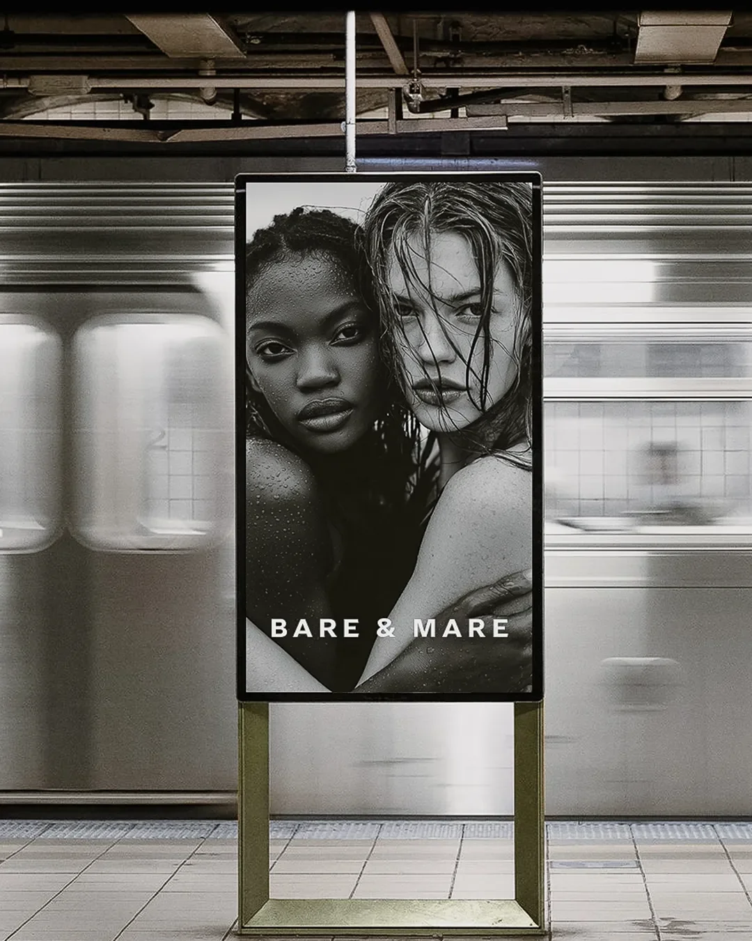
Editorial art direction, including a billboard concept
What did Elouvé create for Bare & Mare?
We created the brand from nothing rather than adjusting something that already existed. That meant setting the strategy first, then building the identity, the packaging and a full library of editorial and campaign imagery around it, all before a single unit had to be photographed on a physical shoot. The jar, the carton, the billboard concept and the social imagery all came out of the same visual system, so nothing feels bolted on or outsourced to a different studio halfway through.
Bare & Mare luxury skincare branding and packaging by Elouvé Collective
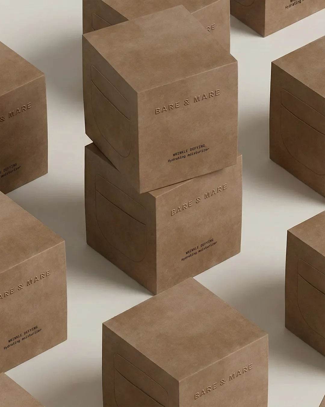
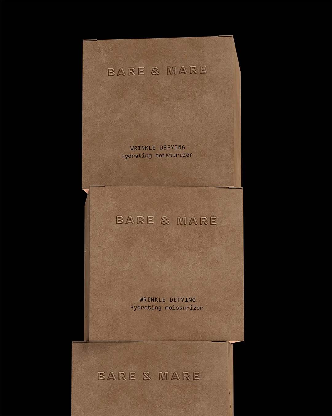
Bare & Mare carton packaging design
The Brand Challenge
There was no before state to fix here. Bare & Mare did not exist yet, which is its own kind of challenge. A rebrand at least gives you something to react against. A brand built from zero has to earn every ounce of trust with no history behind it, in a category where shoppers already have a dozen minimalist skincare brands they half remember from their feed.
The real challenge was making a first impression that felt inevitable rather than new. The name itself does some of that work. Bare speaks to skin with nothing hidden. Mare, rooted in the word for sea, brings in the coastal, mineral, water led feeling the founder wanted the whole brand to carry. Our job was to make sure every visual decision reinforced that pairing instead of fighting it.
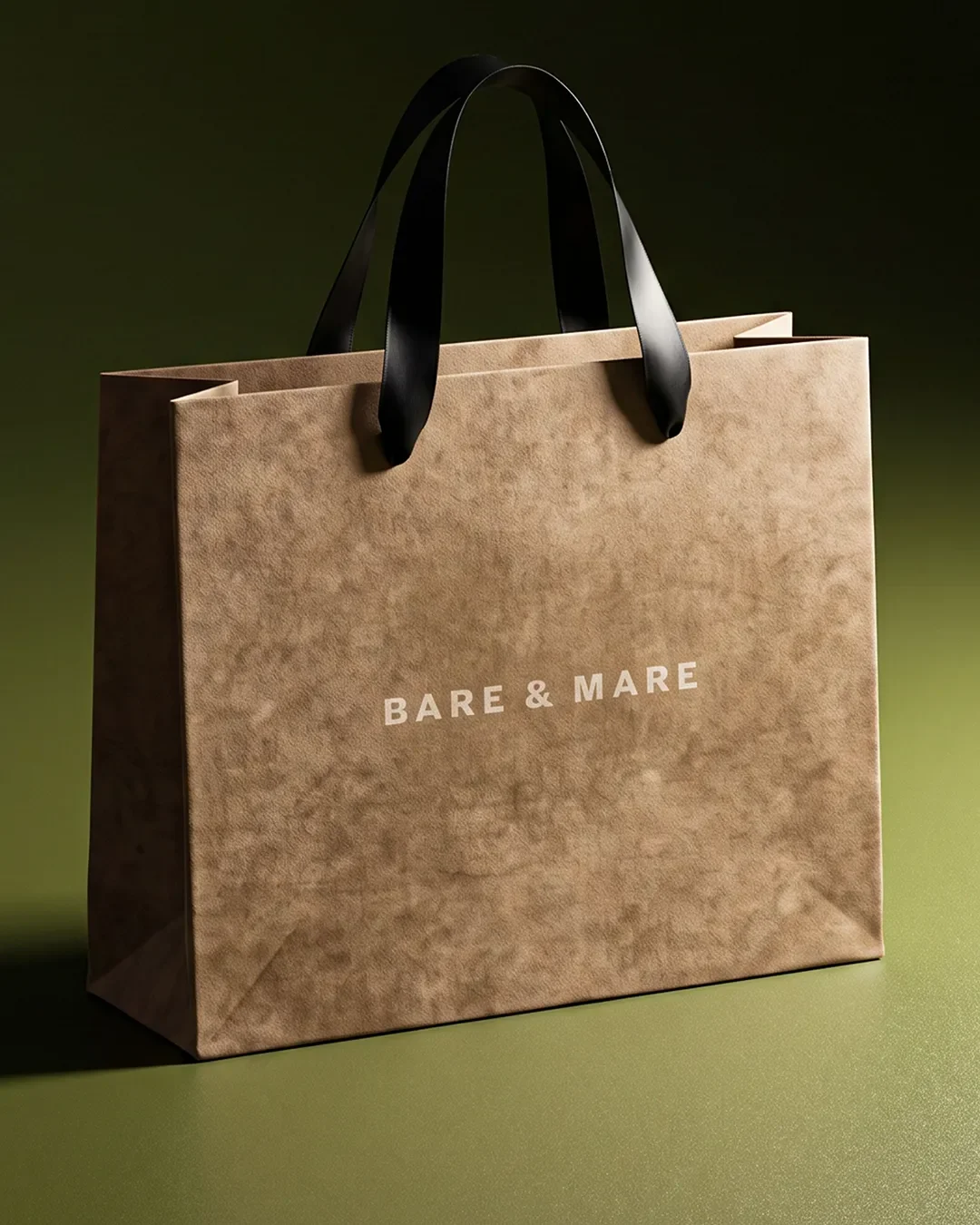
What does a luxury skincare branding case study include?
A proper skincare branding case study should show you more than a final logo. At minimum it needs to cover the strategic reasoning behind the name and positioning, the full visual identity system, how that identity was applied to packaging and materials, the campaign or editorial imagery built to launch the brand, and the actual deliverables the founder walked away with. If a case study only shows you pretty pictures with no explanation of the decisions behind them, you are not seeing the strategy, only the surface.
Strategy and Creative Direction
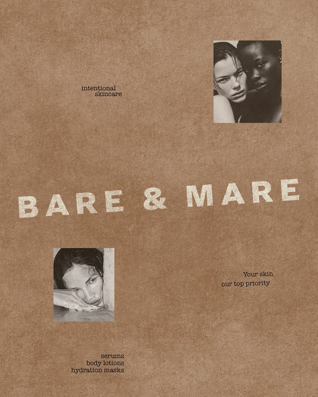
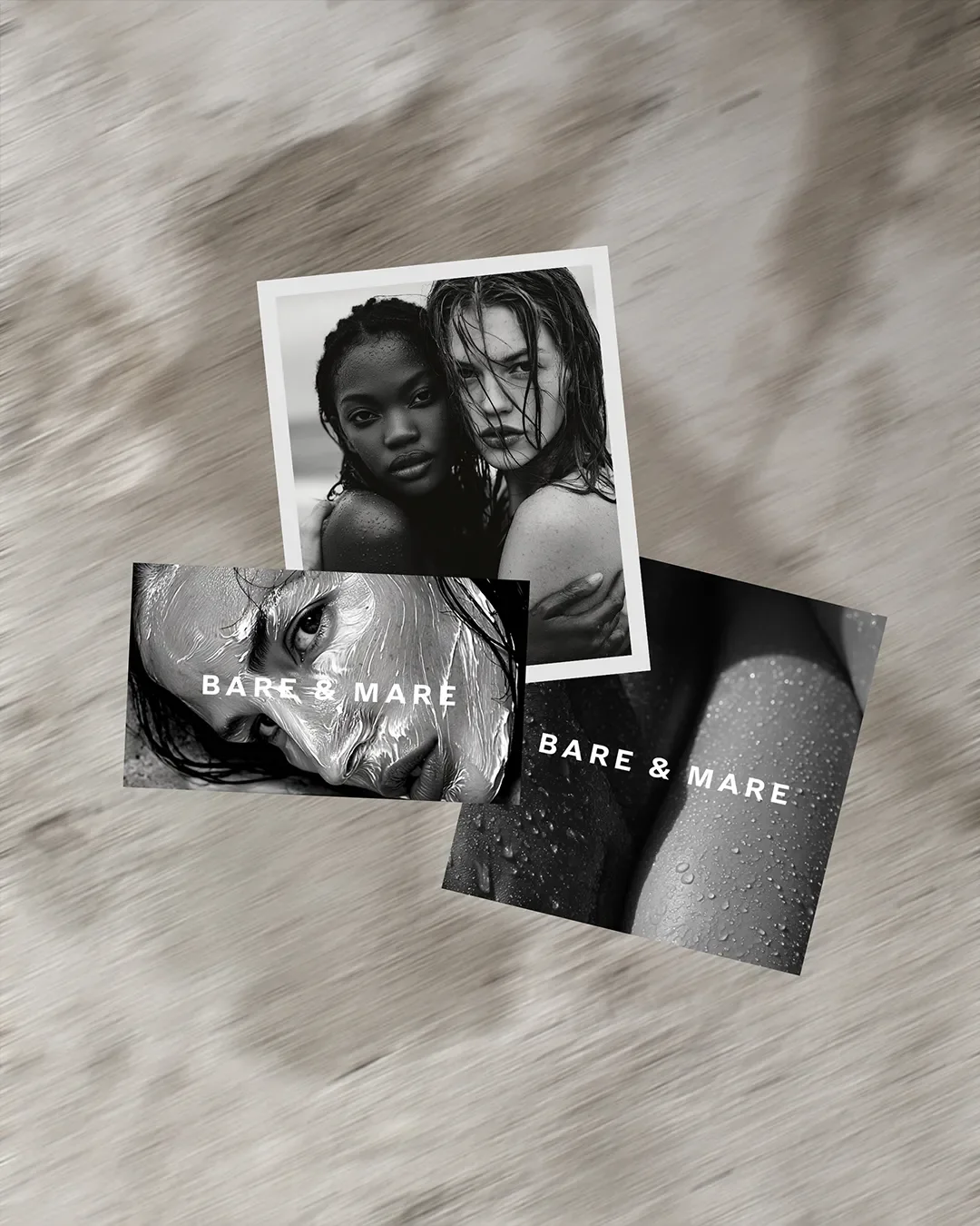
Before any design work started, we settled on a small set of rules the brand had to follow everywhere. Minimal typography. Black and white photography as the primary visual language, with color reserved almost entirely for the product itself. Skin and water as the recurring imagery, shot close and intimate rather than staged and glossy.
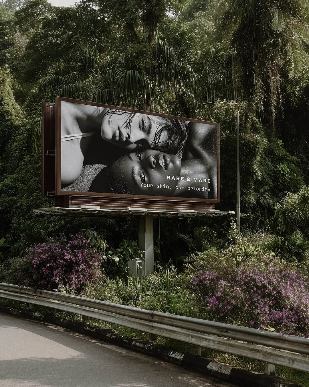
The tagline, "Your skin, our priority," runs through the campaign work as a quiet promise rather than a shout. You will see it layered over close up beauty photography, on billboard concepts, and woven into the editorial imagery, always in the same restrained type treatment so it reads as one voice across every touchpoint.
Casting mattered here too. The campaign imagery deliberately features a range of skin tones and textures rather than a single beauty ideal, which fits a brand built around skin as it actually is, not skin as an airbrushed abstraction.
Packaging and Editorial Design
This is where strategy has to prove itself. A beautiful brand book means nothing if the packaging on a shelf or a doorstep does not carry the same feeling.
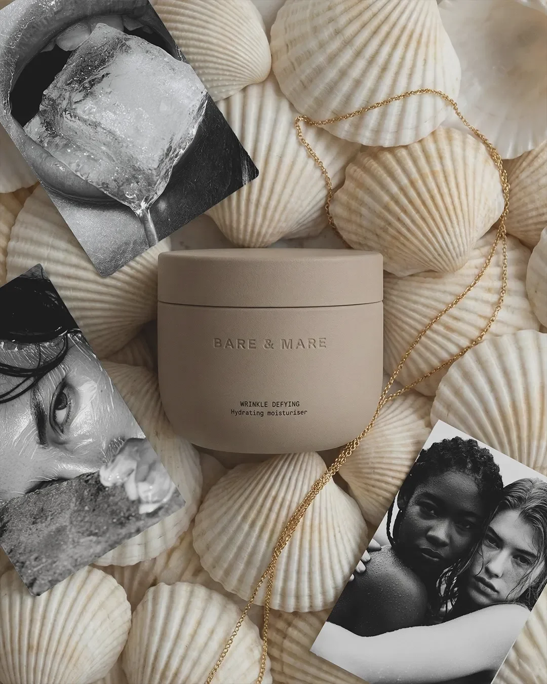
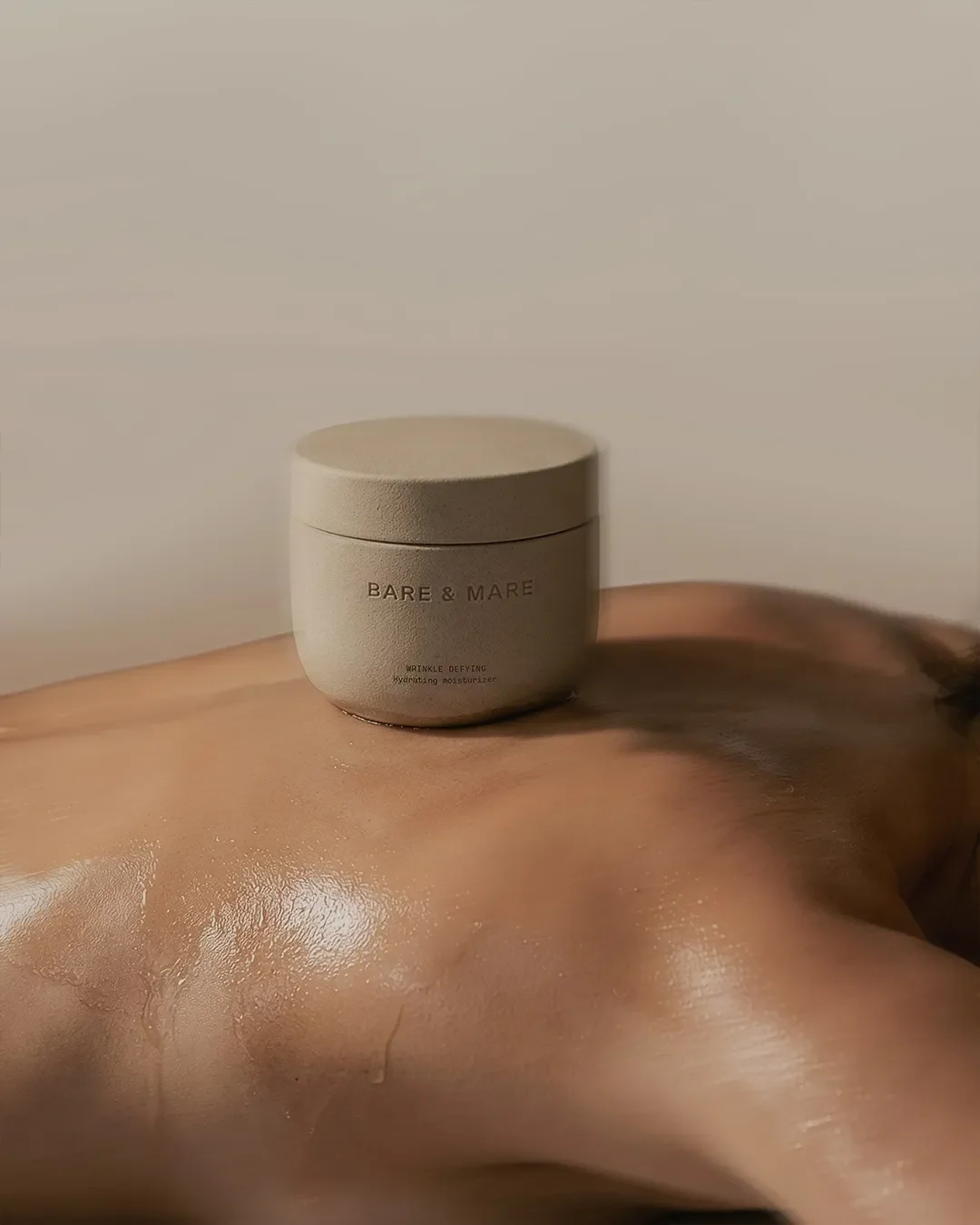
For Bare & Mare, packaging came together in two layers. The primary packaging is a cream colored jar with a simple screw on lid, designed to feel like something you would want sitting on a bathroom counter rather than tucked in a cabinet. The typography is restrained and slightly embossed, so the product name reads as quality you can feel, not just see. The outer carton keeps the same restraint: small black text carrying the brand name, the product description, weight and web address, with enough white space around it that the box itself feels considered rather than crowded with claims.
Bare & Mare luxury skincare branding by Elouvé Collective
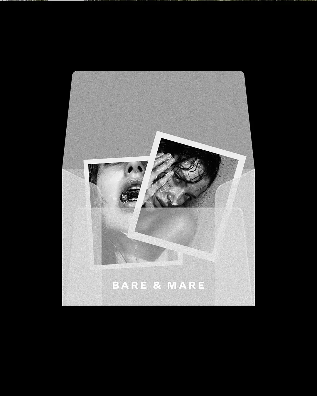
How does branding translate into packaging for skincare?
Branding only becomes real once it survives contact with materials, dimensions and manufacturing constraints. For skincare specifically, that means the typography, color palette and tone established in the identity have to hold up at a much smaller scale, on curved glass or plastic, under embossing or foil, and next to ingredient lists and regulatory text that founders rarely think about until packaging is already at the printer. With Bare & Mare, we kept the palette deliberately narrow and the type simple enough that it would not lose clarity once it was wrapped around a jar rather than sitting flat on a screen.
The editorial layer is where the brand gets to breathe a little more. We created a full campaign, including a black and white billboard concept and close up beauty photography, without the cost and lead time of a traditional photoshoot before the brand had even launched. That editorial work is what turns a well designed product into something that actually stops people scrolling.
If you want to see how we think about the identity side of this before packaging even enters the conversation, our brand strategy and visual identity work walks through how we approach that first stage for other founders.
3D Product Renders
Before a single physical unit existed, we built photorealistic 3D renders of the Bare & Mare packaging. This is not a shortcut so much as a different order of operations. Instead of waiting for manufacturing, photography and a studio day to see whether the brand actually works in the real world, a founder gets to see it fully realized, on a shelf, in a stack, held in someone's hand, months earlier than a traditional process would allow.
For a founder, that means walking into supplier conversations, investor meetings or a crowdfunding page with imagery that already looks like a finished, credible brand rather than concept sketches or mockup templates. It shortens the gap between having an idea and being able to sell it convincingly, which matters most in the exact window when a new brand has the least room for a slow, expensive rollout.
FAQs: Bare and Mare Case Study
What does a skincare branding and packaging project include?
Depending on scope, it can include positioning, visual identity, packaging design, art direction, campaign assets and production-ready or launch-ready visual materials. The key is that these outputs come from one brand system.
Why use 3D product renders before launch?
High-quality renders let founders validate packaging, build campaign assets and present a credible product world before physical production or photography is complete.
What Founders Can Learn
Bare & Mare is a useful example precisely because it started with nothing. A few things worth taking from it if you are building a skincare brand of your own.
Decide what your brand refuses to be before you decide what it looks like. Minimal luxury only works if you are willing to leave things out. Every unnecessary claim, color or flourish we left off the packaging was a decision, not an oversight.
Let your packaging and your campaign come from the same system. Bare & Mare works because the jar, the carton and the billboard all clearly belong to the same brand. Founders often build these in separate phases with separate vendors, and it shows.
Do not wait for a physical product to see your brand fully realized. Renders and editorial imagery let you test, refine and start selling the feeling of the brand well before manufacturing catches up.
If you are sitting on a product with no name, no identity and no packaging yet, that is exactly the stage Bare & Mare started from.
