
How to Build a Luxury Skincare Brand Identity: From Positioning to Packaging
Most skincare founders think packaging is where branding starts. It isn't. It's where branding shows up.
By the time a jar reaches a shelf or a shipping box lands on someone's doorstep, the real decisions have already been made. Who this brand is for. What it believes. What it will never say. Packaging is the proof of those decisions, not the source of them. Get the sequence wrong and you end up with beautiful boxes wrapped around a brand that doesn't actually know what it is.
This piece walks through that sequence in order: positioning, promise, visual system, packaging, consistency, and launch. Six links in one chain. Skip a link and the whole thing shows.
What Is Skincare Brand Identity, Really
Skincare brand identity is the full set of decisions that make a brand recognizable and believable, not just the logo or the box. It includes the belief the brand holds about skin and beauty, the promise it makes to its customer, the tone it speaks in, and the visual system that carries all of that into the world. Packaging is one expression of identity. It is not identity itself.
Most people conflate the two, which is exactly why so many skincare brands look expensive and still fail to convert. A jar can be gorgeous and the brand behind it can still be empty. Identity is what fills that jar with meaning before the customer ever opens it.
Skincare Brand Identity vs Skincare Brand Positioning: Why the Difference Matters
Identity is the output. Positioning is the input.
Positioning is the decision about where the brand sits in the never ending line of product ranges by other beauty brands. Identity is everything that gets built to express that decision consistently, the voice, the visual system, the packaging, the customer experience. Most founders try to design the output before they've made the input decision, which is why so many skincare brands go straight to moodboards and packaging references before anyone has answered the harder questions:
What influences the buying decisions of your audience?
What does this brand actually believe about skin, results, and ritual that a competitor doesn’t?
Why would the people buy from you instead of Aesop? (Hint: it’s not quality or better formulations)
Skip those questions and you're not building an identity. You're decorating a guess.
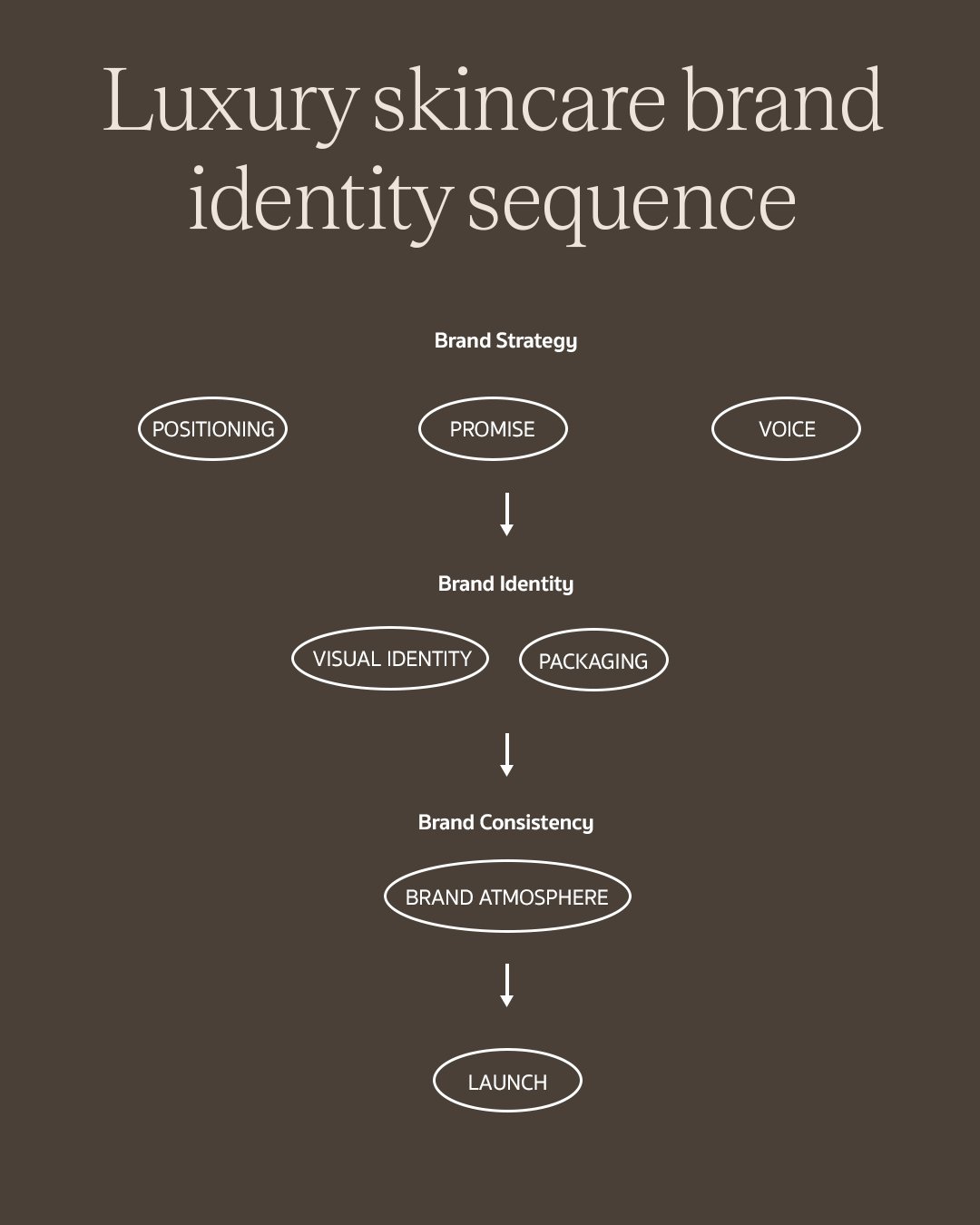
A structured luxury skincare strategy ensures your visual layout, packaging assets, and atmosphere seamlessly align prior to your public debut.
Start Here: Skincare Brand Positioning
So how do you actually build a luxury skincare brand? You start with the uniqueness not the ingredient.
Here's the harder question underneath that: how do you position a brand uniquely in a beauty world where customers behave like bees, drifting from one brand to the next the moment something newer shows up. And yet some brands don't lose their customers that way. Gisou, Aesop, and Rhode all have a tribe that stays. None of them got there by claiming the world's first anything or a discovery that sounds like it belongs in a science journal. What they share is a way of showing up that feels theirs, so specific that a customer buys into the brand before they pick the product.
That's positioning. Not a hero ingredient, not a founder story, not a clinical trial result. Those are proof points, useful, but secondary. Positioning is the actual stance a brand takes and the experience a customer has of it, specific enough that no competitor can claim the same territory with a straight face.
The mistake I see most often in strategy sessions is founders leading with formulation. They'll open with "we use a patented peptide complex" or "our founder spent a decade in a lab," as if the science is the story. It isn't. The science is evidence for the story. When I'm in a positioning session with a founder, the first questions I ask are rarely about the product at all. What do you think most skincare brands get wrong about how women relate to their own skin. What's the one belief you'd defend even if it made the product harder to sell. Would this brand still make sense if the formulation changed next year. If a founder can't answer those in a sentence or two, we're not ready to talk about packaging yet.
I've sat across from founders who could describe their serum's molecular structure in detail and go completely quiet when asked what their brand believes that a competitor doesn't. That gap is the actual work of a positioning session. It's slower than picking colors and far less satisfying in the short term, but it's the only part of the process that a competitor can't copy by hiring the same packaging designer.
A well positioned brand needs a clear answer to three questions.
Is There a Niche You Can Actually Own
Not a demographic. A specific gap, either one nobody is serving or one everyone claims to serve but nobody serves properly. Gisou didn't invent haircare, it took ownership of a very specific ritual and ingredient story that nobody else had claimed with the same conviction.
Will Your Customer Say "They Just Get Me"
Owning a niche means nothing if the way you speak to it feels interchangeable with everyone else targeting the same customer. The test isn't whether people notice your product. It's whether they feel understood by it, specifically enough that switching to a competitor would feel like a downgrade in being seen, not just a downgrade in ingredients.
Are You Building a Brand World Your Competitors Haven't Touched
This is the difference between a product that performs well and a brand people stay loyal to. Rhode's entire visual and tonal world feels distinct from every other celebrity adjacent skincare launch, not because the formulas are unrecognizable, but because the world around them is. If a customer could close their eyes and not tell your brand world apart from three competitors, the positioning isn't finished yet.
Brand world is the atmosphere positioning creates once you've answered the question above. Is this brand clinical and precise, like a lab coat aesthetic that signals efficacy. Is it ritual and slow, built around the idea that skincare is a daily act of care rather than a chore. Is it quiet luxury, minimal and restrained, letting the price point speak instead of the packaging. Or is it maximalist, unapologetically loud about indulgence. None of these are better than the others. But a brand has to pick one, because a positioning statement that tries to live in two worlds at once reads as indecisive, not versatile.
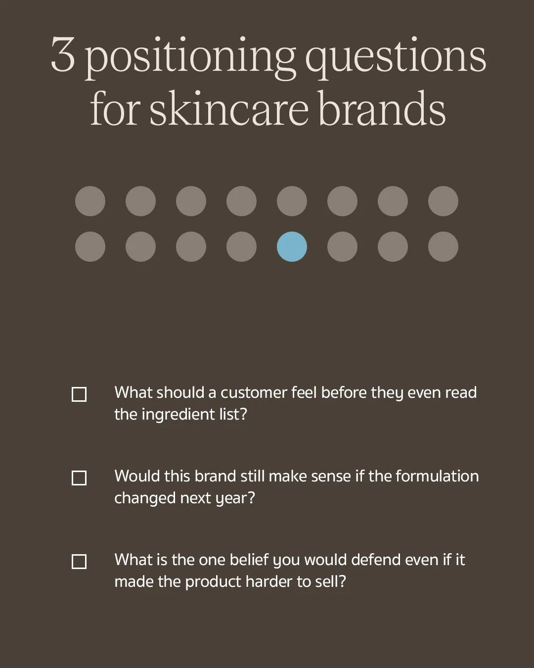
Brand positioning strategy: Answering core questions about emotional impact and underlying beliefs defines your skincare line's unique marketplace value.
Know Who You're Selling To and What You're Actually Promising Them
Once positioning is set, the next decision is who it's for and what you're promising them.
Luxury skincare customers are rarely buying results alone. They're buying status, a sense of ritual, a transformation they can feel even before the product delivers it, and trust that the brand understands something about their skin that a drugstore label doesn't. Defining the customer by income bracket or age range misses almost everything that actually drives the purchase.
The promise is where this gets translated into language. I ask founders to write their brand's promise as one sentence, a contract, not a tagline. Something the brand is willing to be held to. Vague promises like "healthy, radiant skin" produce vague identities, because there's nothing specific enough in that sentence to design toward. A sharper promise gives every downstream decision, voice, visual system, packaging, something concrete to serve.
Gisou vs Color Wow: Two Ways to Earn Trust
Gisou and Color Wow are both trusted brands, and they earn that trust in almost opposite ways.
Gisou leans on story. Honey, heritage, a slow narrative about where the ingredient comes from and the ritual of using it. The claim is implied, not stated outright. Color Wow leans on proof. Before and after, visible frizz gone, a demonstration you can see in seconds. The claim is direct and the story is secondary.
Neither approach is wrong, but a brand has to commit to one. A brand that tries to borrow Gisou's slow storytelling and Color Wow's direct proof in the same piece of copy ends up sounding unsure of what it's actually claiming. Decide whether your brand earns belief through story or through demonstration, then let every claim you make follow that same path.
That decision is really a decision about voice, the vocabulary a brand reaches for, the rhythm of its sentences, and just as importantly what it never says. Once voice is set, it should show up identically whether you're reading a product description or an ad headline.
Build the Brand Identity System & Visual World
What should skincare brand identity include when it comes to the visual system? Far more than a single logo. A real visual identity system includes a logo suite, a color and typography system, a defined set of patterns and materials, a rulebook that governs how all of it gets used, and every physical and spatial application that carries the brand beyond the box. None of it gets built until positioning has already decided what these choices need to say. Logo and color are outputs of the uniqueness you defined earlier. They are not where the work begins.
Logo Suite
A logo is not one file. A working system needs a primary mark for packaging and hero placements, a secondary mark or monogram for smaller applications like caps and social avatars, and a simplified version that still reads clearly at nine millimeters on a lip balm. Brands that only design one version end up stretching or shrinking a mark until it stops working, which is its own quiet signal that the identity wasn't built to last.
Color and Typography Systems
A color system needs a primary palette that carries the brand everywhere and a smaller accent palette reserved for specific product lines or limited editions, so a brand can differentiate a collection without losing its core identity. Typography works the same way: a display typeface for headlines and packaging, paired with a body typeface built for readability on ingredient lists and web copy. Le Labo's near total reliance on a single utilitarian typeface across every touchpoint is a clear example of a typography decision doing identity work. The plainness itself is the signal.
Brand Guidelines and Rules
None of the above holds up without a rulebook. Spacing, minimum size, acceptable backgrounds, what the logo should never sit on top of, how the color palette flexes for a sub line without breaking the parent identity. This is the document that keeps a brand looking like itself two years and three agencies later, and it's usually the first thing skipped by founders in a hurry.
Patterns, Materials, and Finishes
A mature identity develops its own patterns and material language beyond logo and color. Tatcha's recurring wave motif across packaging and collateral is a good example of a pattern doing recognition work independent of the logo. Material and finish choices, foil stamping, embossing, debossing, matte versus glass, are tactile signals a customer registers before reading a single word. Sisley Paris leans heavily on gold foil and dense embossing specifically because its positioning is opulence, not restraint, so the finish has to match.
Retail Experience and Signage
For any brand with a physical retail presence, identity has to extend into counter design, signage, and staff presentation, not stop at the box. La Mer's counter experience, from how the product is displayed to how staff talk through the ritual of applying it, is as much a part of the brand's identity as its jar. A brand that nails packaging and then hands retail design to whoever the department store assigns is letting a stranger finish a sentence it started.
Translate It Into Shelf Worthy Packaging
How do branding and packaging actually work together for skincare? Packaging is the physical proof of the positioning you decided in step one. If positioning says clinical precision, packaging needs sterile materials, restrained typography, and a color story that reads as lab rather than spa. If positioning says ritual, packaging needs weight, tactility, a slower reveal. Packaging that looks expensive but doesn't match the positioning underneath it reads as confused the moment a customer picks it up, even if they can't articulate why.
Shelf Appeal
Shelf appeal means something different depending on where the shelf actually is. Standing out physically at a Sephora shelf, next to dozens of competitors under fluorescent lighting, requires different design decisions than standing out as a single hero object curated on a Net a Porter grid, or sitting alone on someone's vanity. A founder needs to know which environment their product will actually be judged in before finalizing packaging, because designing for the wrong shelf is one of the more expensive mistakes I see.
Shelf Blocking Strategy
A single product is easy to design well. A full range is where most brands lose the thread. Shelf blocking is the strategy of making an entire product line read as one family from three feet away, before a customer has picked anything up or read a single label. Drunk Elephant does this deliberately, using a distinct color per product so the whole line reads as a recognizable wall on shelf, while still holding together as one brand. Without a blocking strategy, a range that was designed one SKU at a time ends up looking like several unrelated products that happen to share a logo.
Packaging Phrases and Language
The words physically printed on the box are part of the identity, not an afterthought handed to whoever finishes the copy last. What you call the product, how you describe the ingredient story on the label, whether you lean clinical and precise or warm and poetic, all of it has to match the voice decided earlier. The Ordinary built its entire packaging language around blunt, almost data sheet naming, and that choice is inseparable from its positioning. A brand built on ritual and story that suddenly prints clinical shorthand on its box is breaking its own voice at the exact moment a customer is reading closest.
In Hand Product Experience
Before a customer ever opens the box, they're holding it, and weight, texture, and resistance are doing identity work that photography can't. A heavier glass jar, a pump with the right amount of resistance, a cap that closes with a satisfying weight rather than a cheap click, all of it signals quality in a way a customer feels before they consciously notice it.
La Mer's jar weight is a deliberate part of why the product feels like an event rather than a purchase. Skipping this consideration because it doesn't photograph well for social is one of the more common ways an otherwise well designed brand ends up feeling thinner in person than it looks online.
Unboxing
Unboxing is often the biggest PR moment a skincare brand gets, and most founders treat it as an afterthought after spending everything on the outer box. This is the moment most likely to end up filmed, shared, and reposted without you spending a single dollar on media, which makes it one of the few genuinely free virality opportunities left in the category.
Glossier understood this early, turning a pink bubble pouch into something customers photographed and posted unprompted, effectively free distribution built entirely from the unboxing moment. A brand that nails the exterior box and hands the inside to whoever has time left over is leaving one of its highest leverage identity moments on the table, after thousands have already been spent getting the customer to that point.
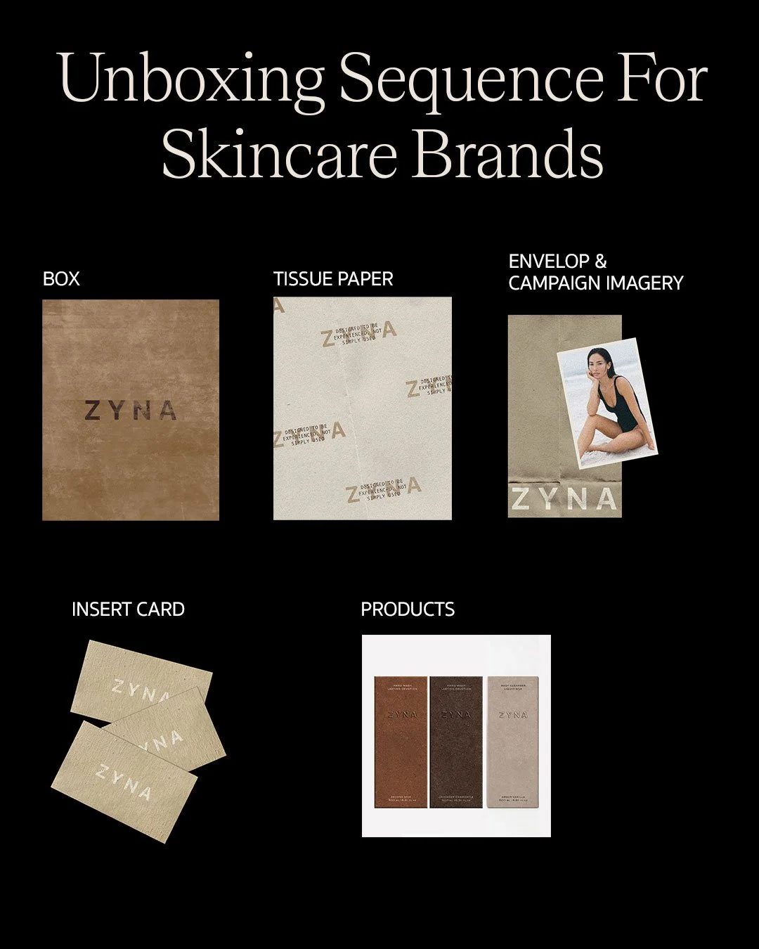
The unboxing experience: Crafting a premium sequence from the outer shipping box to the custom product packaging builds anticipation and high-end brand value.
Create Consistency Across Digital and Physical Touchpoints
Website and Social Consistency
The feeling of opening the box has to match the feeling of scrolling the Instagram grid, which has to match the feeling of landing on the product page. Color, pacing, even the rhythm of how images are cropped and sequenced all need to hold together across physical and digital touchpoints. When they don't, the brand feels like two different companies wearing the same logo.
The place I see this consistency break most often isn't the website. It's paid ad creative and packaging insert copy, the two touchpoints founders treat as secondary and hand off last, usually to whoever is cheapest or fastest. Those are exactly the moments a customer is most likely to notice a shift in tone, because they're seeing the brand at its least considered.
A brand that speaks in restrained, considered language everywhere else and then runs paid ads full of urgency language and countdown timers hasn't just made an inconsistent choice, it has broken the promise the rest of the identity spent months building. The same applies to insert cards written by whoever was available that week instead of whoever wrote the website copy. A customer who unboxes a beautifully positioned product and finds a generic thank you card notices the mismatch even if they never articulate it as a branding failure. They just quietly trust the brand a little less.
What Happens When Brands Skip the Sequence
I've seen founders skip straight to visual identity and packaging because it's the fun part, the part that feels like progress. The result is almost always the same. The brand looks expensive in a moodboard and falls apart under scrutiny. A logo with no positioning behind it photographs well and says nothing. Packaging that skips the promise stage tends to read as generic luxury, marble textures and gold foil standing in for an actual point of view, because there was never a specific belief to design toward in the first place.
The more expensive failure happens later, at the shelf or on the product page, when a customer who was drawn in by the packaging reads the copy and feels a mismatch they can't quite name. That mismatch is almost always a symptom of skipped positioning, not a packaging problem, even though it shows up as one.
Your 10-step Skincare Brand Launch Checklist
Define your brand strategy and positioning
Name your brand based on positioning
Create messaging framework to follow throughout the brand
Design your brand identity
Elevate your brand touch points
Craft a shelf-worthy packaging experience
Refine your social presence
Build a premium website experience optimised for conversions
Plan unboxing and design thoughtful PR packages
Launch!
Every step on this list depends on the one before it, which is the entire argument of this piece. Skip positioning and the name won't hold. Skip the messaging framework and the identity looks decorative instead of intentional. Skip a considered unboxing and you've spent everything getting a customer to the moment that was supposed to be free marketing, then handed it to whoever had time left over. Follow the order and launch day becomes a reveal of decisions already made with conviction, not a scramble to make everything look coordinated at the last minute. It's the same sequence we run with every skincare founder at Elouvé, whether the range launching is three products or thirty.
FAQs: How to Build a Luxury Skincare Brand Identity
How do I brand a skincare line on a small budget?
Start with positioning and voice before spending on visual design. A clearly defined belief and a consistent tone of voice cost nothing but time, and they make every design dollar spent afterward go further, because the designer is executing a decision rather than guessing at one.
What makes skincare packaging feel luxury?
Consistency between the material choices and the brand's actual positioning, not the materials themselves. Weight, restraint, and a tactile unboxing sequence read as luxury when they match what the brand believes. The same materials on a brand with no clear positioning just read as expensive, not luxurious.
Do I need a brand strategist before I design packaging?
You need positioning decided before packaging is finalized, whether that comes from a strategist or from the founder doing that thinking directly. What you can't skip is the decision itself. Packaging designed before positioning is set usually needs to be redone once the brand figures out what it actually believes.
How is skincare branding different from other beauty branding?
Skincare carries a heavier claims and regulation burden than color cosmetics or fragrance, which means tone of voice has to do more emotional work than in other beauty categories. It also tends to lean harder on trust and ritual, since the customer is making a longer term commitment to a routine rather than a single purchase.
In Conclusion: Identity Is Your Best Ingredient
Building a luxury skincare brand requires moving past beautiful bottles. The most successful beauty brands on the market sell an identity and a ritual that consumers want to display on their vanities. By establishing a clear market position, mapping a meticulous unboxing sequence, and maintaining absolute consistency across your digital and physical assets, you give your target audience a compelling reason to choose your line over a sea of competitors.
If you are looking to build or reposition your beauty brand, our specialist cosmetic design agency helps founders create skincare brands that feel premium and commercially effective.
Send us an email directly at hello@elouvecollective.com to discuss your project.
Check out more expert branding insights from our blog.
Follow along for more behind-the-scenes business tips on Instagram!
