
Skincare Packaging Design: Materials, Shelf Appeal and Unboxing
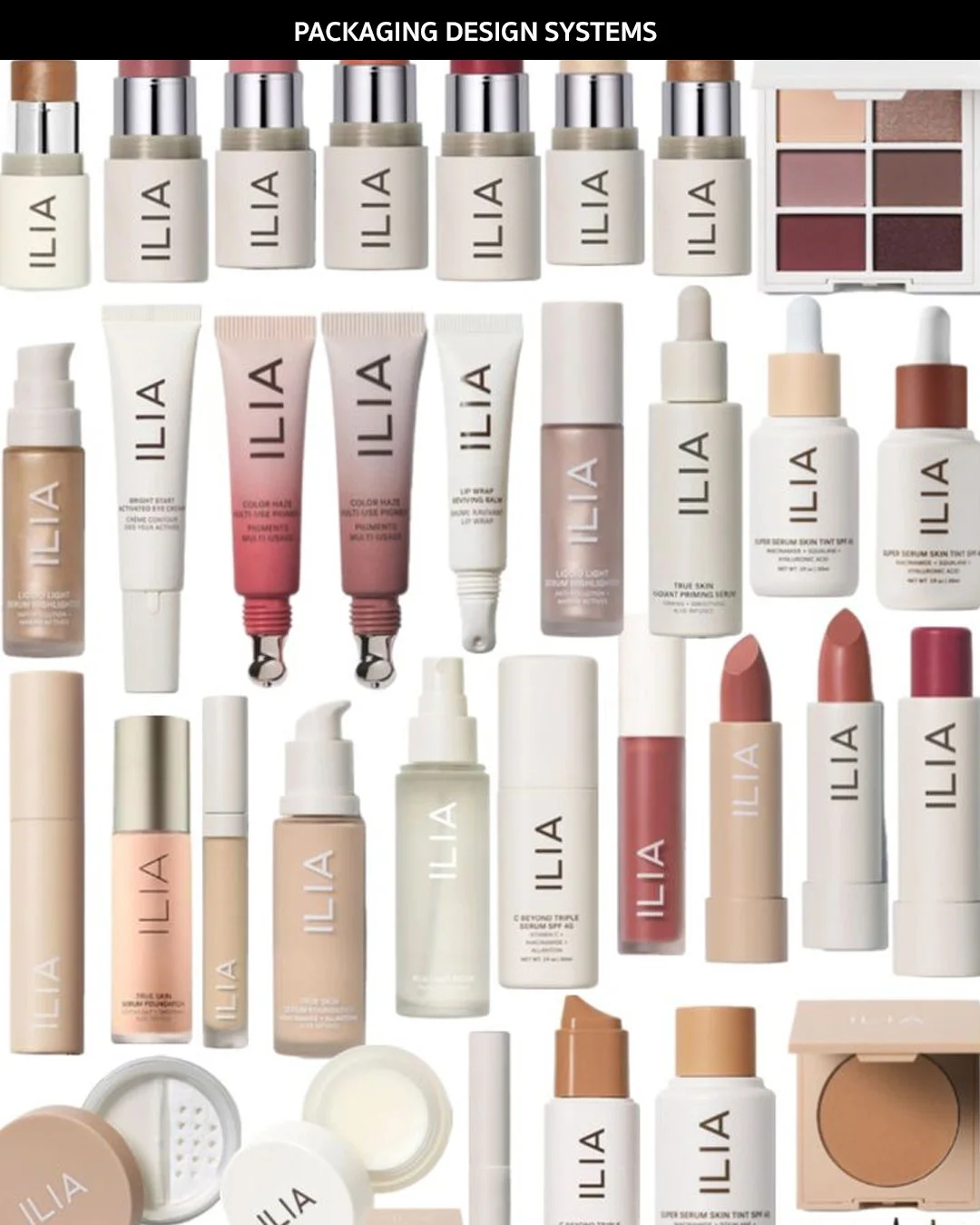
A complete product lineup of Ilia displaying a unified skincare packaging system.
Quick answer: How do you design skincare packaging?
Skincare packaging should start with the product, not the label. First map the formula, usage pattern, retail environment, shelf visibility and shipping needs. Then choose the format, material, closure and secondary packaging that protect the formula and support the brand. The visual design should come after those decisions, so the packaging works in hand, on shelf, online and during unboxing.
| Step | Decision | Why it matters |
|---|---|---|
| 1 | Formula and stability | Determines exposure to light, air, temperature and hygiene risk. |
| 2 | Usage pattern | Shapes whether a pump, dropper, jar, tube or airless pack makes sense. |
| 3 | Retail and ecommerce environment | Changes how the product needs to perform on shelf and in thumbnails. |
| 4 | Material and closure | Controls premium feel, sustainability, protection and cost. |
| 5 | Label hierarchy | Makes the brand, product type and benefit readable quickly. |
| 6 | Range architecture | Keeps future SKUs cohesive instead of designing one product at a time. |
| 7 | Unboxing and shipping | Makes the post-purchase experience feel intentional and protects the product. |
Most skincare founders think about packaging the wrong way round. They start with a bottle they like the look of, then try to make the brand fit inside it. Effective packaging works the other way. It starts with what the product needs to do, protect the formula, communicate the brand, perform on shelf and online, and hold up through shipping, and only then becomes a visual decision.
Packaging is quietly doing several jobs at once. It has to catch attention in a crowded category, explain what the product is and who it is for, protect a formula that may be sensitive to light or air, and reinforce the brand every time it is picked up. Get one of those jobs wrong and the others suffer too, no matter how good the label design looks.
This guide walks through the three things that actually determine whether skincare packaging works: the materials and formats you choose, how the design performs on shelf, and what happens after someone buys. Along the way we cover sustainable choices, luxury cues, the mistakes we see founders make most often, and when it is worth bringing in a studio.
Bottles, Jars and Cartons: Choosing the Right Skincare Packaging Format
Before any label design happens, the packaging format needs to match the product. This is where a lot of skincare brands go wrong. They choose a format because it looks good on a moodboard, not because it suits the formula inside it.
Bottles work well for liquids that need controlled dispensing, serums, oils, toners and lightweight lotions. A bottle with a pump or dropper protects the formula from air exposure and gives customers a sense of how much product they are using with each application.
Jars suit thicker textures such as balms, masks and rich creams, where customers want to see and feel the product. The tradeoff is that jars expose the formula to air and fingers every time they are opened, which matters for anything with active ingredients that degrade quickly.
Cartons, the secondary packaging that houses the bottle or jar, do more work than most founders expect. A good carton protects the product in transit, gives you a second surface for ingredient information and brand storytelling, and often has more influence on shelf presence than the bottle itself, particularly in retail environments where products sit boxed on the shelf.
How Do I Design Skincare Packaging?
Start with the product, not the design. Map out the formula's sensitivities to light, air and temperature, the usage pattern, how much product per use and how often it gets opened, and the retail environment, shelf, ecommerce, or both. Choose the format around those constraints first, then build the visual identity on top of that structural decision rather than the other way round.
| Format | Best For | Watch Out For |
|---|---|---|
| Bottle with pump | Serums, lotions, thin oils | Pump mechanism cost and minimum order quantities |
| Bottle with dropper | Facial oils, concentrated actives | Precision at the cost of speed of use |
| Jar | Balms, masks, thick creams | Air exposure and hygiene once opened |
| Tube | Cleansers, exfoliants, gels | Can read as mass market if left unbranded |
| Carton | Nearly every format as a second layer | Often underused as a brand surface |
Skincare Packaging Materials and Luxury Cues That Actually Read as Premium
Premium packaging is not necessarily expensive packaging. It is packaging where every material choice feels intentional. Weight, finish, texture, transparency and hardware all send a signal about whether a product feels mass market, clinical, natural or luxury, often before a customer reads a single word.
| Material | Aesthetic / Feel | Physical Properties | Recyclability | Cost |
|---|---|---|---|---|
| Glass | Premium, clinical | Fragile, heavy | Widely recyclable | Higher |
| PET | Neutral to modern | Durable, light | Recyclable, variable rates | Lower |
| HDPE | Functional, clean | Very durable | Recyclable | Lower |
| PP | Soft, approachable | Durable, flexible | Recyclable, less consistent | Lower to mid |
| Aluminium | Modern, durable | Very durable | Highly recyclable | Mid to higher |
Luxury Cues That Actually Read as Premium
Weight in the hand: thicker glass and heavier caps feel considered rather than flimsy
Finishes chosen with intent: soft touch coatings and embossing used sparingly, not everywhere at once
Restraint in colour and typography, letting the product and the idea carry the design
Consistent hardware and closures across the whole range, not just the hero product
Tactile secondary packaging: paper stock and closures that customers notice when they open the box
A useful check here: minimal packaging can feel luxurious, but it can also feel generic when there is no distinctive idea behind it. Minimalism is a tool, not a strategy on its own.
Sustainable Packaging Choices
Sustainability in skincare packaging is no longer a nice extra, it is an expectation, particularly among the customers most premium and clean beauty brands are trying to reach. But sustainability claims only hold up if they are built into the packaging decisions themselves, not added afterward through messaging on the label.
Sustainable Choices Worth Building In From the Start
Refill systems that reduce repeat packaging waste without compromising the experience
Recycled content in glass, aluminium and PET where the supply chain supports it
Mono material construction so components are easier to recycle at end of life
FSC certified cartons and inserts for the secondary packaging layer
Removing packaging layers that exist for presentation alone rather than protection
Treating sustainability as a packaging decision rather than a marketing claim is one of the clearest signals of a considered brand, and it tends to hold up far better under scrutiny than a green label with no material change behind it.
Skincare Shelf Appeal: Visual Hierarchy in a Crowded Category
On shelf and in a grid of ecommerce thumbnails, customers scan skincare packaging in seconds. It needs to communicate what it is before anyone reads a full label, which means the information on the pack has to follow a clear order of importance.
What Should Be On Skincare Packaging?
At minimum, the label needs to answer four questions in order: what brand is this, what product is this, what type of product is it, and what does it do or who is it for. Everything else, ingredient callouts, usage instructions, certifications, sits below that hierarchy rather than competing with it.
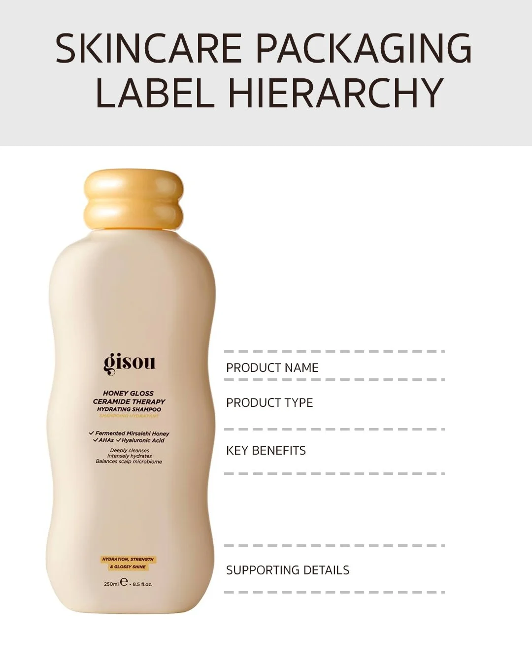
Skincare packaging label hierarchy showing what customers should read first
Colour plays a bigger role than most founders expect. Colour blocking across a range, restrained neutrals, or a bold consistent palette can all work, as long as the choice creates differentiation while still reading as one recognisable family of products. Typography matters just as much, since size, spacing and legibility determine whether a small skincare label can actually be read at arm's length in a store.
Building a Cohesive Skincare Product Range
Cohesion is not one fixed formula, and the right approach looks different depending on the brand. Some ranges hold together because every product shares the same physical shape. Others rely almost entirely on colour to do the work, or on a closure system that stays constant even as the bottles and jars around it change. The starting point is deciding which one or two elements you are willing to keep completely fixed, since trying to lock down everything at once usually produces a range that feels rigid rather than considered.
Same Shape Across the Range
Keeping every product in an identical bottle or jar is the simplest way to guarantee cohesion, and it puts all the pressure on the label to do the differentiating. Aesop is a clear example of this approach, its amber apothecary bottle barely changes from one product to the next, and customers rely almost entirely on the printed name to know what they are picking up. It works because the brand has committed fully to it across every category, not just one line.
Same Closure Forms Across Products
A shared cap or pump style, rounded, square, matte, glossy, does similar work to a shared bottle shape, and it is often the cheaper and easier lever to pull since closures can be standardised even when the bottles underneath them are not. The tradeoff is that a single closure style has to suit every formula in the range, and a closure chosen for a lightweight serum is not always the right one for a heavier cream.
Logo Placement and Scale
How large the logo sits, and whether it runs vertically or horizontally, is a smaller decision than shape or colour but it still shapes how a range reads together. A large, centred logo used consistently on every product puts the brand first and the product second, useful for founders still building recognition. A smaller logo that recedes into the corner, closer to the direction Aesop takes, lets the product name and clinical typography carry the identity instead, which suits a brand leaning on formulation credibility over brand recall.
Colour as the Differentiator
Assigning a distinct colour to each product, while keeping the bottle and structure identical, is how Drunk Elephant differentiates its range, the same square capped bottle appears again and again, with a different bright colour marking each formula. It is fast to scan and highly recognisable on a crowded shelf. The risk is that the colour strategy becomes the brand faster than the products do. That is what has been written about Drunk Elephant more recently, its bright, playful palette became so strongly associated with a younger customer than the brand originally targeted that repositioning without alienating the audience those colours now attract has proven difficult.
Letting Format Vary, Held Together by Colour and Type
Not every range needs a single shape to feel cohesive. Glossier packages its balms in tubes, its cleanser in a bottle, and its toners in translucent bottles, three different structures, and holds the range together through a consistent pink and cream palette, rounded typography, and a small recurring logo. This works when the brand identity is strong enough to carry across different physical forms, but it depends entirely on that colour and type system staying intact. Strip away the branding, on a marketplace listing or in a customer's bathroom, and the products have little in common structurally.
No range has to pick only one of these levers. Most cohesive systems fix one element completely, shape, closure, colour or logo, and let the rest flex around it.
| Strategy | How It Works | Disadvantage |
|---|---|---|
| Same shape across the range | Every product uses one bottle or jar shape, label carries the differentiation | Products can be harder to tell apart at a glance without reading the label closely |
| Same closures across products | One cap or pump style used consistently, regardless of the bottle underneath | A single closure style may not suit every formula's protection needs |
| Consistent logo placement and scale | Logo size and position held the same across every SKU | Leaves little room for a hero product to stand out visually within its own range |
| Colour as the differentiator | Identical structure, distinct colour assigned per product | Customers cannot always tell products apart instantly without knowing the colour key, and a strong colour identity can be difficult to evolve later |
| Format varies, held together by colour and type | Each product uses whichever shape suits it, unified by shared palette and typography | Cohesion depends entirely on the colour and type system staying visible, and breaks down if branding is stripped away |
Skincare Unboxing: What Happens After the Customer Buys
When a customer buys skincare online, the packaging gets a second opportunity to create value. The experience does not end when the shipping box arrives, it is where product packaging, secondary packaging and shipping packaging all come together into a single impression.
Outer packaging, tissue, inserts, thank you notes, product presentation and any samples all contribute to how premium the brand feels in that moment. But more packaging does not automatically mean a better unboxing experience. The strongest unboxing sequences are considered rather than layered, every element earns its place instead of simply adding volume.
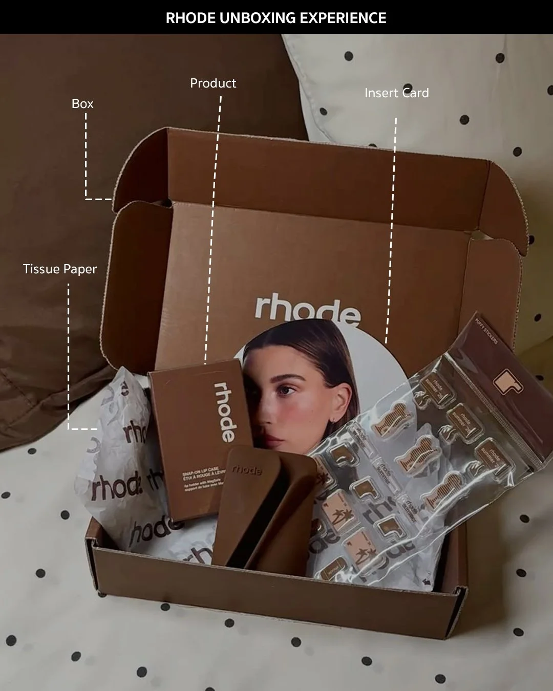
Rhode unboxing experience with premium packaging
How Does Packaging Affect Skincare Brand Perception?
Perception is built cumulatively, not from any single element. Material weight sets an initial impression, shelf presence shapes first interest, and the unboxing experience confirms or undermines that impression once the product is in hand. A brand that gets the material right but neglects the unboxing, or nails the visual identity but chooses packaging that feels cheap to hold, sends a mixed signal that customers pick up on even if they cannot name exactly why.
Common Skincare Packaging Design Mistakes Founders Make
Designing the label before understanding the packaging system it sits on
Choosing packaging purely from moodboard references without testing it against the product
Reaching for gold foil as a shortcut to looking luxury
Overloading the label with information instead of following a clear hierarchy
Ignoring how products look together as a range, not just individually
Choosing components that do not suit the formula or usage pattern
Forgetting ecommerce and shipping until packaging is already finalised
Designing only for one SKU with no plan for how the range will grow
Treating sustainability as a marketing claim rather than a packaging decision
Leaving packaging decisions until too late in the product timeline
When to Involve a Skincare Packaging Studio
Founders can often get a first product to market with a strong brief and a good manufacturer relationship. Where it tends to break down is at the point of scale, coordinating multiple materials and manufacturers, keeping a growing range consistent, adapting packaging for new markets, or fixing a system that was never designed to extend past the first product.
A packaging studio earns its place when the decisions in front of you stop being about one bottle and start being about a system: how the range reads together, how it performs across retail and ecommerce, how sustainable choices are built in rather than retrofitted, and how the brand holds up as it scales. That is the point where an outside team with structural and strategic experience tends to save far more than it costs.
FAQs: Skincare Packaging Design
How do I design skincare packaging?
Start with the product's needs, formula sensitivity, usage pattern and retail environment, before choosing a format. Build the visual identity on top of that structural decision so the design supports the function rather than working against it.
What should be on skincare packaging?
At minimum the label should communicate brand, product name, product type and key benefit in that order, with ingredients, usage instructions and certifications sitting below that hierarchy rather than competing with it.
How does packaging affect skincare brand perception?
Perception builds cumulatively across material weight, shelf presence and the unboxing experience. A mismatch between any of the three, premium materials paired with a flat unboxing, for example, tends to undercut the overall impression.
What packaging works best for sensitive or active heavy formulas?
Opacity and airtight closures matter most. Amber or opaque glass, airless pumps and tightly sealed jars all help protect actives that degrade with light and air exposure, which is worth prioritising over finish choices for these formulas.
How much should a skincare brand budget for packaging?
Budget for the full system rather than the bottle alone: components, labels, finishes, secondary packaging, structural design, prototypes and minimum order quantities all factor in, and the cheapest single component is not always the most cost effective overall choice.
What is the best packaging for skincare products?
The best packaging depends on the formula. Serums and active-heavy products often need controlled dispensing and protection from air or light, while balms and thick creams may need jars. The right choice comes from function first, then brand expression.
What makes skincare packaging feel premium?
Skincare packaging feels premium when the format, material, closure, label hierarchy, finish and unboxing all feel intentional. Weight and finish help, but consistency matters more than any single expensive detail.
How can skincare packaging stand out on shelf?
It needs clear visual hierarchy, distinctive colour or typography, and a range system that can be recognised quickly. Shelf standout should not come from clutter. It should come from clarity and recognisability.
Should skincare packaging be designed for ecommerce differently?
Yes. Ecommerce packaging needs to work in thumbnails, PDP photography, social content, shipping and unboxing. A pack that looks strong in hand but disappears online will underperform in digital-first beauty.
A Skincare Packaging Design Checklist for Founders
A finished packaging system is really the output of nine separate stages, and skipping or rushing any one of them tends to show up later as a costly fix rather than a small tweak. Strategy sets the direction before a single visual is made. Shelf research grounds that direction in what customers are actually seeing around your product, on shelf and online. Formulation study makes sure the format and material can actually protect what is inside them. Structural design, materials, label, closures and secondary packaging turn those decisions into a physical object. Unboxing is where all of it gets tested in the customer's hands. Use the table below as a working checklist through each stage, not just a summary at the end.
| Stage | What to check |
|---|---|
| Strategy |
Packaging aligned to brand positioning and target customer Structural and material direction agreed before label design starts Range architecture mapped before designing the first SKU |
| Shelf Research |
Competitor packaging reviewed on shelf and online, not just on moodboards Category conventions identified, so following or breaking them is a choice Shelf blocking and thumbnail visibility checked against real competitors |
| Formulation Study |
Formula sensitivity to light, air and temperature mapped Usage pattern accounted for, amount per use and how often it is opened Ingredient stability checked against the chosen material and closure |
| Container and Structural Design |
Format matches the formula and how it is used Structural prototypes tested for stability, dispensing and shipping Format works across the full range, not only the hero product |
| Materials and Finishes |
Material choice reads as intentional rather than default Finishes reinforce the brand idea rather than just adding cost Sustainability built into the material choice, not added as a claim |
| Label Design |
Visual hierarchy followed: brand, product name, product type, key benefit Colour and typography restrained and legible at real label size Required information placed without disrupting the hierarchy |
| Closures |
Closure protects the formula appropriately, dropper, pump or airless Closure feels considered in the hand, not just the cheapest option Same closure family used consistently across the range |
| Secondary Packaging |
Carton or box used as a brand surface, not only protection Secondary packaging suits retail and shipping requirements Range stays consistent while variants are still easy to tell apart |
| Unboxing |
Sequence considered from outer box through to product reveal Every element earns its place rather than adding volume Personal touches used with intent rather than as filler |
Final Thoughts: Your Packaging Is Part of the Product Experience
Materials create physical perception. Shelf appeal creates first interest. Unboxing reinforces the decision to buy. The strongest skincare packaging design considers all three from the beginning rather than treating them as separate decisions made by different people at different stages.
If you are approaching packaging as a series of one off choices rather than a system, that is usually the moment to bring in outside support before the next round of decisions locks you in further.
Design Your Skincare Packaging System
Work with Elouve Collective to build packaging that holds up on the shelf, online, and after the sale.
If you are building a skincare brand and need the strategy, identity, packaging, and digital experience to work together, book a discovery call with Elouve or email us directly at hello@elouvecollective.com
