
How to Position a Wellness Brand So It Does Not Look Like Everyone Else
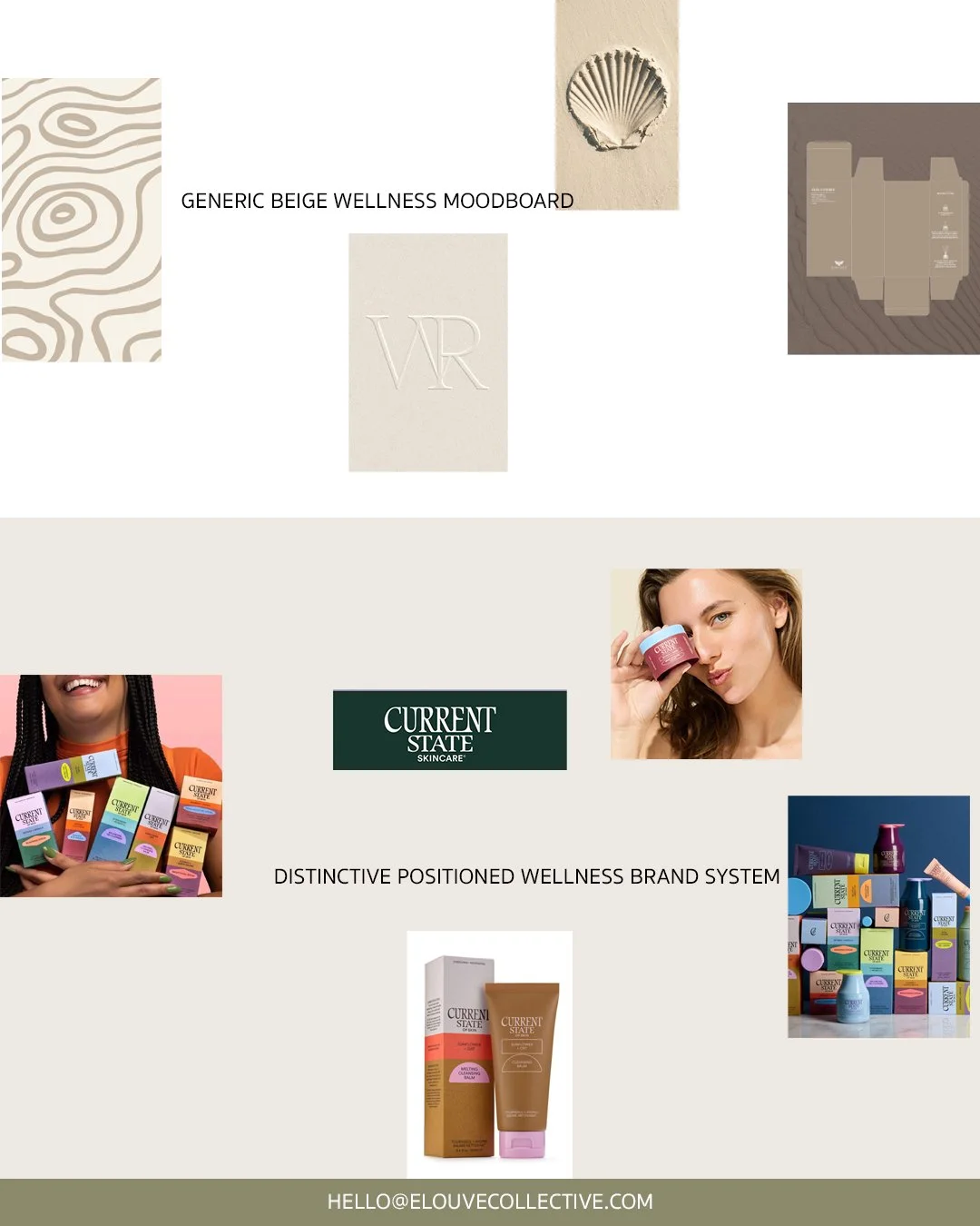
Wellness brand positioning guide showing generic minimal branding versus a distinctive brand system.
Quick answer: How do you position a wellness brand so it stands out?
A wellness brand stands out when it starts with a specific position instead of a category aesthetic. Before choosing beige, serif type, botanical imagery or soft lighting, the founder needs to define who the brand serves, what transformation it promises, what belief it is built on and what territory it can own. Minimalism can still work, but only when it expresses a clear point of view instead of copying the category.
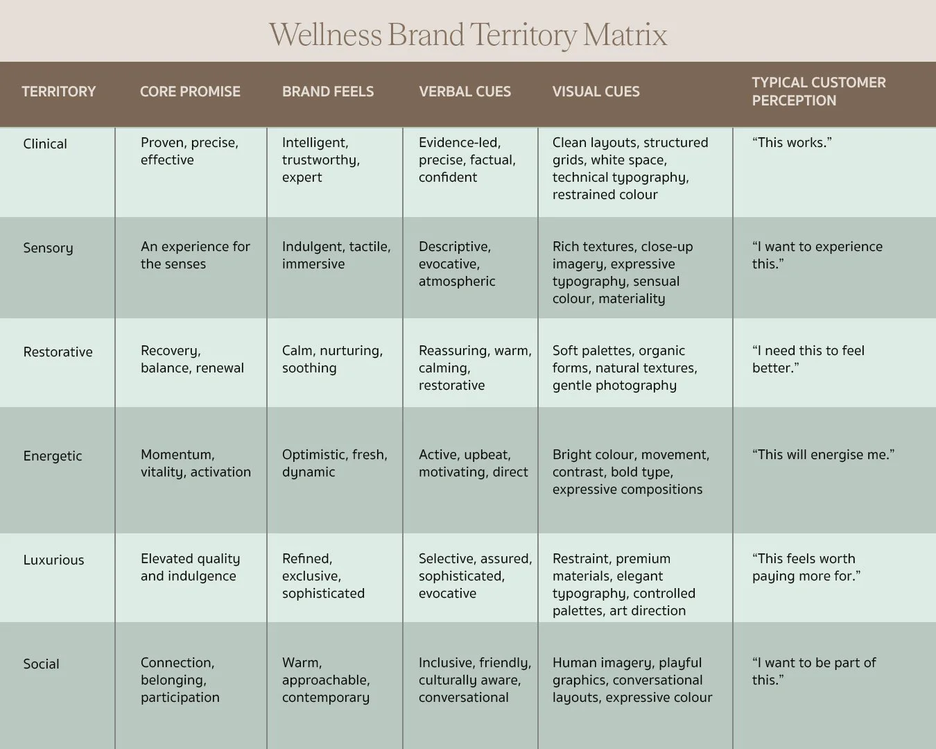
Wellness brand territory matrix showing different positioning directions
Why Do So Many Wellness Brands Look the Same?
Open any wellness brand's Instagram grid and you can usually guess the palette before you scroll. Beige backgrounds. A thin serif logo. Soft natural light. A ceramic bowl, a linen towel, a sprig of something green. None of this is accidental. Founders are told, correctly, that wellness customers respond to calm, considered visuals. So everyone reaches for the same signals of calm.
The result is a category that looks unified but feels forgettable. Minimalism is not the problem. Sameness is. When every brand borrows the same visual shorthand for "wellness," none of them actually own the word.
Why do wellness brands look the same? Because most founders design from the category rather than from their own position within it. They ask "what does a wellness brand look like" instead of "what does our wellness brand stand for." The first question always leads back to beige.
The Real Problem Is Not Minimalism. It Is Lack of Positioning.
There is a real difference between a minimalist brand and a generic minimalist brand. A minimalist brand uses restraint on purpose, because the restraint says something. A generic minimalist brand uses restraint because it saw other wellness brands do it and assumed that was the price of entry.
Strong positioning gives minimal design a job to do. Without it, white space is just empty space, and a neutral palette is just an absence of decision. This is Elouvé's core view on what we call minimal branding fatigue: customers are not tired of clean design. They are tired of clean design that has nothing behind it.
What does wellness brand positioning include? At minimum, it should define who the brand serves, what specific transformation or feeling it delivers, what belief system it is built on, and what it deliberately refuses to be. Positioning is the argument. Aesthetics are how that argument gets expressed.
What Makes a Wellness Brand Actually Different?
Differentiation rarely comes from a single adjective. "Premium," "natural," "holistic," and "backed by science" are starting points, not positions, because every competitor is reaching for the same four words.
Real differentiation comes from choosing a territory and committing to it. A few examples of territories a wellness brand can own:
Sensory, built around texture, scent, and physical ritual
Clinical, built around evidence, precision, and visible results
Restorative, built around slowing down and recovery
Energetic, built around momentum and physical performance
Social, built around community and shared experience
Luxurious, built around indulgence and elevated materials
Functional, built around efficiency and simplicity
Philosophical, built around a specific belief system about how wellness should work
None of these territories require abandoning minimalism. They require deciding which one is actually true for the brand, then letting every design decision reinforce it.
Start With the Wellness Experience You Are Selling
A skincare line, a Pilates studio, a spa, or a wellness retreat is never only selling the product or the service itself. It is selling how the customer wants to feel before, during, and after that experience.
Someone booking a restorative spa treatment wants to feel unhurried and cared for from the moment they walk in. Someone joining a performance focused Pilates studio wants to feel capable and slightly challenged. Someone buying a clinical skincare product wants to feel reassured that the formula will actually work. These are different emotional outcomes, and they should produce different brands, even if all three technically sit inside "wellness."
Starting with the experience, rather than the product category, is usually what separates a brand with a clear point of view from one that simply looks the part.
Define Your Brand's Position Before You Choose Its Aesthetic
Colour, typography, packaging, and photography should all be downstream decisions. They come after positioning, not before it.
Founder Questions to Answer First
Before choosing a single visual element, founders should be able to answer:
Who is this actually for, specifically, not just "people who care about wellness"
What do they already have access to, and what are they not getting from it
What do they currently believe about wellness, and does the brand confirm or challenge that belief
What makes our approach genuinely different, beyond quality or price
What is the one thing customers should associate with us immediately
If a founder cannot answer these clearly, no amount of design work will fix the underlying sameness. The aesthetic will simply be a well produced version of the same unclear idea.
Find the Tension That Makes Your Wellness Brand Interesting
Memorable wellness brands often live in the space between two ideas that do not usually sit together. Clinical and sensual. Ancient and contemporary. Energetic and refined. Scientific and human. Playful and premium. That tension is what makes a brand feel specific instead of generic, because it is a combination competitors are less likely to be occupying.
This is also where category blends become useful. A wellness brand does not have to stay inside its original category to find its tension. It can borrow from an adjacent one.
Skincare Brand Meets Healthy Smoothie Cafe
A skincare brand that extends into a small smoothie cafe attached to its flagship store creates a tension between what customers put on their skin and what they put in their body. It reframes the brand from a product line into a daily ritual, and it gives the visual identity a reason to include food photography, cafe signage, and packaging that neither a pure skincare brand nor a pure cafe would need on its own.
Spa Meets Coffee Culture
A spa that opens a small coffee counter in its reception space blends the ritual of a coffee order with the ritual of a treatment booking. It softens the clinical edge of a spa environment and gives customers a reason to linger, which extends brand contact time well beyond the treatment itself.
Yoga Studio Meets Sunday Run Club
Pairing a yoga studio with a casual running community blends stillness with momentum. It positions the studio as a home for a broader physical lifestyle rather than a single class type, and it opens the brand to a more social, less purely aesthetic audience.
These blends work because they are unexpected without being unrelated. They give a wellness brand a reason to look different, because it is genuinely doing something different.
Stop Using the Same Visual Shortcuts as Everyone Else
The Visual Codes Every Wellness Brand Reaches For
Certain choices have become so common in the category that they read as wellness shorthand rather than as a distinctive identity: beige and warm neutral palettes, botanical imagery, arched shapes in packaging and interiors, thin serif typography, linen textures, and soft gradients. None of these are wrong in isolation. The issue is that most brands use several of them at once, which makes the brand blend into everyone else using the same combination.
Common Positioning Mistakes
A few mistakes come up repeatedly when founders are early in building a wellness brand:
Choosing an aesthetic before defining a position, then trying to reverse engineer the strategy afterward
Describing the brand only in adjectives like premium or holistic, without a specific point of view behind them
Copying visual codes from a competitor because they performed well, without asking whether they fit this brand's territory
Treating minimalism as a finished strategy rather than a starting point that still needs a reason behind it
Underestimating how much of a wellness brand's difference should come from tone of voice and experience design, not only from visuals
Build a Visual Identity From Your Positioning, Not the Wellness Category
Once positioning is defined, typography, colour, imagery, layout, packaging, and materials should each reinforce that specific territory rather than simply signal "this is a wellness brand." A clinical wellness brand and a sensory wellness brand might both use restraint, but the restraint should look and feel different in each case, because it is protecting a different idea.
How Different Wellness Positions Can Look Completely Different
There is no single correct wellness aesthetic. The brands below all sit inside wellness, broadly defined, and every one of them uses restraint. But the position behind each brand is different, so the restraint produces a completely different result.
Aman: Restraint as Philosophy
Aman's positioning is built on subtraction. Every design and service decision has to earn its place, or it gets removed, which is why properties that look nothing alike architecturally still feel unmistakably Aman. The visual result is an earthy palette, custom script inspired typography, and materials sourced from each location, all in service of a single idea: true stillness requires removing anything that competes with it. This is not beige because beige performs well in the category. It is beige, or its equivalent, because the position demands it.
The Ordinary: Restraint as Evidence
The Ordinary's positioning is built on radical transparency, clinical formulas sold without the usual beauty industry storytelling. Its visual identity follows directly from that: lab style dropper bottles, plain black and white labels, and product names that are simply the active ingredient and its concentration. The stripped back look is not a wellness aesthetic borrowed from the category. It is proof of the brand's central claim that nothing is hidden.
Solidcore: Intensity Instead of Stillness
Solidcore sits at the fitness end of wellness, and its positioning is built around measurable personal strength rather than calm. That shows up as dark, moody studio lighting, a recognisable blue light used across every location, and bold, energetic typography, the opposite of the soft neutral codes most wellness brands default to. It is proof that a wellness adjacent brand does not need to look calm at all if calm is not the position.
Aesop: Sensory Craft
Aesop's positioning centres on formulation, ingredient integrity, and a literary, editorial sensibility rather than clinical claims. Its amber glass bottles were originally a functional choice, protecting plant based formulas from UV light, and became the brand's single most recognisable asset. Utilitarian labels, restrained typography, and stores individually designed for each neighbourhood all reinforce the same idea. Aesop shows that a sensory, ingredient led wellness brand can still be minimal. The minimalism is simply protecting craft and formulation, which is a different job than the minimalism is doing for The Ordinary.
Alo Yoga: Wellness as Everyday Lifestyle
Alo Yoga positions wellness as an aspirational, everyday identity rather than a purely athletic pursuit. Its visual identity leans soft and lifestyle oriented rather than performance focused, and its retail spaces combine shopping with studios and cafes so the brand extends well past the product itself. Alongside Aman's restrained luxury and The Ordinary's clinical minimalism, Alo shows just how far apart two brands can sit while both technically belonging to wellness.
Five brands, one broad category, five different territories, and five aesthetics that follow directly from the position behind them rather than from a shared idea of what wellness is supposed to look like.
How to Make a Minimal Wellness Brand Feel Distinctive
A brand can stay minimal and still avoid disappearing into the category. A few practical ways to do it:
Choose a signature colour that is not commonly used across the category, rather than the expected neutral palette
Use a typeface with a slightly unexpected personality instead of the default premium serif
Commission distinctive photography with a consistent point of view, rather than generic stock style imagery
Design one unusual compositional habit, such as an asymmetric layout or a repeated proprietary shape
Build a small set of graphic elements that belong only to the brand
Add one memorable packaging detail that customers would notice even without the logo
Write in a voice that sounds like a specific person, not a generic wellness tone
Your Brand Should Be Recognisable Without Its Logo
This is a useful test for any wellness brand, minimal or not. Remove the logo from the packaging, the Instagram post, the website, or the studio signage. Would someone still recognise it as this brand?
If the answer is no, the identity is relying entirely on the logo to carry recognition, which means the rest of the system, colour, type, imagery, tone, and materials, is not yet distinctive enough to stand on its own.
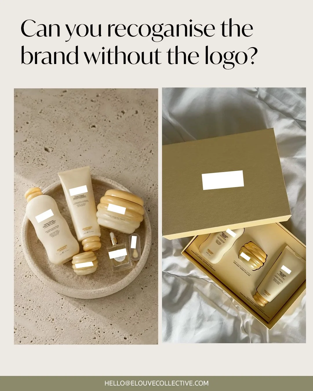
Wellness brand recognition test showing packaging and website without logo.
A Simple Wellness Brand Positioning Framework
A practical starting framework for founders working through this:
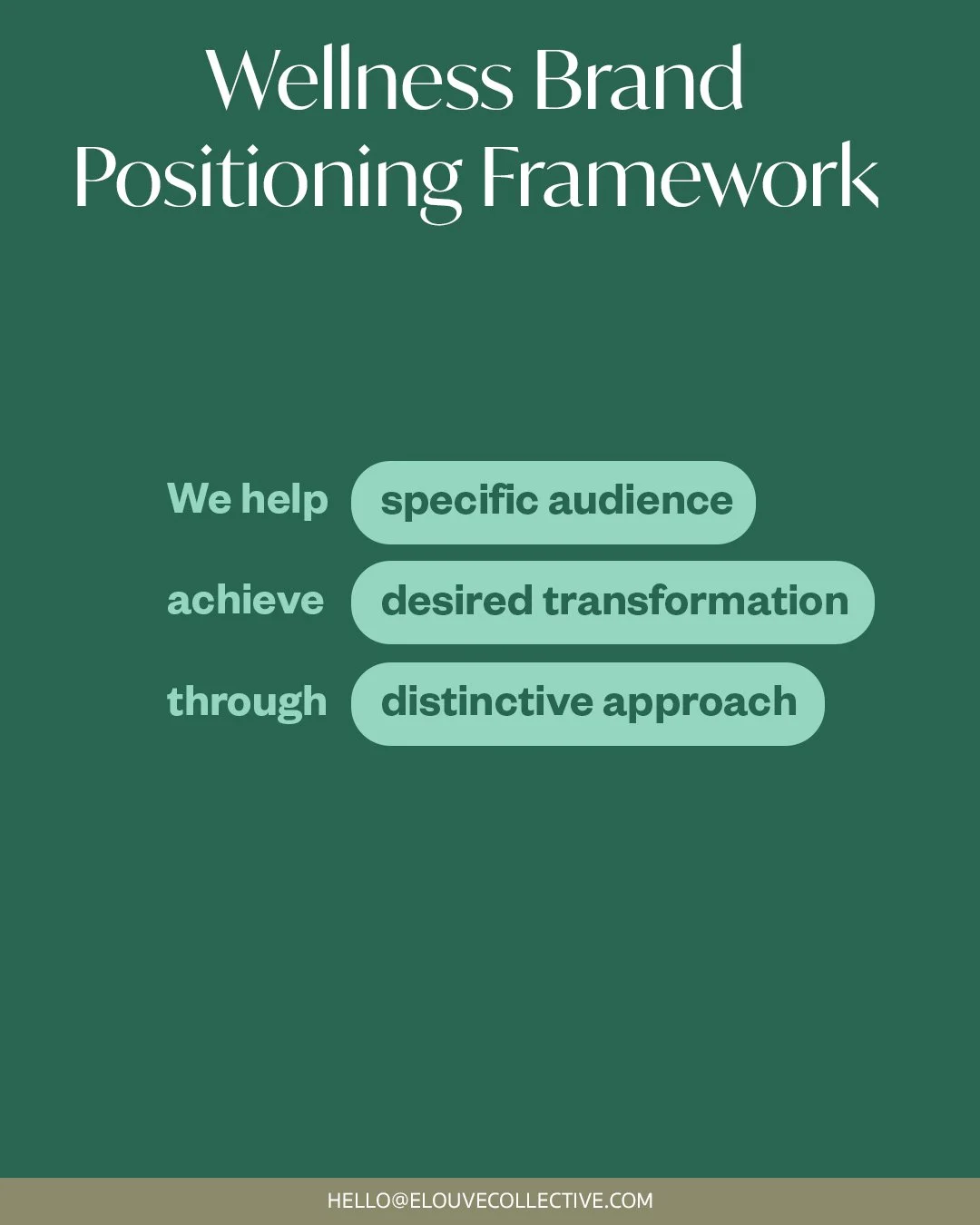
Wellness brand positioning framework for founders
Once this sentence is filled in clearly, it becomes the reference point for every visual and verbal decision that follows.
Before and After: Positioning in Action
Before: "We are a premium, natural skincare brand for people who care about wellness." This could describe hundreds of brands and gives a designer nothing specific to build from. The result is usually a beige palette, a serif logo, and botanical photography, because that is the only direction generic positioning can produce.
After: "We help people managing sensitive skin conditions feel confident in their routine, through dermatologist informed formulas presented with the warmth of a trusted friend rather than the coldness of a clinic, unlike purely clinical skincare brands, because skin health and emotional confidence are connected." This gives a designer a real brief: clinical credibility paired with human warmth. That single sentence can justify a distinct colour choice, a specific tone of voice, and packaging that avoids both extremes of the category, generic beige softness on one side and cold clinical white on the other.
When Your Wellness Brand Needs More Than a Logo
Many founders start their branding search by looking for a logo, when what they actually need is a full positioning and visual identity system, one that works consistently across packaging, the website, social content, physical space, and every other customer touchpoint. A logo is one output of that system. It is rarely the thing that makes a brand memorable on its own.
FAQs: How to Position a Wellness Brand
What is wellness brand positioning?
Wellness brand positioning is the decision about who the brand serves, what transformation it promises, what belief system it is built on and how it should be remembered against category alternatives.
How do I make a wellness brand stand out?
Start with positioning rather than visuals. Define a specific audience, a clear point of difference, and a tension the brand can own, then build the visual identity, colour, typography, imagery, and packaging, to reinforce that position rather than to signal the wellness category in general.
Why do wellness brands look the same?
Most founders design from the category instead of from their own position, borrowing the same beige palettes, serif type, and botanical imagery that already dominate wellness branding. The sameness comes from copying visual signals rather than defining a specific point of view.
What does wellness brand positioning include?
At minimum, it should define who the brand serves, the specific transformation or feeling it delivers, the belief system behind it, and the tension or territory that separates it from category alternatives. Positioning should be settled before any visual decisions are made.
Can a wellness brand be minimal and still stand out?
Yes. Minimalism can still be distinctive when it expresses a clear position. The issue is not clean design. The issue is using the same visual shortcuts as every other wellness brand without a specific point of view.
What should come before wellness brand design?
Positioning should come first. A founder should define the audience, transformation, belief, tension and territory before choosing colours, type, packaging or photography.
How do I know if my wellness brand is too generic?
Remove the logo from your website, packaging and social posts. If the brand becomes hard to recognise, the wider system is probably relying too much on category codes and not enough on its own distinctive assets.
How a Wellness Branding Studio Can Help You Own a Distinctive Position
A branding studio's role in this process is rarely to make a wellness brand look less minimal. It is to make sure the minimalism is protecting something specific: a clear position, a defined audience, a considered tension, and a visual system built to reinforce all three. That is the difference between a brand that looks calm and a brand that is instantly recognisable, remembered, and returned to.
Ready to shape a distinctive wellness brand? If your brand currently looks like the rest of the category, the fix is rarely a new logo. It starts with positioning, and Elouvé Collective builds both the strategy and the visual identity to carry it through. book a discovery call with Elouve or email us directly at hello@elouvecollective.com
