
Beauty Brand Identity System: What Founders Need Beyond a Logo
Quick Answer: What is a beauty brand identity system?
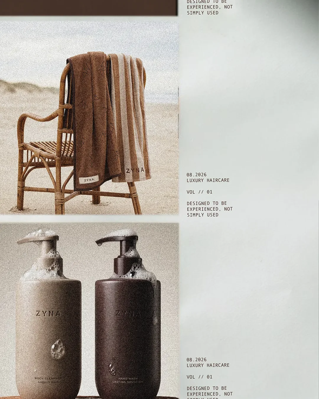
A beauty brand identity system is the set of visual, verbal and application rules that keeps a skincare or beauty brand consistent as it grows. Beyond a logo, it should define a logo suite, typography hierarchy, colour palette, packaging rules, photography/art direction, tone of voice, social templates, retail and PR applications, and clear brand guidelines. The goal is not simply to look cohesive; it is to make every new SKU, campaign, vendor handoff and retail touchpoint easier to execute without reinventing the brand each time.
KEY TAKEAWAY: If a new designer, manufacturer or marketing hire cannot apply the brand correctly without asking the founder how it should look or sound, the brand does not yet have a complete identity system.
The Logo Was Never the Hard Part
Most skincare founders treat the logo as the finish line. You brief a designer, you get a mark you love, you drop it on the bottle, and branding feels done.
Then the real work shows up. A buyer asks for your brand guidelines before a Sephora pitch. Your co-packer needs packaging specs that go beyond "make it look like the logo." Your team launches a limited edition and nobody agrees on whether the new packaging still looks like you. A freelancer builds your Instagram templates and they clash with the website.
None of that is a logo problem. It's a system problem. The logo is one asset inside something bigger, and founders who skip building that bigger thing end up paying for it later, usually at the exact moment they can least afford the delay: a retail deadline, a funding round, a rebrand under pressure.
This is what an actual brand identity system includes, why skincare brands hit a wall without one, and how to know when you need to build yours.
What a Brand Identity System Actually Contains
What should a beauty brand identity include?
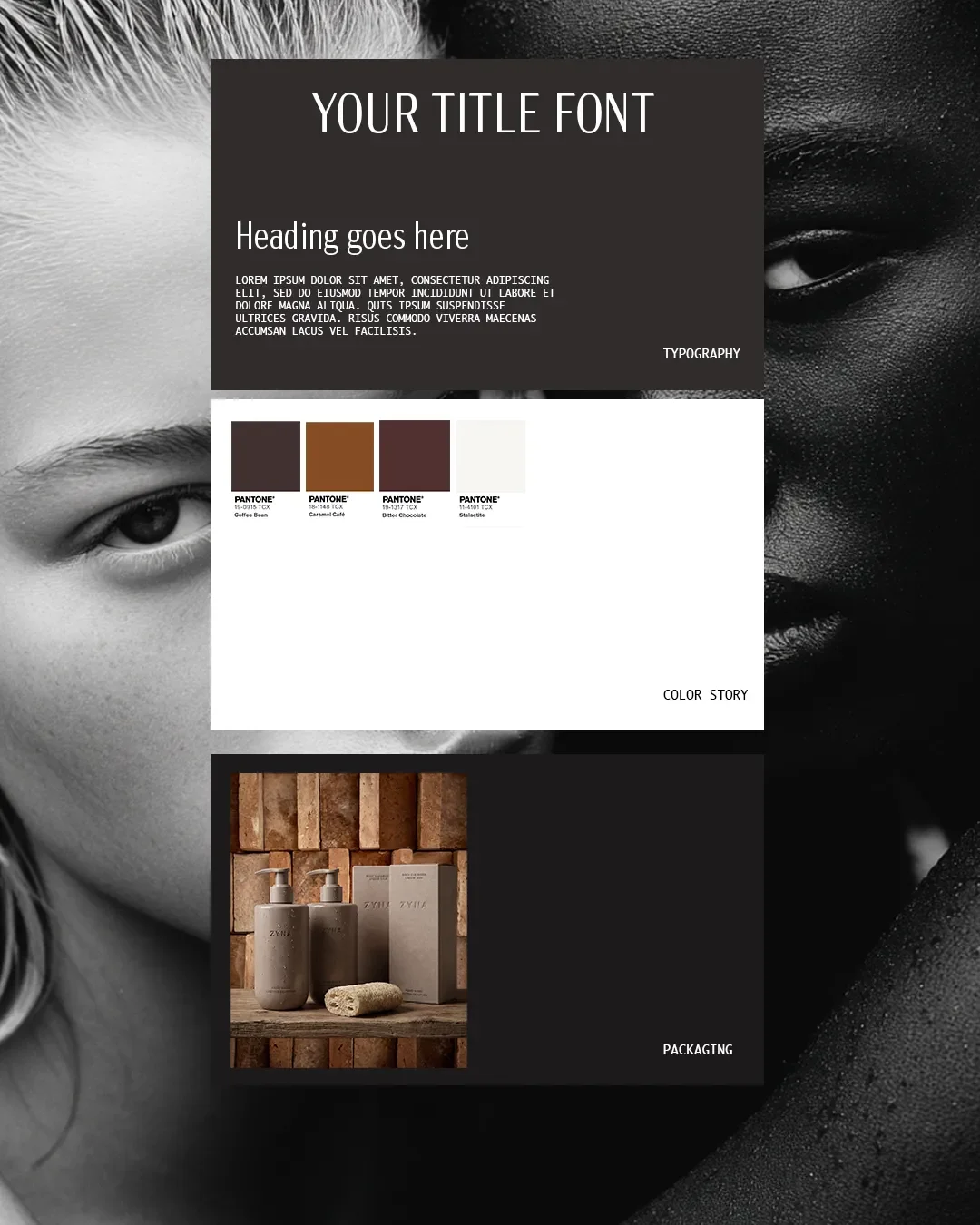
A complete beauty brand identity is not a folder of logo files. It is a documented system that tells anyone, your team, a factory, a retail buyer, a freelance designer, exactly how your brand looks, sounds, and behaves across every surface it touches.
Beauty brand identity system showing logo typography colour and packaging applications
At minimum, it should include:
System overview
Visual Identity
Primary and secondary logo
Monogram or brand mark
Type hierarchy
Typography rules
Colour palette & Range Guidelines
Verbal Identity
Tone of voice
Claims and ingredient language
Applications
Packaging rules
Social templates
Retail and PR materials
What is a logo suite?
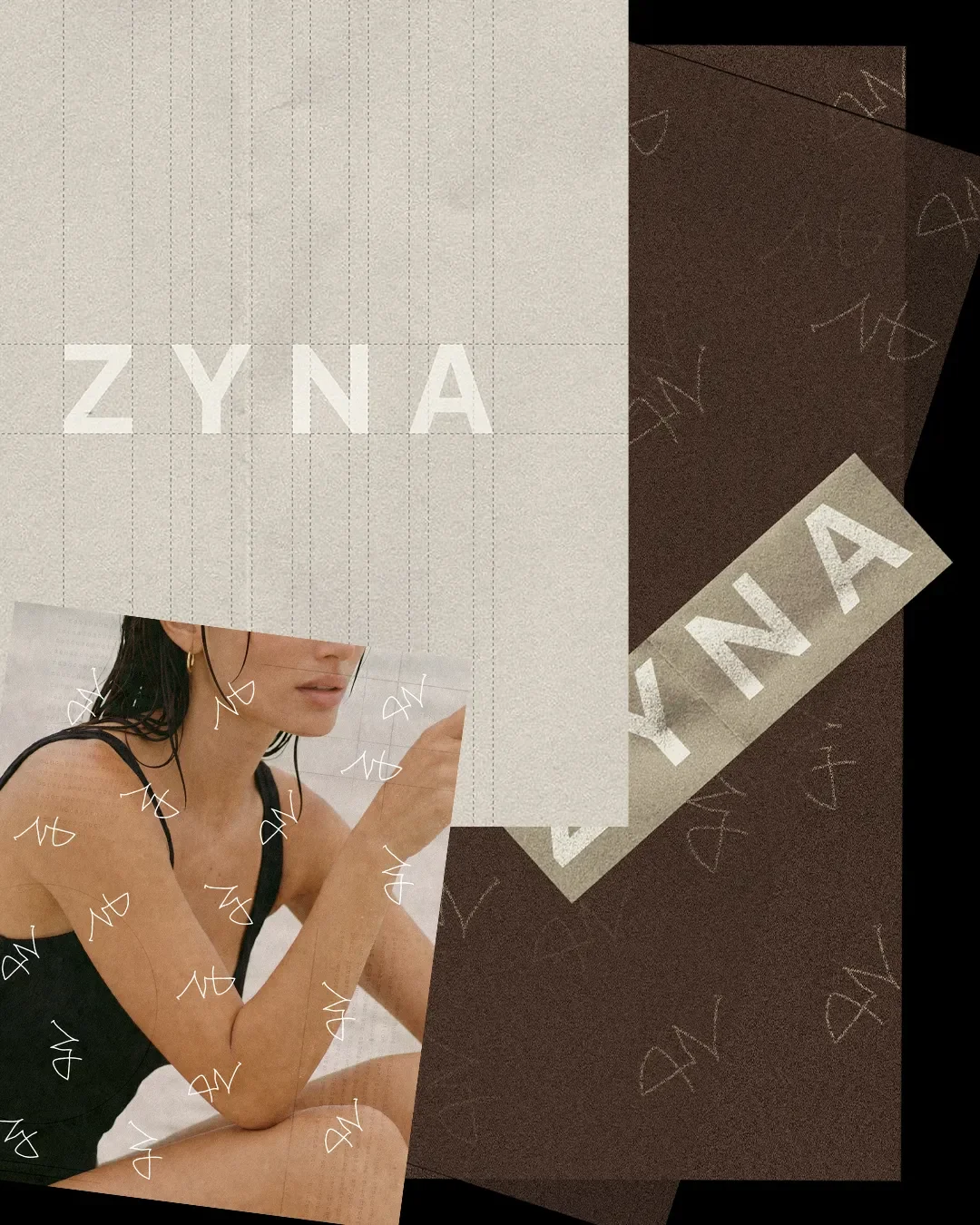
A logo suite is the full set of logo variations your brand needs to function across different formats, not just the one file a founder usually gets first. It typically includes a primary logo for hero placements like packaging and the homepage, a secondary or lockup version for tight spaces like social avatars or embossing, and a monogram or icon mark for favicons, stickers, and packaging details where a full wordmark won't fit.
logo-suite example showing primary, secondary and monogram uses
Here's what the full deliverable set looks like laid out clearly:
| Deliverable | What it does | Where it shows up |
|---|---|---|
| Primary logo | Main brand mark, used in hero placements | Packaging front, website header, PR kits |
| Secondary logo | Compact or single colour version | Social avatars, embossing, small packaging areas |
| Monogram | Icon level mark for tight or repeated use | Favicons, stickers, refill packaging, pattern work |
| Type hierarchy | Defined heading, subheading, and body fonts with sizing rules | Website, packaging copy, PR decks |
| Colour palette | Primary and secondary colours with exact codes | Packaging, social, print, retail signage |
| Packaging rules | Placement, spacing, and material guidance | Product line, gift sets, refills |
| Social templates | Pre-built layouts for recurring content types | Instagram, TikTok, email |
| Retail and PR applications | Line sheets, press kits, sell sheets | Buyer meetings, press mailers, trade shows |
| Typography | Defined spacings, editorial layouts and composition | Packaging, social media and overall branding |
Each row on that table is a working tool. Without it, every new deliverable becomes a fresh design decision instead of an application of something already defined.
Why Skincare Founders Hit a Wall Without One
Why does a skincare brand need brand guidelines?
Skincare brands run into identity problems faster than most other categories, for a few specific reasons.
First, SKU count grows quickly. A serum becomes a serum, a cleanser, a refill pouch, and a travel size within a year. Without documented rules, each new SKU gets designed from scratch, and small inconsistencies pile up until the range stops looking like one brand.
Second, regulatory label requirements eat into your design space. Ingredient lists, warnings, and claims language all compete for room on a small bottle. A brand system that accounts for this from the start protects your visual identity even when the label is 40 percent compliance text.
Third, retail and DTC packaging often need to diverge. A version built for a countertop display at Sephora has different requirements than a version built for a mailer box. Founders without guidelines end up with two versions of the brand that quietly drift apart.
Fourth, your vendors need more than a logo file. A packaging manufacturer needs Pantone codes, material specs, and placement tolerances. A formulator doesn't need any of that but your marketing team does. A guidelines document is the translation layer between your brand and everyone building it.
The Verbal Identity Most Founders Skip
Most brand conversations stop at how a brand looks. The founders who build lasting skincare brands also define how it sounds.
Verbal identity covers your tone of voice (clinical and precise, or warm and ritualistic, or minimal and editorial), your ingredient storytelling language (how you talk about actives without sounding like a lab report or overselling a claim), and your claims language (phrasing that survives legal and regulatory review while still sounding like you, not like a disclaimer bolted onto good copy).
This section is where most competitor content stops short. A logo suite gets attention because it's visible immediately. Verbal identity gets ignored until a founder is three years in, staring at inconsistent product copy across the website, packaging, and Instagram captions, wondering why nothing sounds connected.
Define it early and every piece of copy your brand ever produces, whether you write it or someone on your team does, starts from the same foundation.
Packaging as a System, Not a one-off Design
Packaging is usually the first place a beauty brand identity gets tested at scale, and the first place it breaks without a system.
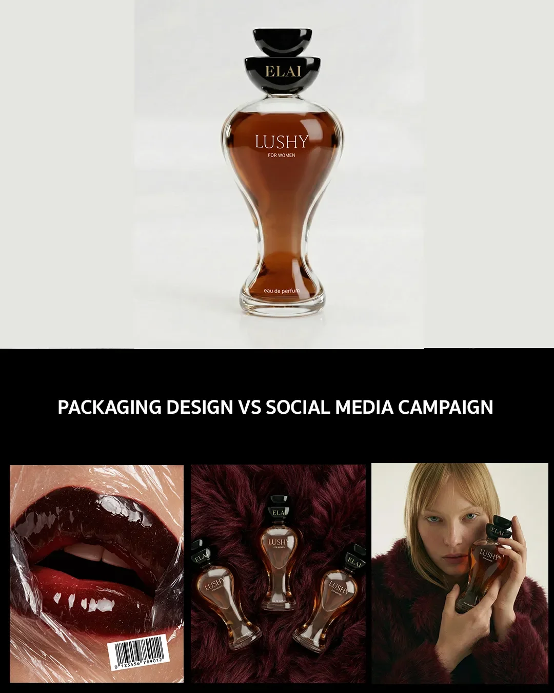
A hero SKU gets a beautiful, bespoke design. Then a sub-range launches. Then shopping bag. Then a PR box. Then inserts and tissue paper. If each one is treated as its own design project, you end up with a shelf that looks like five different brands sharing a name.
Brands that hold together at scale, think of the coherence across Gisou's range or the way Tatcha keeps a consistent visual language from hero serum to travel kit, aren't relying on a design team remembering what the last SKU looked like. They're working from documented packaging rules: fixed placement zones for the logo, a defined colour system for range differentiation, type rules that stay consistent even as claims copy changes.
A packaging system means your fifth SKU takes a fraction of the design time your first one did, because most of the decisions are already made.
packaging design vs social media campaign
What This Looks Like in Practice
Building a real identity system follows a defined process, not a single design sprint.
Discovery. Understand the brand's positioning, audience, and competitive set before any visual work starts. Skipping this step is why so many identities feel generic; they were designed before anyone answered what makes the brand different.
Positioning. Translate that discovery into a clear point of view: what the brand stands for, what it explicitly does not do, and where it sits relative to competitors.
Visual language. Develop the logo suite, colour palette, and type hierarchy as a connected system, not as separate deliverables signed off one at a time.
Applications. Apply that visual language across packaging, social templates, and retail materials, testing it against real use cases like a countertop display or a gift set mailer.
Guidelines document. Package everything into a single reference document that any team member, vendor, or partner can use without needing the original designer in the room.
This is the difference between a brand that was designed once and a brand that was built to scale.
A Founder's Checklist: Is Your Brand Identity Actually a System?
Run through this list honestly:
If you checked fewer than six, you have a logo. Not yet a system.
When to Invest in a Full System vs a Logo Refresh
Not every founder needs the full build immediately, and pretending otherwise doesn't serve anyone.
Pre launch:
You likely need the core system: primary logo, colour palette, type hierarchy, and packaging rules for your first SKU. Full retail and PR applications can wait until you're closer to needing them.
Post launch, scaling a range:
This is when the gap becomes visible. If you're adding SKUs and each one feels like a fresh design decision, this is the point to formalise packaging rules and social templates properly.
Entering retail:
A buyer will expect brand guidelines, professional line sheets, and consistent packaging across formats. This is the point where an incomplete system starts costing you real opportunities, not just internal friction.
Knowing which stage you're in tells you what to invest in now versus what to build out next.
FAQs: Beauty Brand Identity System
What should a beauty brand identity include?
A complete system includes a primary and secondary logo, a monogram, a defined type hierarchy, a colour palette, packaging rules, social templates, and retail and PR applications, all documented in a single guidelines reference.
What is a logo suite?
A logo suite is the set of logo variations, primary, secondary, and monogram, built to function across different formats and sizes, from packaging to social avatars to embossing details.
Why does a skincare brand need brand guidelines?
Skincare brands scale SKUs quickly, split packaging between retail and DTC, and work with vendors who each need different specifications. Guidelines keep the brand consistent across all of it without requiring the founder to make every decision personally.
How does visual identity apply to packaging?
Visual identity applies to packaging through documented placement rules, a defined colour system for range differentiation, and consistent type application, so new SKUs, gift sets, and refills stay visually connected without a new design brief each time.
How much does a brand identity system cost?
Cost varies by scope. A logo refresh is a fraction of the investment of a full system with packaging rules, social templates, and retail applications built in. The right starting point depends on your stage, covered above.
Your Beauty Brand Launch Is More Than a Logo
Treat branding, packaging and digital experience as one connected ecosystem rather than separate projects, and the launch itself becomes far less stressful than founders expect.
Ready to build a beauty brand that stays consistent beyond the first logo or product launch? Explore Elouvé’s skincare branding approach or get in touch to build a scalable identity system.
Email us directly at hello@elouvecollective.com
