
What Makes Packaging Feel Luxury? A Founder Guide to Premium Packaging
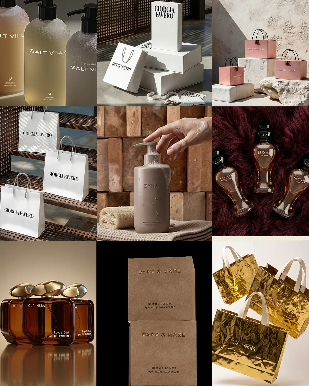
Luxury packaging design details including glass, textured paper and premium finishes.
Quick answer: What makes packaging feel luxury?
Packaging feels luxury when the material, structure, typography, colour, finish, closure and unboxing all support one clear brand position. It is not only about heavier glass, foil or a larger box. A package feels premium when every detail feels intentional, consistent and difficult to replace with a cheaper choice without weakening the brand.
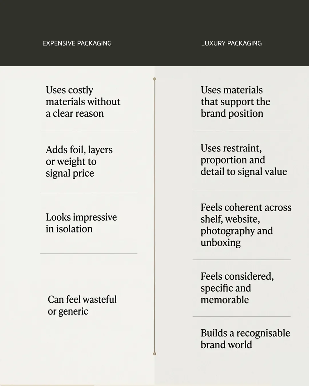
Comparison of expensive packaging and luxury packaging for premium brands.
What Actually Makes Packaging Feel Luxury?
Most founders ask the wrong question first. They ask what luxury packaging looks like, when the real question is what luxury packaging does. It builds trust before a customer has touched the product. It signals value before a single ingredient or fabric has proven itself. And it does this through a series of small, deliberate decisions rather than one expensive gesture.
At Elouvé, we see the same misunderstanding across beauty, fashion and hospitality clients. People assume luxury is an ingredient list: heavier glass, a metallic finish, a bigger box. It isn't. Luxury is coherence. It's every decision, from typeface to closure mechanism, agreeing with every other decision. When that happens, a package feels inevitable. When it doesn't, no amount of gold foil will save it.
Definition: What is luxury packaging? Luxury packaging is packaging where every material, structural and visual decision reinforces a single, deliberate brand position. It is judged not by cost but by coherence: whether the weight, finish, typography, colour and structure all belong to the same idea of the brand.
The Psychology Behind Premium Packaging
Packaging is the first physical proof a customer has of a brand's claims. Before anyone smells the product, feels the fabric or tastes the formula, they have already formed an opinion from the object in their hands. That opinion sets the baseline for everything that follows: perceived quality, perceived price, and whether the product is trusted enough to be repurchased or gifted.
This is why packaging decisions cannot be treated as a final step. They are a strategic layer, not a finishing touch.
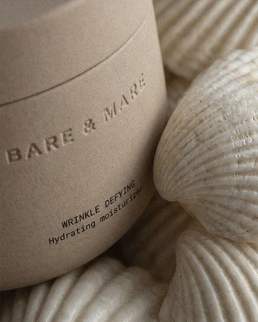
Premium packaging details that make a product feel luxury in hand.
Start With Positioning Before You Design the Packaging
Before a single material or colour is chosen, a founder needs clear answers to four questions: who they are selling to, where they sit in the market, what they want to be known for, and what the product should feel like in someone's hand.
Skip this step and you get packaging that looks nice in isolation but says nothing specific. It could belong to any brand, which means it effectively belongs to none. To avoid this, it helps to understand how strategic mapping shapes the cosmetic packaging design process from day one.
What makes packaging look expensive?
People often expect a technical answer here: heavier glass, soft touch coatings, foil stamping. Those things help, but they are not the source of the effect. Packaging looks expensive when restraint, proportion, material choice and typography are all working toward the same idea at once. A single premium finish on packaging that is otherwise inconsistent will read as an add on, not as quality. The expensive feeling comes from agreement between elements, not from any one element on its own.
Materials That Make Packaging Feel Premium
Glass, plastic, paper stock, coatings, finishes and closures all carry meaning before a customer reads a word. Weight in the hand suggests substance. A matte, soft touch coating suggests quiet confidence. A glossy, reflective surface suggests energy or youth.
The mistake is choosing materials because they look premium in a supplier catalogue rather than because they support the brand's specific positioning. A minimalist skincare brand and a maximalist fragrance house should never reach for the same material shortlist, even if both are aiming for luxury. For a deeper look at material selection for this category, explore our comprehensive packaging design guide.
Typography Does More Than Identify the Product
Typeface, hierarchy, spacing, scale and alignment do more work than most founders expect. The same bottle, printed with two different type treatments, can read as clinical and serious in one version and warm and approachable in another. Neither is wrong. But only one of them will match the brand underneath it.
Typography is often the cheapest lever a brand has to shift perception, and it is frequently the most neglected.
Restraint, Proportion and Visual Balance
This is less about minimalism as an aesthetic and more about editing as a discipline. What deserves space on the front of the pack? What can be moved to the back or removed entirely? How much information does a customer actually need at the point of purchase?
Editing well requires confidence. It is far easier to add another line of copy or another badge than to trust that less says more. The brands that get this right are usually the ones willing to leave something out.
The Packaging Structure Has to Feel Considered
Bottle, cap, label, box and closure need to relate to one another, not just sit next to one another. A beautiful label cannot rescue a structure that feels generic or poorly proportioned, and an expensive cap on a cheap feeling bottle only draws attention to the mismatch.
Structure is where a lot of early stage brands cut corners, because it is expensive to change once tooling is committed. It is also the decision with the longest lasting impact on how premium a product feels in hand. You can see real-world examples of custom structures we’ve developed in our portfolio.
Colour Should Have a Reason
Black, white and beige get treated as a default shortcut to looking expensive. Sometimes that shortcut works. More often it produces a brand that looks like every other brand attempting the same shortcut.
Colour should be chosen through positioning, category convention, differentiation, material behaviour and the emotional world the brand wants to occupy. A confident colour choice, backed by reasoning, will always outperform a safe one chosen out of habit.
The Details Customers May Never Consciously Notice
Print quality, edge finishing, embossing depth, foil registration, cap alignment, bottle weight and the resistance of an opening mechanism all sit below conscious notice for most customers. Almost nobody will look at a cap and think "the alignment is off." But they will feel that something is slightly wrong, even if they cannot name it.
What packaging details change brand perception?
The details that shift perception most are usually tactile and mechanical rather than decorative: the resistance of a cap as it opens, the weight of a box relative to its size, the crispness of a printed edge, and whether components align precisely when the product is closed. These details rarely get complimented directly, but they are the first thing customers notice when they are missing.
Unboxing and PR Boxes Are Part of the Brand Experience
Luxury does not end at the shelf. It continues through delivery, into the moment a box is opened, and through every layer a customer moves past before reaching the product itself. Tissue, inserts, presentation and sequencing are all part of that experience.
It's worth saying plainly: more packaging does not automatically create a more luxurious experience. Excess layers without a reason behind them read as wasteful rather than generous, and that perception is only getting stronger as customers pay closer attention to sustainability.
PR boxes deserve their own strategy
PR and gifting boxes carry a different job than retail packaging. They are built to be photographed, unboxed on camera and shared, often by someone who has never bought the product before. That means sequencing, surprise and a moment worth filming all matter more here than they do on a shelf. A PR box that simply repeats the retail unboxing misses the opportunity. It should feel considered specifically for the audience receiving it: editors, stylists or creators who will judge the brand on this single experience.
How Luxury Looks Different by Category
Luxury packaging is not one formula applied everywhere. What reads as premium changes depending on what is being sold and how it is used.
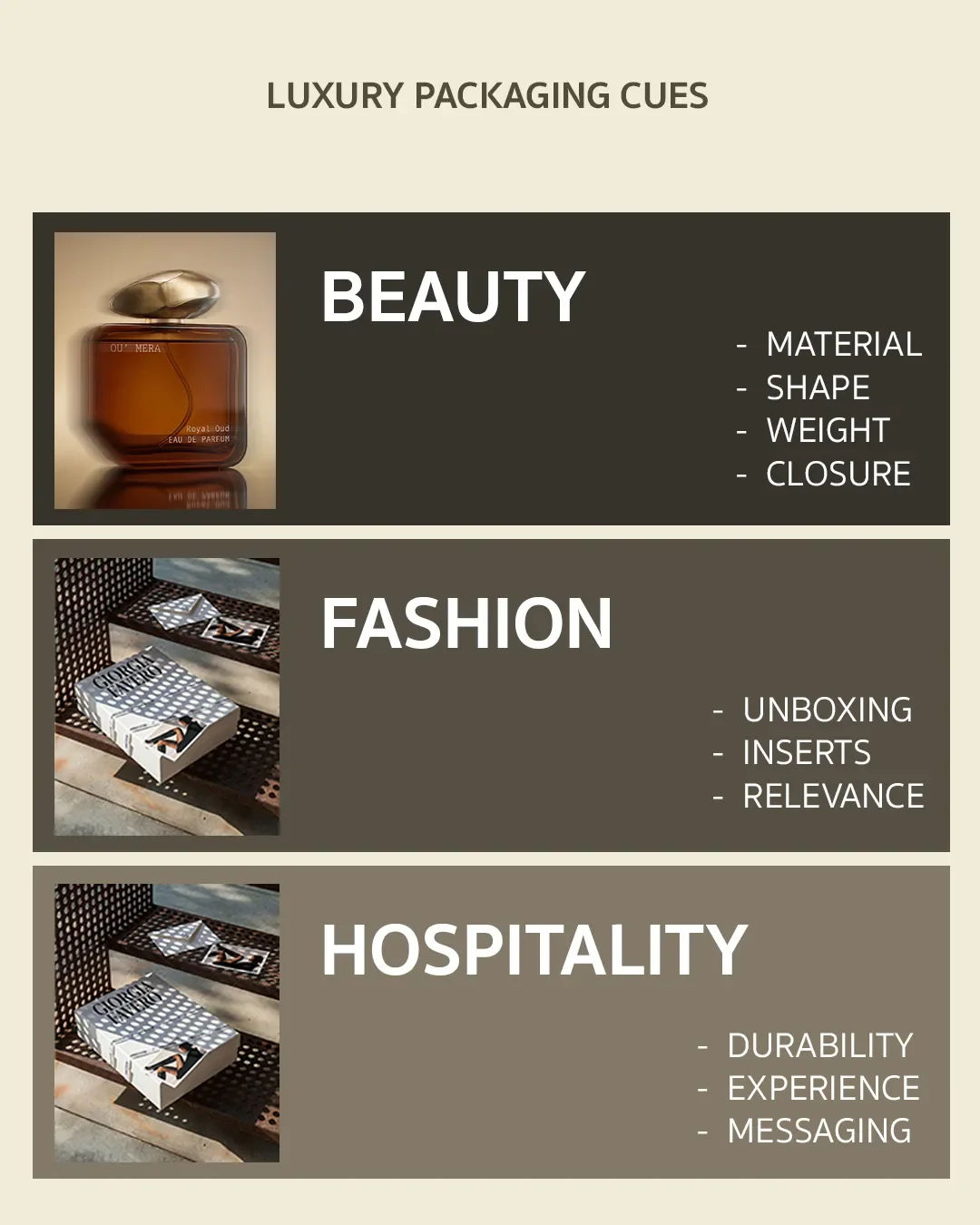
Luxury packaging cues for beauty, fashion and hospitality brands
Beauty
Beauty packaging lives or dies on repeated daily contact. A customer will pick this object up every morning and every night, so weight, closure mechanism and how it sits on a counter matter as much as how it photographs. Beauty brands also carry heavy regulatory and ingredient information, which makes the editing discipline from earlier in this article especially important. The brands that feel most premium are usually the ones that resist the urge to print everything on the front.
Fashion
Fashion packaging is judged more on presentation and reveal than on daily function, since most of it is opened once and then discarded or kept as an object in its own right. Structure, material honesty and how the packaging photographs unboxed carry more weight here than repeat use durability. A fashion brand's packaging is also more directly tied to campaign and seasonal identity, so it needs room to shift without losing recognisability.
Hospitality takeaway
Hospitality packaging, from in room amenities to takeaway and delivery formats, has to survive handling, transit and sometimes climate, while still carrying the same sense of considered quality as the physical space it represents. The takeaway here is that hospitality brands cannot treat packaging as a lesser cousin of their interior and guest experience design. It is often the only physical object a guest takes home, which makes it one of the most valuable and most neglected brand touchpoints available.
Luxury Packaging Should Create a Recognisable Brand World
Packaging should not be designed as a single beautiful object. It should be designed as part of a visual language that also shows up on the website, in campaigns, across social content, in retail and in photography. The goal is a system that can grow across a full product range without losing coherence, not one perfect SKU that cannot be repeated.
Common Luxury Packaging Mistakes Beauty Founders Make
| Mistake | Why it undermines the brand |
|---|---|
| Choosing packaging because it looks luxurious in isolation | Ignores whether it fits the actual brand and audience |
| Starting with aesthetics before positioning | Produces beautiful packaging that says nothing specific |
| Overusing gold, foil or metallic finishes | Reads as generic luxury rather than considered luxury |
| Trying to communicate every benefit on the front | Removes the restraint that makes packaging feel premium |
| Copying established luxury brands | Signals imitation rather than a distinct point of view |
| Treating the logo as the entire identity | Leaves typography, material and structure undeveloped |
| Choosing materials without considering production quality | Creates a gap between the concept and the finished object |
| Designing one product instead of a scalable system | Makes future range expansion inconsistent and costly |
| Adding packaging layers purely for perceived expense | Feels wasteful rather than generous to the customer |
| Forgetting how packaging will photograph online | Loses impact in the channel most customers actually see it in |
The Difference Between Expensive Packaging and Luxury Packaging
This is worth separating clearly, because the two get confused constantly. A product can use expensive materials, elaborate finishes and heavy packaging and still feel generic. Meanwhile, a genuinely simple package can feel highly desirable because proportion, typography, material and colour all belong together.
Luxury is coherence and intention, not the number of premium finishes a brand can afford. This is also, in our experience, the single hardest idea to convince a founder of before their first packaging project, and the one they understand completely by the end of it.
How do you design luxury packaging?
The process runs in a fairly consistent order for us: positioning first, then a clear picture of the customer and the competitive landscape, then product architecture, then packaging structure, then material selection, then visual identity including typography and colour, then production planning, then the full experience from shelf to unboxing. Skipping ahead to visual identity before positioning is the most common reason packaging projects need to be revisited later.
When Should You Hire a Packaging Designer or Packaging Studio?
There is a point where choosing components independently, a cap here, a label there, stops working. That point is usually when a founder can no longer explain why one decision should override another, or when the packaging needs to work across a growing range rather than a single product. That is the moment to bring in a specialist who considers brand strategy, packaging architecture, design, materials, production and the wider customer experience as one connected decision, rather than a series of separate ones.
Founder Checklist Before You Brief a Packaging Designer
Before your first conversation with a packaging designer, you should be able to answer the following:
Can you describe your brand position in one sentence, without listing features
Do you know who the packaging needs to convince at the point of purchase
Have you defined what the product should feel like in someone's hand
Do you know which category conventions you are following and which you are deliberately breaking
Have you thought about how the packaging needs to work across future products, not just this one
Do you know how the packaging needs to photograph for your website, social content and press
Have you considered how it will be unboxed, and whether that moment matters for your brand
Do you have a realistic sense of production cost against your actual price point
If several of these are unanswered, that is not a problem to solve alone before hiring someone. It is exactly the gap a good packaging designer should help you close.
| Checklist item | Ready |
|---|---|
| Brand position defined in one sentence, without listing features | |
| Clear on who the packaging needs to convince at the point of purchase | |
| Defined what the product should feel like in someone's hand | |
| Know which category conventions you're following and which you're breaking | |
| Considered how packaging works across future products, not just this one | |
| Know how packaging needs to photograph for web, social and press | |
| Thought through the unboxing moment and whether it matters for this brand | |
| Realistic sense of production cost against your actual price point |
FAQs: A Founder Guide to Premium Packaging
Is luxury packaging always expensive?
No. Luxury packaging is not defined only by cost. It is defined by coherence, proportion, material quality, production finish and whether the packaging matches the brand position.
Does gold foil make packaging look luxury?
Gold foil can support a luxury direction, but it is not enough on its own. If the structure, typography, spacing and material choices are weak, foil often makes the packaging feel more generic rather than more premium.
What is the biggest mistake founders make with luxury packaging?
The biggest mistake is choosing premium-looking materials before defining the brand position. Without a clear position, expensive packaging can look polished but still feel forgettable.
How should luxury packaging work online?
Luxury packaging needs to work in photography, ecommerce thumbnails and social content. The product should still feel recognisable and premium when it is seen on a screen, not only when held in person.
A Strong Luxury Packaging Concept Starts Long Before the Artwork
Positioning, customer, competitive landscape, product architecture, packaging structure, materials, visual identity, production, experience. That is the real order of operations, and it rarely matches the order most founders expect.
A luxury package should not simply look expensive in a mockup. It should still feel considered in a customer's hand, on a retail shelf, on a bathroom counter, and in a photograph taken by someone who was never asked to take it.
If you're ready to create packaging that feels premium at every one of those moments, that's exactly the work we do at Elouvé.
Book a discovery call with Elouve or email us directly at hello@elouvecollective.com
