
Luxury Skincare Website Design: Product Pages, Trust and Conversion
Table of Contents
- 1. Why Beautiful Skincare Sites Still Lose the Sale
- 2. What a Luxury Skincare Website Actually Needs to Include
- 3. Treat Your Homepage Like Your Flagship Store
- 4. Product Page Layout That Builds Trust
- 5. Designing Shopify Pages for Luxury Skincare Brands
- 6. Trust Signals That Match How Your Brand Sells
- 7. Reviews and Social Proof
- 8. Converting Without Leaning on Discounts
- 9. Website and Packaging Consistency
Quick answer: Luxury Skincare Website Design
A luxury skincare website converts when premium visual identity is paired with clear product information, credible proof, sensory imagery, fast UX and consistent brand cues from homepage through checkout and unboxing. Product pages should answer buyer hesitation without relying on discount-heavy tactics.
Why Beautiful Skincare Sites Still Lose the Sale
Most skincare founders assume conversion is a design problem. If the site looks luxurious enough, if the photography is clean enough, if the layout feels premium enough, sales will follow. Visuals are crucial but not enough for conversions
A luxury skincare website is not just a shopfront, it is the mechanism that convinces a stranger to spend more on a serum than they would on a week of groceries. That decision rests on more than good typography. It rests on whether the site gives the shopper enough reason to believe the product will do what it claims.
This guide is about what actually needs to exist on the site itself, page by page, so the identity you have already built translates into a system that sells. As a specialized skincare branding agency, helping founders bridge this exact gap between identity and conversion is foundational to our work.
What a Luxury Skincare Website Actually Needs to Include
A skincare website is not one page doing all the work. It is a set of pages, each with a specific job, that together move a visitor from curiosity to purchase without friction.
At minimum, a luxury skincare site needs:
A homepage that establishes brand tone within the first few seconds
Product pages built to answer every hesitation a shopper has before adding to cart
A brand or story page that gives the founder and formulation philosophy a voice
Reviews and proof points woven throughout, not isolated on a separate tab
A checkout experience that feels as considered as the unboxing that follows
Post purchase touchpoints, confirmation emails and delivery communication, that extend the brand experience rather than dropping it
Each of these gets its own attention below, but the point worth holding onto is this: no single page carries the weight of the sale. The system does. To ensure your wider go-to-market milestones align seamlessly with your digital presence, you can also reference our beauty brand launch checklist.
Treat Your Homepage Like Your Flagship Store
Imagine walking into a flagship boutique for a skincare brand you have never heard of. You form an impression before anyone speaks to you. The lighting, the layout, the way products are displayed, all of it tells you whether this is a brand worth your attention.
Your homepage does the same job online, in under three seconds.
A few elements carry most of that weight:
The hero section should communicate tone before it communicates product. This is where brand voice lives, whether that voice is clinical and precise, or slow and ritualistic, or warm and ingredient led. The words you choose here matter as much as the imagery.
A trust bar near the top, a slim strip noting things like dermatologist tested, cruelty free, formulated in small batches, or founder led, gives shoppers an immediate reason to keep scrolling instead of bouncing.
Category entry points should feel curated, not like a catalogue. Three or four clear paths into the range, not twelve.
A brand story snippet partway down the page, short, a few lines, with a link through to the full story. Not everyone wants the full narrative on the homepage, but everyone should get a taste of it.
The mistake most founders make here is treating brand tone as something that lives only on the about page. It should be present in every microcopy decision on the homepage, from button text to section headings.
Product Page Layout That Builds Trust
If the homepage sets the tone, the product page closes the sale. This is where most luxury skincare sites lose shoppers, not because the product is wrong, but because the page fails to answer the questions a careful buyer is silently asking.
A product page that converts typically includes:
Hero imagery that shows the product clearly, along with context, texture, application, packaging in hand. A single clean product shot is not enough for a considered purchase.
Ingredient storytelling, not a dry list. Explain what the key actives do and why they were chosen, in language that matches your brand tone rather than a lab report.
Texture and application cues, a short video or a sequence of images showing how the product feels and applies. This single addition often does more for conversion than any amount of copy.
Pricing presentation that avoids apologising for the price. State it clearly, and let the surrounding content, ingredient sourcing, formulation detail, packaging quality, do the work of justifying it.
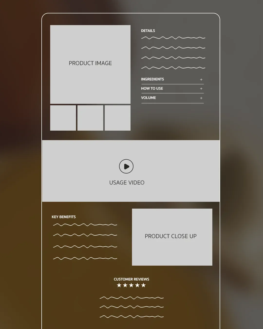
Product page wireframe for luxury skincare website design
Product Page Checklist
Use this as a working checklist when auditing or building a product page.
Clear hero image plus supporting lifestyle and texture shots
Ingredient breakdown written in brand voice, not clinical shorthand
Texture or application visual, video preferred
Price shown clearly, without discount framing
At least one trust signal visible above the fold
Reviews or proof points integrated into the page, not hidden in a separate tab
Clear, single primary call to action
Related products or routine suggestion below the fold
Designing Shopify Pages for Luxury Skincare Brands
Shopify is the right foundation for most luxury skincare brands, and the reasoning is practical rather than trend driven. It handles the operational complexity, inventory, subscriptions, international shipping, without requiring a development team on retainer, while still allowing enough customisation to avoid looking like every other store on the platform.
The trap founders fall into is using an off the shelf theme without adapting it. A default Shopify theme, even a premium one, telegraphs itself immediately to a shopper who has seen it before on another site.
For a luxury skincare brand, the Shopify build should focus on:
Custom product page templates, built around the structure above rather than the theme's default layout, which is usually designed for general ecommerce, not a considered beauty purchase.
Metafields for ingredient and routine data, so ingredient storytelling and routine pairing can be managed consistently across the catalogue without manual page building for every product.
App restraint. Every review widget, upsell popup and countdown timer app adds visual noise. Choose a small number of apps that align with brand tone, and skip the rest.
Page speed as a trust signal in itself. A slow loading site undercuts the premium impression the design is trying to build, regardless of how good that design looks.
Trust Signals That Match How Your Brand Actually Sells
Here is where a lot of skincare website advice goes wrong. Most guides treat trust signals as universal, dermatologist tested, clinically proven, lab backed. Those signals work well for a clinical, results led brand. They can actively undercut a brand built on ritual, heritage or natural formulation, where that language reads as borrowed authority rather than genuine positioning.
Trust should be built from what your brand actually is.
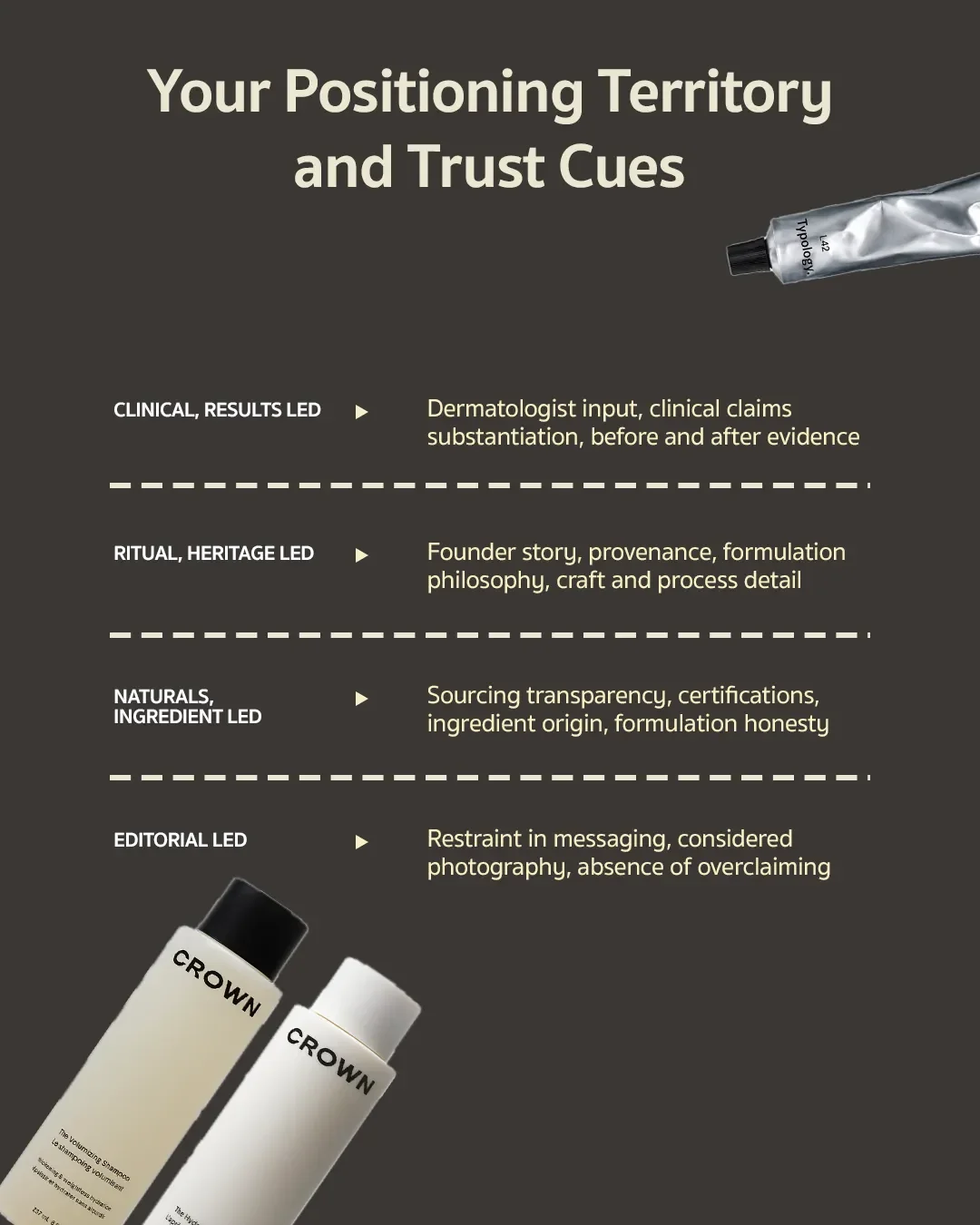
Luxury skincare product page layout for trust and conversion
The point is not to pick one and ignore the rest. Most brands sit across two of these. The point is to identify which trust signals genuinely match how you sell, and build the site around those, rather than defaulting to a generic set because it is what every skincare site seems to include.
Photography, Routine and Texture Content That Earn Trust
Skincare is a tactile, sensory category, and a website strips that away entirely unless the photography and visual content compensate for it.
The brands that convert well online tend to invest in a specific type of content that generic product photography misses:
Texture shots, showing the product's consistency, whether it is a rich balm or a lightweight serum, communicate more about quality in a single frame than a paragraph of copy could.
Routine sequencing, showing how a product fits into a broader ritual, morning or evening, layered with other products, gives shoppers a reason to buy more than one item and reinforces that this is a considered system rather than a single purchase.
Honest before and after content, where relevant to the category, builds credibility precisely because it avoids the overly polished, clearly staged imagery that seasoned online shoppers have learned to distrust.
Stock feeling photography, generic hands, generic bathroom counters, is one of the fastest ways to undercut a luxury positioning that the rest of the site has worked hard to build.
Reviews and Social Proof Without Undermining Luxury Positioning
Reviews matter enormously for skincare, arguably more than most categories, because shoppers are trusting a product with their skin. The challenge is that most review widgets are built for volume ecommerce, and they look it, yellow stars, generic layout, review count badges that feel more Amazon than Aesop.
A few approaches keep proof on brand:
Curate rather than display everything. A handful of well chosen, specific reviews, ones that mention texture, scent, results, do more work than a wall of star ratings.
Style the review section to match the rest of the site rather than leaving the plugin's default appearance untouched. This is often a small design investment with a disproportionate return.
Use founder or expert commentary alongside customer reviews, particularly for a heritage or ritual led brand, where a founder's perspective can carry as much weight as a customer's.
Integrate proof throughout the product page rather than isolating it in a separate reviews tab that many shoppers never click.
Converting Without Leaning on Discounts
Discount led conversion tactics, percentage off banners, countdown timers, flash sale language, work against a luxury positioning almost every time. They signal that the price is negotiable, which is the opposite of what a premium brand wants a shopper to believe.
There are better levers for a luxury skincare site:
Scarcity through craft rather than urgency. Small batch language, limited edition formulations, or seasonal releases create genuine reasons to act without implying the price is inflated to begin with.
Bundling as curation, not as a discount mechanism. A considered routine bundle, framed as an edited selection rather than a bulk deal, maintains positioning while still increasing order value.
Loyalty and repeat purchase incentives, rather than first purchase discounts, reward the customers most likely to become long term advocates without training new shoppers to wait for a sale.
Clear value communication on the product page itself, so the price feels justified by what surrounds it rather than needing to be softened by a markdown.
How Your Website and Packaging Stay Consistent
A shopper's experience of your brand does not end at checkout, and the website's job is not finished once the order is placed. The strongest luxury skincare brands treat the entire path, from first homepage visit to the moment the box is opened, as a single continuous experience.
Website to Unboxing Map
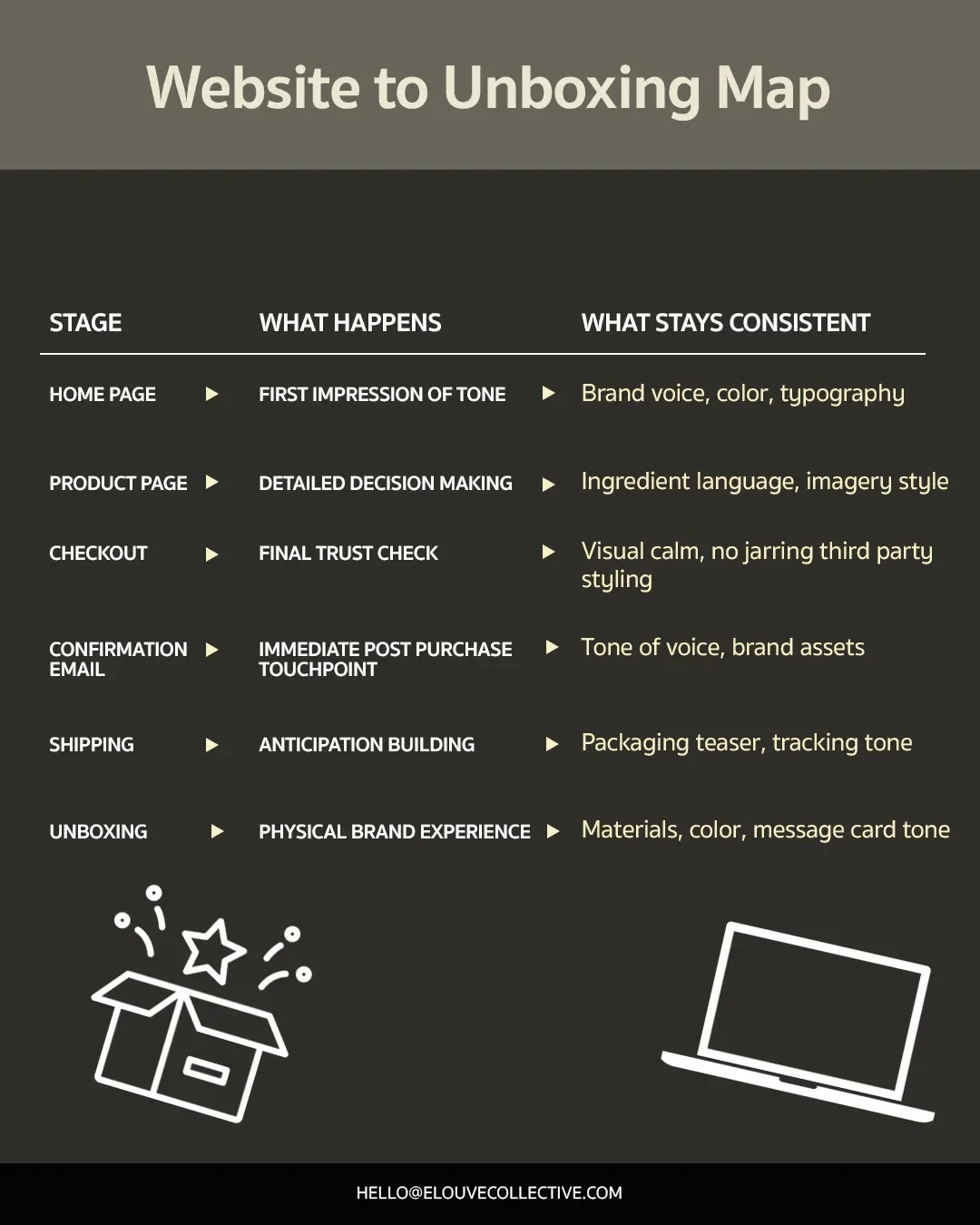
Skincare website and packaging brand consistency map
When these stages feel disconnected, a plain shipping box after a beautifully designed site, a generic confirmation email after considered product copy, it quietly erodes the trust the website worked to build. Consistency across this whole map is often what separates a brand that feels genuinely luxury from one that simply looks it online.
FAQs: Luxury Skincare Website Design
What should a skincare website include?
At minimum, a homepage that establishes brand tone quickly, product pages built to answer buyer hesitation, a brand story page, integrated reviews and proof, a considered checkout, and post purchase communication that extends the brand experience.
How do skincare product pages build trust?
Through a combination of honest imagery, texture and application content, ingredient storytelling written in brand voice, clear pricing presentation, and trust signals matched to the brand's actual positioning rather than generic claims.
How should luxury skincare brands design Shopify pages?
By moving away from default theme layouts, building custom product page templates around the buyer's decision process, using metafields for consistent ingredient and routine data, and keeping app usage restrained to protect page speed and visual clarity.
How do website and packaging stay consistent?
By treating the entire journey, homepage through unboxing, as one continuous brand experience, carrying voice, colour and material language across every touchpoint including checkout, confirmation emails and shipping.
What should appear above the fold on a skincare product page?
Product name, clear product image, benefit-led description, price, primary CTA and at least one credible trust signal.
Building the skincare website Once, Getting It Right
A luxury skincare website is not a single project with a finish line. It is a system, homepage, product pages, checkout, packaging, that either reinforces trust at every step or quietly undermines it. Founders who treat these as separate workstreams tend to end up with a site that looks premium in isolation but does not convert consistently.
Getting this right the first time, with brand tone, page structure and packaging consistency built together rather than patched together later, saves the cost of rebuilding it in eighteen months.
Design a skincare website and brand system that feels premium from first click to unboxing. Book a discovery call with Elouve or email us directly at hello@elouvecollective.com
