
Luxury Beauty Packaging Examples and What Founders Should Learn From Them
Quick Answer: What are the Luxury Beauty Packaging Examples
Luxury beauty packaging feels premium when positioning, form, typography, colour, materials and detail reinforce one clear brand idea. The strongest examples are not luxurious because they use the same visual codes; they are luxurious because each brand applies a distinctive system consistently. Founders should study the principle behind an example, not copy its surface aesthetic.
Luxury packaging is not simply about gold foil, heavy boxes, neutral palettes or minimalist type. Those are surface choices. What actually makes packaging feel luxurious is the relationship between brand positioning, material, typography, colour, form, proportion and detail. Remove any one of those and the "luxury" reads as decoration rather than substance.
Before we get into examples, one note on how to use them. These brands are cited as public reference points only, to illustrate a principle. They are not templates. A brand with Chanel's heritage or Aesop's category dominance can afford codes that would look borrowed, rather than owned, on a younger label. At Elouvé Collective, we treat every one of these examples the same way we'd want a client to treat them: as a study of why something works, not a moodboard to copy from.
What Makes Beauty Packaging Feel Luxurious?
Premium perception comes from a system of decisions working together rather than any single "luxury" ingredient. The brands worth studying below all do one thing distinctly well, and that distinction is what gives them shelf presence, recognition and desirability.
10 Luxury Beauty Packaging Examples Worth Studying
Aesop: When Consistency Becomes a Luxury Asset
Aesop's amber bottles, restrained sans serif labels and near identical presentation across its entire range are instantly recognisable, even without a logo in view. The brand has resisted the urge to redesign for the sake of novelty.
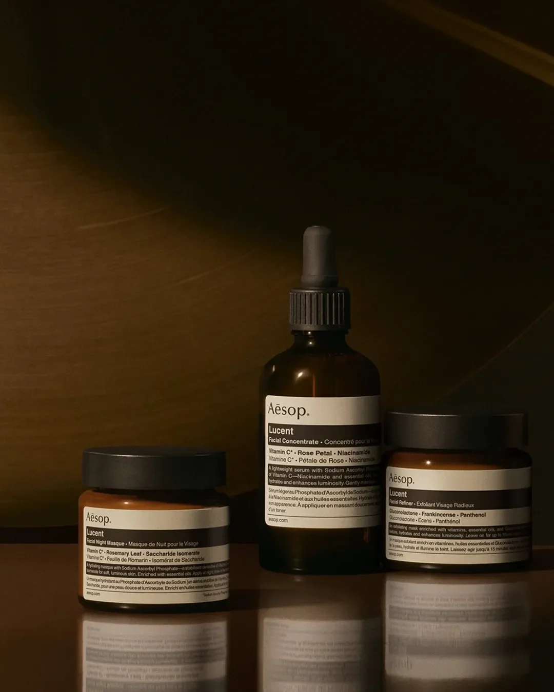
Subdued lighting and clinical labeling used to create an editorial, premium atmosphere for Aesop
Founder takeaway: Visual consistency, repeated relentlessly, can become more valuable than decoration. A system customers recognise at a glance is worth more than a package that impresses once.
Le Labo: When Imperfection Feels Personal
Le Labo's apothecary style labels, deliberately utilitarian bottles and handwritten batch details make each product feel individually prepared rather than mass produced.
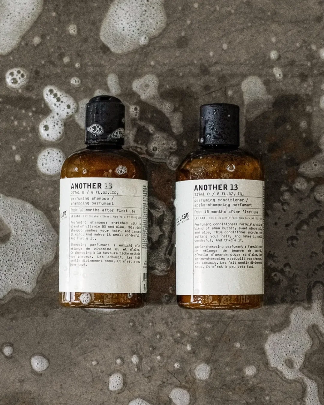
Le Labo packaging, apothecary-style product packaging leveraging clean, text-forward typography
Founder takeaway: Luxury does not have to look polished or conventional. A considered "unfinished" aesthetic can read as more authentic and more premium than a flawless one.
Augustinus Bader: When Science Becomes Sophisticated
The clinical blue and white palette, precise typography and pharmaceutical references position the brand as rigorous rather than indulgent, and that rigour itself becomes the luxury cue.
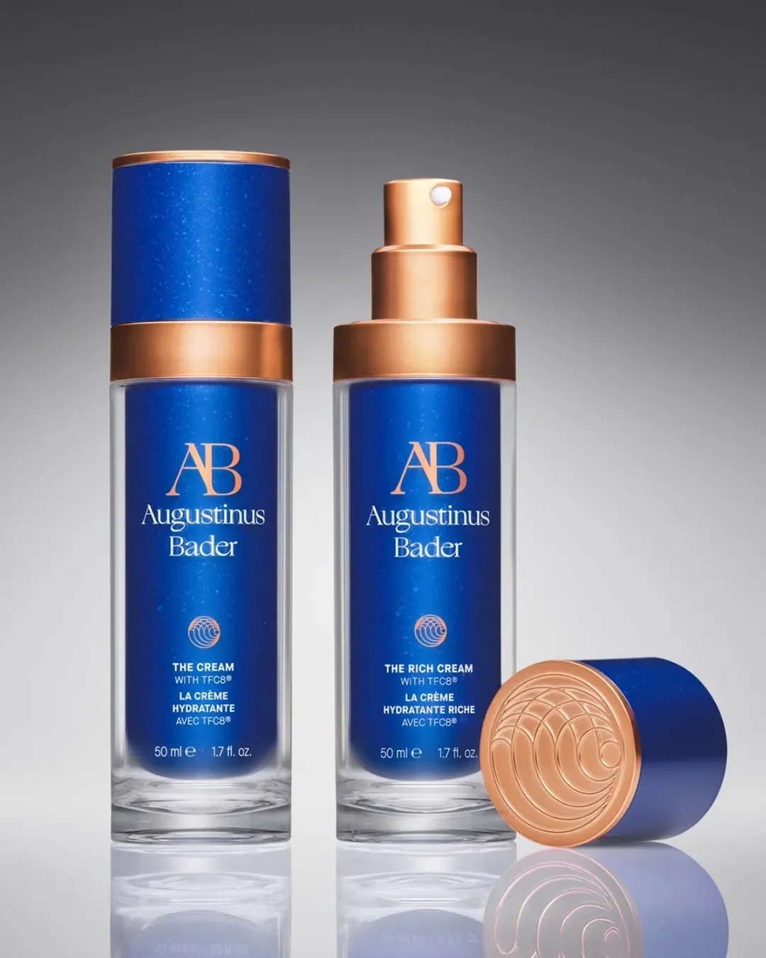
Augustinus Bader packaging, High-contrast metallic finishes used to signal scientific authority and luxury value.
Founder takeaway: A science led beauty brand can feel premium without borrowing traditional luxury codes at all. Precision can be its own form of prestige.
Crown Affair: When Packaging Creates a Beautiful Everyday Experience
Soft, muted colour palettes, tactile finishes and editorial photography turn haircare, a category not typically associated with luxury, into something that feels considered and desirable.
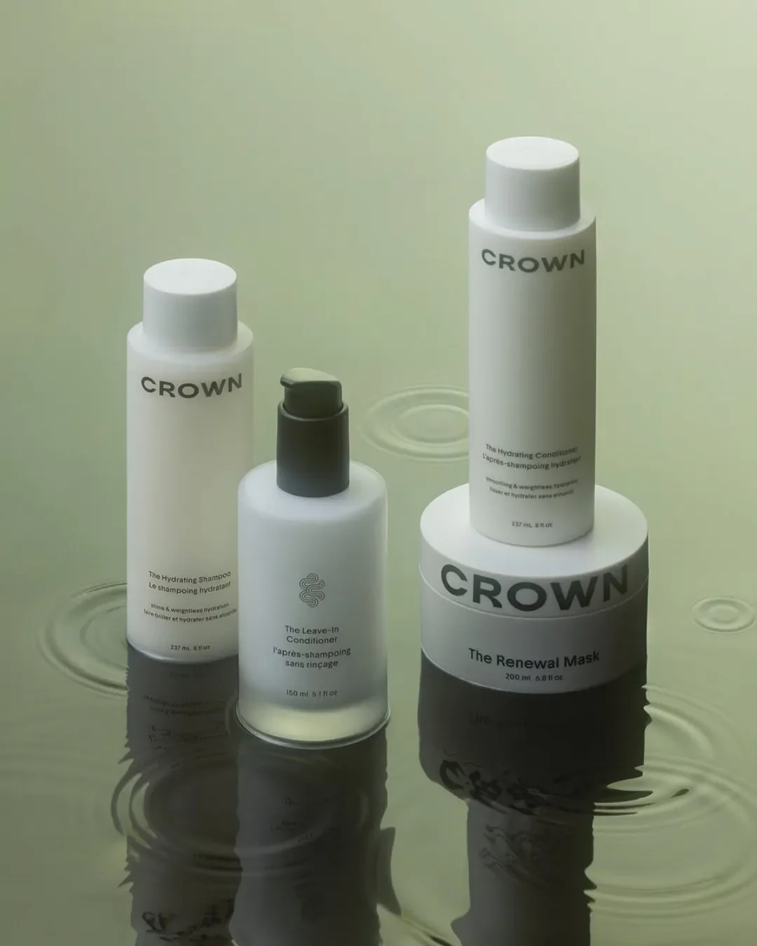
Crown Affair packaging, using clean shapes and serene environments to communicate a ritual-based brand position.
Founder takeaway: Luxury can come from elevating an everyday category rather than only from expensive materials. Consideration is visible, and customers notice it.
Chanel Beauty: When Packaging Becomes an Icon
Black, white and gold codes, distinctive silhouettes and a highly defined color system for each range make Chanel's packaging recognisable from across a room.
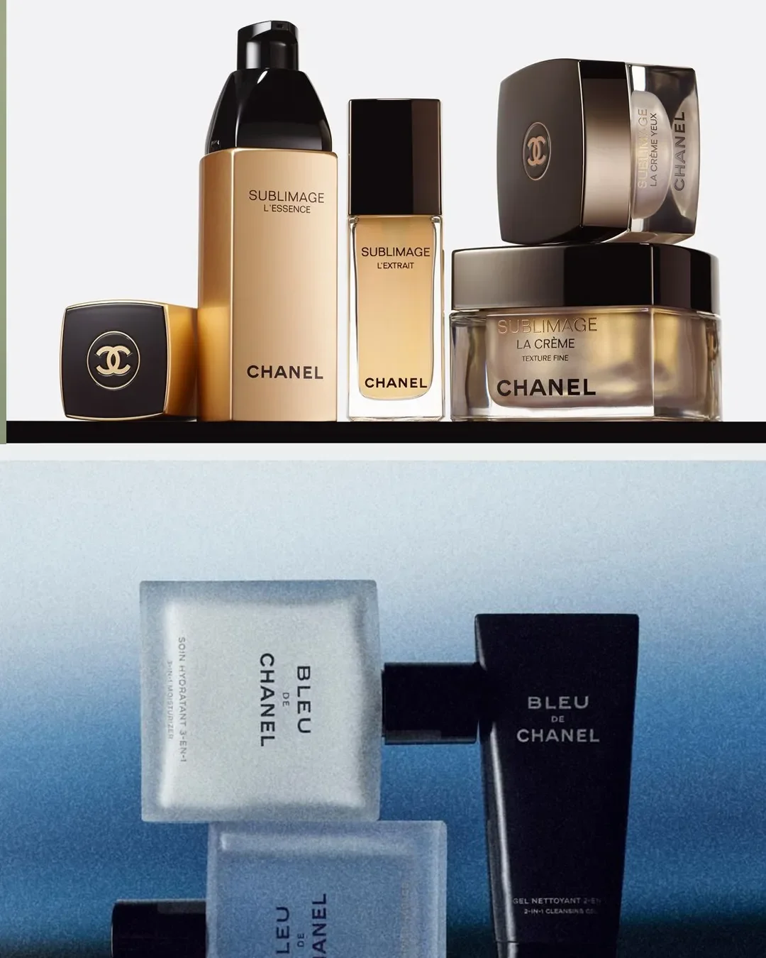
Chanel Beauty packaging: contrasting warm metallics with stark architectural shapes to segment product collections.
Founder takeaway: Strong, disciplined brand codes allow packaging to become instantly identifiable, which builds recall and desire long before a customer reads a single word.
Hermès Beauty: When Packaging Becomes Collectible
Distinctive forms, saturated colour and a clear visual link to the wider Hermès world turn beauty products into objects customers want to keep on display.
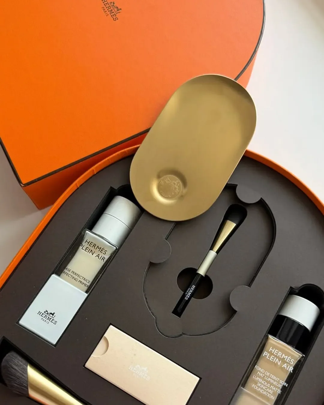
Hermes beauty premium unboxing experiences built around structural hierarchy and signature brand colors.
Founder takeaway: Packaging can create desirability beyond the product itself. When a package becomes worth keeping, the brand extends well past the point of purchase.
Gucci Beauty: When Packaging Builds a Complete World
Decorative motifs, vintage references and a maximalist visual language build an entire aesthetic universe around the product.
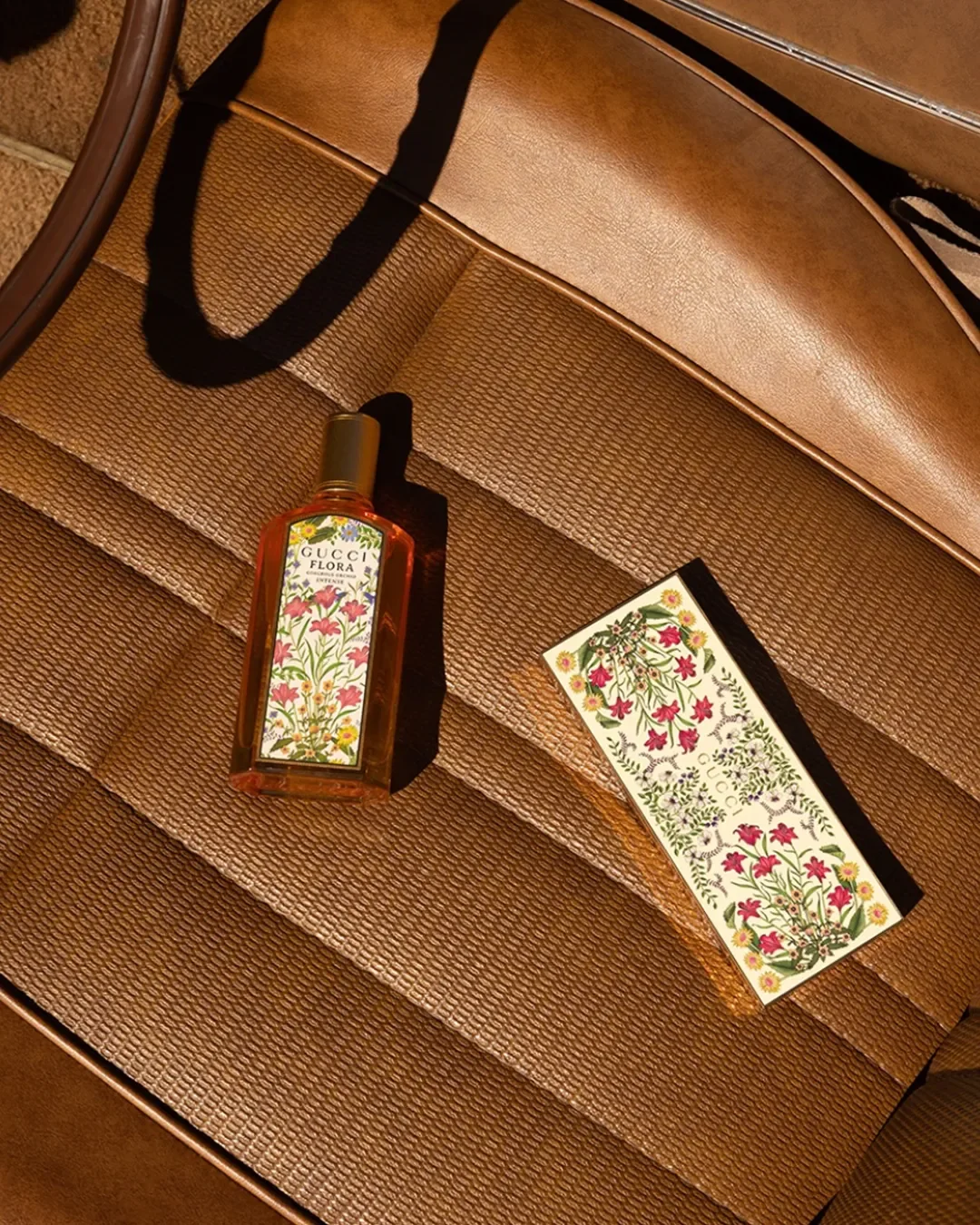
Gucci Beauty Packaging: Maximalist packaging design using intricate botanical illustrations to establish identity
Founder takeaway: Luxury does not have to mean minimal. A strong, specific point of view can be just as premium as restraint, sometimes more so.
Byredo: When Simplicity Creates Recognition
Restrained bottle shapes, a distinctive typeface and a highly consistent graphic system give Byredo a quiet but immediate recognisability.
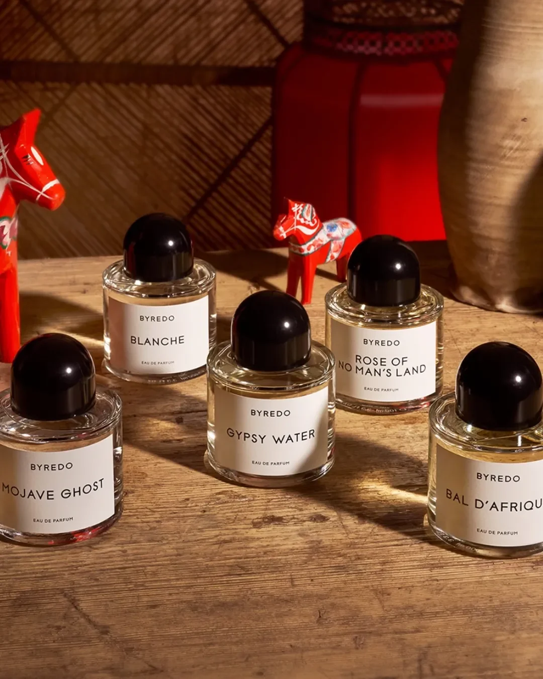
Byredo Packaging: Cohesive structural design allowing varied product names to sit under one unified brand world.
Founder takeaway: Simple packaging can feel highly premium when the underlying identity behind it is strong and applied without deviation.
Fenty Beauty: When Premium Does Not Mean Traditional
Sculptural forms, unusual geometry and a distinctive visual identity give Fenty a premium feel built on innovation rather than heritage.
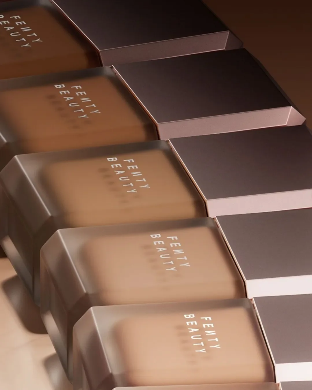
Fenty beauty packaging: Inclusive shade ranges highlighted through uniform, frosted geometric packaging.
Founder takeaway: A modern luxury beauty brand can create premium perception through newness rather than legacy cues. You do not need decades of history to feel high value.
Rare Beauty: When Form Becomes Part of the Experience
Distinctive silhouettes, glass surfaces with metallic finish closures and thoughtful usability mean the packaging performs as well as it looks.
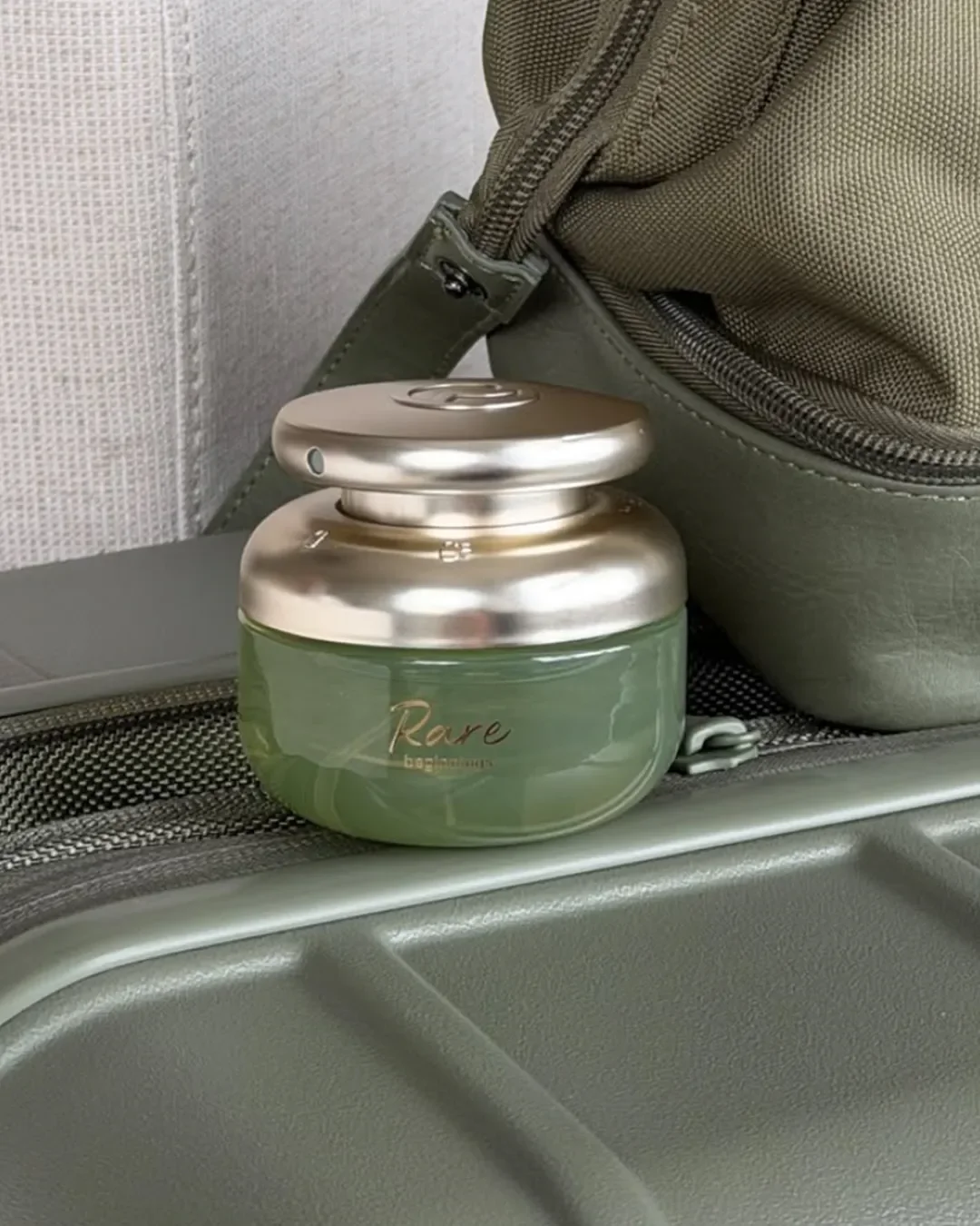
Rare Beauty Packaging: Minimalist luxury skincare packaging
Founder takeaway: Glass and metallic combinations done right make a premium impression. A product that feels good in the hand reinforces the promise on the label.
Example Table: Approach, Principle and Takeaway
| Brand | Core Approach | Underlying Principle | Founder Takeaway |
|---|---|---|---|
| Aesop | Restrained, repeated system | Consistency | Repetition builds recognition |
| Le Labo | Utilitarian, apothecary styling | Authenticity | Imperfection can feel personal |
| Augustinus Bader | Clinical, precise palette | Credibility | Rigour can be a luxury cue |
| Crown Affair | Soft, editorial presentation | Everyday elevation | Consideration is visible |
| Chanel Beauty | Disciplined black, white, gold codes | Brand codes | Recognisability drives recall |
| Hermès Beauty | Distinctive, collectible forms | Object desirability | Keep worthy packaging extends the brand |
| Gucci Beauty | Maximalist, decorative world | Point of view | A strong stance can be premium |
| Byredo | Restrained graphic system | Simplicity | Identity strength, not decoration |
| Fenty Beauty | Sculptural, unusual geometry | Innovation | Newness can replace heritage |
| Rare Beauty | Sculptural, custom closures | Usability | Function shapes perceived value |
What These Luxury Beauty Packaging Examples Have in Common
Ten different brands, ten different aesthetics, and yet a handful of the same principles keep resurfacing.
Strong visual codes applied without exception
Intentional typography rather than a default serif or sans serif choice
Controlled colour, used deliberately rather than decoratively
Distinctive forms that hold up even without a logo
Thoughtful material choices matched to positioning
Consistent packaging systems across the full range
A clear, legible relationship between packaging and positioning
None of these principles depend on budget. They depend on discipline. To dive deeper into the core principles of material, proportion, and aesthetic harmony, explore our guide on what makes packaging feel luxury.
Luxury Packaging Is Not About Making Your Product Look Expensive
This is where most founders go wrong, and it's worth being direct about it. Gold foil, black boxes, a serif logotype and heavy stock are not luxury signals on their own. They are shortcuts, and shortcuts borrowed without a brand strategy behind them tend to make a product look generic rather than premium. Customers, especially in beauty, are fluent in these visual cues. They can tell when a code is worn without being earned.
Real premium perception starts with positioning, not finish. The finish should express a decision that was already made about who the brand is, not compensate for a decision that was never made at all.
How to Choose a Luxury Packaging Direction for Your Beauty Brand
The most common trap here is collecting Pinterest references without a filter. A moodboard is not a strategy. Before choosing a direction, a founder needs clarity on:
Positioning: what space the brand occupies relative to competitors
Audience: who the packaging needs to signal value to, specifically
Category: what codes exist in that category, and which ones are worth breaking
Price point: what the packaging needs to justify at the point of sale
Desired perception: how the brand wants to be remembered after the product is used
At Elouvé Collective, this is the stage we spend the most time on with clients, before a single mockup is produced and as a specialized skincare branding agency, skipping it is the single biggest reason packaging projects end up looking like everything else on the shelf.
What Should You Prioritise When Your Packaging Budget Is Limited?
Not every founder is working with a Hermès level budget, and that's fine. What matters is prioritising the elements customers actually notice and touch:
Packaging structure, since form is felt before anything else is read
Typography, since it carries tone even before colour registers
Colour, applied with restraint rather than variety
Materials, chosen for how they feel as much as how they photograph
Print quality, since a cheap finish undercuts every other decision
Finishes, kept consistent rather than layered on for effect
Consistency, which costs nothing extra and does the most work
Where founders can simplify is secondary packaging and unboxing extras. Where they should never simplify is the primary structure and print quality, because that is what the customer is holding.
Your Packaging Should Work as a System, Not Just a Hero Product
One beautiful bottle is not a brand. The packaging direction needs to extend across labels, cartons, secondary packaging, shipping materials and the wider unboxing experience. A hero SKU that looks premium next to a carton or mailer that looks like an afterthought tells the customer the brand's attention has limits. Systems thinking, not single product design, is what separates a genuinely premium brand from one with a nice bottle.
7 Questions to Ask Before Designing Your Beauty Packaging
What does our positioning actually require the packaging to communicate?
What visually differentiates us from the three brands we compete with most directly?
Does this design hold shelf presence at a distance, not just up close?
What will a customer conclude about our value the moment they pick this up?
Is the packaging genuinely usable, not just photogenic?
Can this direction scale across a full range without losing coherence?
Are we applying this consistently enough that it becomes recognisable over time?
FAQs: Luxury Beauty Packaging Examples
What are examples of luxury beauty packaging?
Aesop, Le Labo, Augustinus Bader, Crown Affair, Chanel Beauty, Hermès Beauty, Gucci Beauty, Byredo, Fenty Beauty and Rare Beauty each represent a different, well executed approach to premium packaging, from restrained consistency to maximalist world building.
What makes beauty packaging look premium?
Premium perception comes from the relationship between brand positioning, material, typography, colour, form and consistency, not from any single visual cue like gold foil or heavy stock applied on its own.
What should founders learn from luxury packaging?
Founders should learn to connect packaging decisions to a clear brand strategy first, prioritise the elements customers actually notice and touch, and apply their chosen direction consistently across the full range rather than treating one hero product as the whole system.
What should founders avoid copying from luxury beauty packaging?
Avoid copying isolated luxury cues—foil, serif type, black-and-white palettes or heavy boxes—without the positioning that makes those choices credible.
The Best Luxury Beauty Packaging Does More Than Look Premium
The goal was never to make packaging look expensive for its own sake. The goal is to make the right customer understand, immediately, the value, personality and world of the brand. That's a strategy problem before it's a design problem, and it's the reason packaging decisions made in isolation from positioning rarely hold up.
If you're a founder trying to translate your brand's positioning into a packaging system that actually earns its premium perception, that's the work we do at Elouvé Collective.
Want a packaging system that earns premium perception instead of borrowing luxury cues? Explore Elouvé’s packaging work or start a project.
