
Wellness packaging must feel credible enough to earn trust, calm enough to fit the category and distinctive enough to be noticed. That balance comes from disciplined hierarchy, restrained claims, purposeful colour and materials that support the brand promise.
Wellness founders ask packaging to do three things that pull in different directions. It has to look calm, because the brand promises ease. It has to look credible, because people are deciding whether to put the product in or on their body. And it has to get picked up, on a crowded shelf or as a small square on a phone screen.
The short answer is to decide the reading order first. Choose what a customer should learn first, second and third, then let colour, type, materials and finish support that order. This guide covers how to build that hierarchy, which trust cues to use, where calm helps and where it hurts, and how packaging changes for supplements, topical products and ritual products.
What Wellness Packaging Design Needs to Do
Wellness packaging has four jobs on one small surface. It states the promise, earns trust, creates calm and stands out. Wellness brands feel the tension more than most beauty categories because the buyer is making a health decision as well as a style choice. A lipstick can lean on colour and mood. A magnesium powder or a daily capsule has to answer questions about safety and results before anyone is charmed by the look.
Positioning comes first. If yours is still loose, start with our guide to wellness brand positioning, then return here. This post picks up once the positioning exists and has to become a physical object someone can hold.
Three questions run through every wellness pack, and they make a useful framework.
| Pillar | The customer's question | What packaging controls |
|---|---|---|
| Credibility | Can I trust this? | Claims wording, ingredient clarity, proof placement, typography, regulatory information |
| Calm | Does this suit my routine? | Colour, white space, type weight, finish, form |
| Shelf presence | Will I notice it? | Contrast, one recognisable asset, silhouette, thumbnail clarity |
Each pillar can undermine the others. Too much proof crowds out calm. Too much calm hides the proof. Too much quiet loses the sale. Good packaging sets a priority for each one and holds it across the whole range.
How should a wellness brand design packaging?
Start from the positioning and work in this order:
Write the one sentence the pack must communicate in three seconds.
Set the hierarchy: brand name, product role, key benefit, proof.
Choose trust cues that suit the product type and every market you sell in.
Build calm through colour, space and finish, and keep one asset that is easy to recognise.
Test the front at arm's length and as a thumbnail before anything goes to print.
How to Turn Wellness Positioning Into a Packaging Hierarchy
Hierarchy is the order in which information gets read. Most wellness packs have four levels. Level one is the brand name, which gives recognition. Level two is the product role, a plain description of what the product is, such as evening magnesium powder or barrier repair balm. Level three is the key benefit, one outcome in a few words. Level four is proof, such as ingredients, testing or certifications. A customer should find all four, and find them in that order.
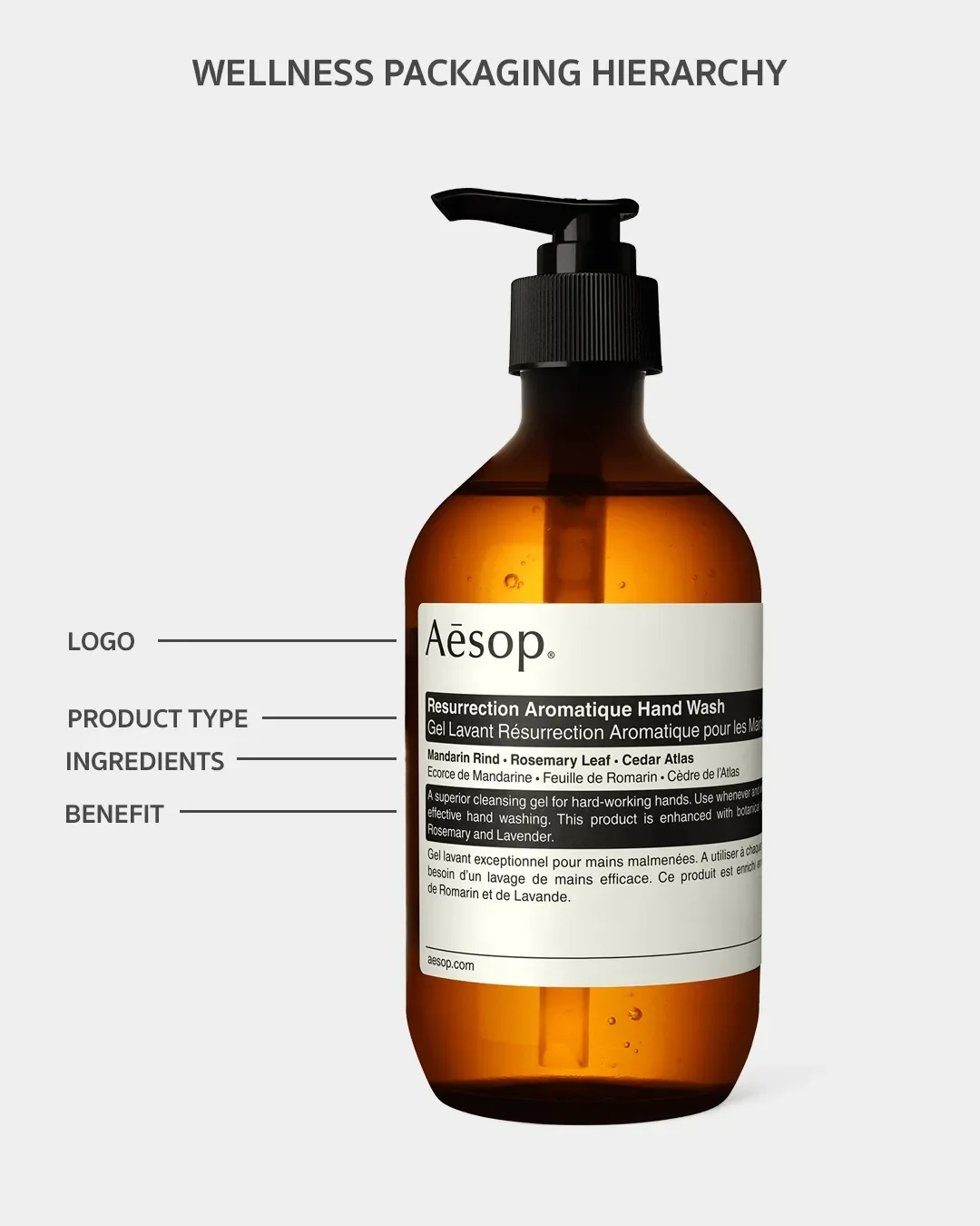
Every positioning idea leads to a different set of packaging decisions.
| Positioning idea | Packaging decision |
|---|---|
| Gentle, low effort routine | Short benefit line, generous space around the name, soft contrast between type and background |
| Evidence led | Specific ingredient names and amounts at level four, a clear sans serif for data, restrained use of icons |
| Daily ritual | Consistent format across the range, a closure or texture people enjoy handling, refill or reuse built into the system |
| Natural and botanical | Honest ingredient listing, one botanical cue used with purpose, uncoated or textured stock |
| Premium and considered | Fewer elements, better materials, one finish used with care |
Trust Cues That Build Credibility on Wellness Packaging
What makes wellness packaging trustworthy?
Wellness packaging looks trustworthy when it is specific, legible and consistent. Customers trust a pack that names its ingredients, says what the product does in plain words and puts the facts where they expect to find them. The cues that do most of the work are:
Specific ingredient names and amounts in place of vague phrases like 'natural blend'
A plain product role on the front
Type with enough size and contrast to read the facts
Certifications that are earned, relevant to your audience and placed where they can be read
A consistent layout across the range, so each new product feels like the same company
Usage guidance, batch information and contact details that are easy to find
Clinical cues and lifestyle cues
Clinical cues include white backgrounds, sans serif data, icons, dosage tables and lab style imagery. Lifestyle cues include warm colour, texture, photography and softer type. A pack that is too clinical feels cold and medical. A pack that is too lifestyle driven can feel like it is avoiding saying what is inside.
Match the mix to the product. Supplements usually lean clinical on the back and lifestyle on the front. Ritual products lean lifestyle with one clear fact. Topical products sit in the middle. Cues that weaken trust include medical styling without evidence behind it, vague claims and overused botanical imagery that could belong to any brand.
Claims caution
Health and wellness claims are regulated differently across markets, and supplements are treated differently from skincare. The rules in the US, the UK and Australia differ on what can be said about benefits and what must appear on pack. Words such as supports, relieves and clinically proven carry different weight depending on where you sell. Design cannot make an unsupported claim safe, so artwork should be built from claims that a regulatory or legal specialist has approved for each selling market. This is general guidance, so confirm your wording with a qualified adviser before artwork is final.
How to Create Calm and Still Stand Out on the Shelf
How do you balance calm design with shelf visibility?
Keep the overall pack quiet and give it one thing that is easy to recognise. That could be a colour, a shape, a typographic treatment or the container itself. Everything else can stay restrained.
Calm comes from limiting what the pack shows. Use fewer colours, fewer type sizes and more space around the name. Shelf presence comes from contrast and recognition. A soft palette works when it differs from the products around it, so photograph the category shelf or the top search results before choosing colour. If every neighbour is pale sage, a soft clay or deep ink tone will be seen first and still feel calm.
Four levers do most of the work:
Colour: choose a tone the category has not claimed, then check how it prints and photographs
White space: use it around the name and benefit, and keep it out of the proof
Type weight: a slightly heavier name holds the shelf, and lighter supporting text keeps the mood
Finish: matte reads calm, and one tactile or glossy detail gives the eye a place to land
Accessibility
Low contrast and tiny type are the usual price of calm design, and they exclude real customers. Aim for strong contrast between text and background. A ratio of at least 4.5 to 1 for small text is a standard from web accessibility guidelines and a useful benchmark on pack. Keep dosage and usage directions at a readable size, and avoid pale type on pale stock or foil. Think about closures too: an easy open cap helps people with limited grip, and distinct colours or shapes help people with low vision tell similar products apart.
The ecommerce thumbnail
Most wellness brands sell largely online, where the pack appears as a small square beside competitors. Shrink the front to about 200 pixels wide and check that the name and product role still read. Fine detail, pale type and tiny benefit lines disappear at that size. A recognisable silhouette and a strong name help the pack hold up, and a clean front facing image on a plain background keeps marketplace listings consistent.
Why Generic Minimalism Weakens Wellness Packaging
Wellness has a recognisable default: a pale background, a small sans serif name, a lot of empty space and a sprig or a leaf. It looks good on a mood board. Put ten of them on a shelf and customers cannot tell the products apart or judge which one is better made.
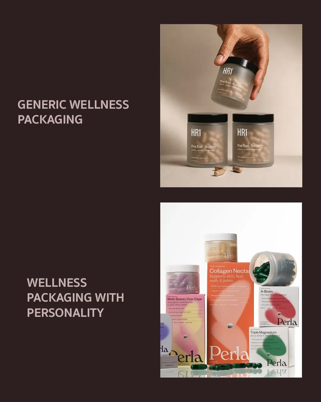
How can wellness packaging feel premium without looking generic?
Premium comes from decisions that can be seen and felt: a considered typeface, a distinctive colour, a confident layout and good materials. Keep the restraint and add a point of view. Pick one element to be unmistakably yours, such as a custom wordmark, an unexpected colour, a label shape or a container people keep and reuse. Then let everything around it stay quiet.
Wellness Packaging Design Mistakes
The mistakes below show up often in wellness packaging and are all fixable.
| Mistake | What the customer reads | Fix |
|---|---|---|
| Pale type on pale stock | Hard to read, maybe hiding something | Raise contrast and test in daylight and as a thumbnail |
| Identical layouts for every product | Cannot tell variants apart | Keep one system and vary colour or a code for each product |
| Too many badges and claims | Overselling, less credible | Keep the proof that matters and move the rest to the back |
| Generic botanical illustration | Could be any brand | Use one ownable asset |
| Medical styling without evidence | Overpromising | Match clinical cues to the proof you hold |
| Sustainability claims without detail | Greenwashing | Name the materials and say how to dispose of them |
| Beautiful front, neglected back | Trust drops when the customer picks it up | Design the back panel as part of the system |
Materials, Finishes and Physical Experience
Customers decide a lot with their hands. Weight, texture, sound and the way a pack opens all signal how much care went into the product.
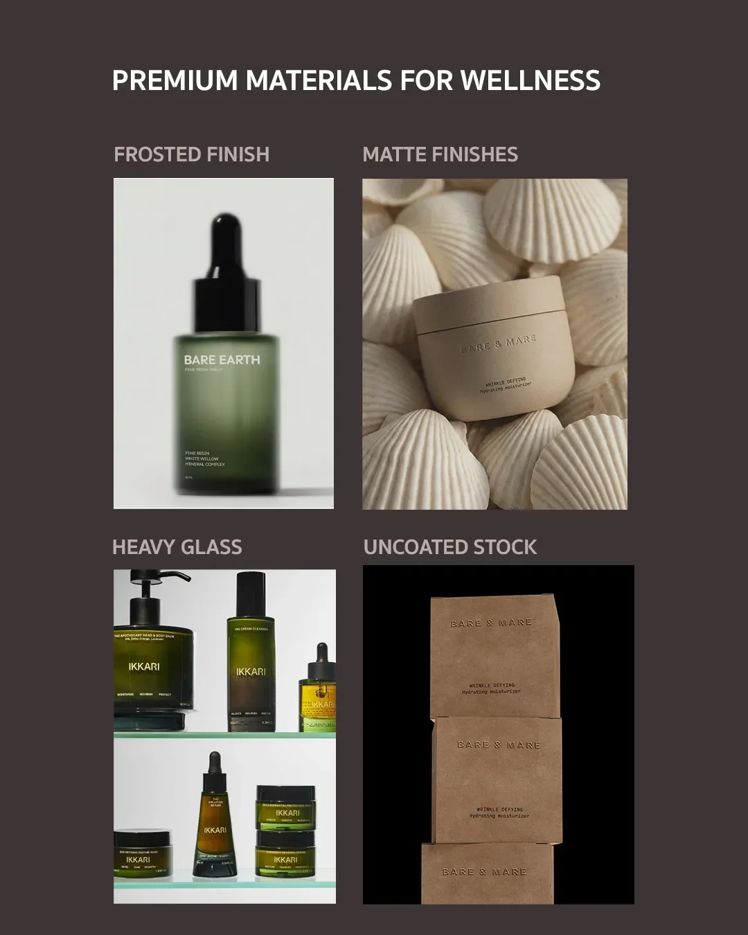
Weight: a heavy glass jar suggests quality, and it also adds shipping cost and carbon, so choose it when the product justifies it
Texture: uncoated stock reads natural, soft touch lamination reads smooth and calm but marks easily, and a deboss adds quiet emphasis without ink
Foil and shine: small amounts work, and large areas fight the calm
Closures: the click of a magnetic cap or the resistance of a screw thread becomes part of the daily routine
Unboxing: plan the order in which a customer meets the outer carton, the product and the instructions
Sustainability cues need to be believable. Name the material, say what can be recycled, refilled or reused, and check recyclability against local collection rules before printing a symbol. Vague phrases such as green or planet friendly invite doubt. For a closer look at foil, embossing, debossing and spot UV, read our guide to choosing premium packaging finishes.
Wellness Brand Packaging Examples
Three brands show hierarchy, trust and physical experience working together. Packaging changes over time, so check current versions before using any of them as a reference.
Ritual
Ritual sells multivitamins in a clear glass bottle with a magnetic cap, and the capsules are visible through the bottle. A single yellow runs across packaging, website and social channels, and the brand publishes where its ingredients come from. Takeaway: show the product and give specific information to build trust.
Seed
Seed ships its DS-01 synbiotic in a reusable green glass jar, with compostable refill pouches after the first order. The pack works as a system, and the jar becomes an object people keep on the counter. Takeaway: the physical experience can carry the sustainability story without extra claims on the front.
Aesop
Aesop uses amber glass bottles and text led labels across a large range. The look is calm, and the consistent typographic system makes each product recognisable at once. Takeaway: one visual system can hold a whole range together.
Signs your wellness brand needs outside help
Signs your brand is ready for outside help:
The positioning is set and the packaging does not yet reflect it
You are moving from one product to a range
You are entering retail or a new market
Your packs feel inconsistent from one product to the next
Customers ask what the product does, even after reading the pack
Bring your positioning, product list, approved claims, target markets, sales channels, current packaging and any production constraints to a first conversation. The result is a packaging system with a clear hierarchy, trust cues suited to each product type, a distinctive identity and artwork that holds across the range.
Wellness Packaging Design FAQs
What colours work best for wellness packaging?
No single colour works best. Soft neutrals, muted greens and warm earth tones are common, which is why contrast matters. Choose a tone your category has not claimed, then check legibility in print and on screen.
How much information should go on wellness packaging?
Keep the front to the name, the product role and one benefit. Put required information, usage directions and proof on the back and sides, set in the same type system as the front.
Is supplement packaging different from skincare packaging?
Yes. Supplements need space for serving size, supplement facts and warnings, while skincare needs room for ingredient lists and usage guidance. Claims rules also differ between the two, so each needs its own review.
When should a wellness brand hire a branding agency?
The right time is usually once the positioning is set and the brand is moving to a range, a retail launch or a new market, or when packs across the range look inconsistent.
How should a wellness brand design packaging?
Start with the product formula, target audience, and brand positioning. Choose materials, formats, and visual elements that protect the product, communicate its benefits, and fit naturally into the customer's routine.
How can wellness packaging feel premium without looking generic?
Use distinctive typography, thoughtful material choices, and one recognisable visual element. Premium packaging comes from purposeful design and consistency, not simply beige colours or minimalist layouts.
What makes wellness packaging trustworthy?
Clear ingredient information, credible claims, readable labels, and appropriate regulatory details help customers make informed decisions. Every design choice should support the product's actual benefits and evidence.
How do you balance calm design with shelf visibility?
Keep the layout uncluttered, then use contrast, distinctive typography, and a recognisable brand element to stand out. Calm packaging can still be easy to spot and recognise on a crowded shelf.
Work With a Wellness Packaging Design Studio
Elouvé Collective is a luxury branding and packaging design studio with a presence in London, Sydney and Miami, working with wellness, beauty and lifestyle founders. A wellness branding agency should start with your positioning and your claims, then design the pack around them.
If you want to ground your identity seamlessly, collaborating with a specialized luxury branding agency will protect your premium visual strategy.
If you want packaging that feels calm, reads as credible and gets noticed, get in touch with Elouvé Collective to create a distinctive wellness packaging system.
