
Foil adds metallic or pigmented shine, embossing raises a surface, debossing presses it inward and spot UV adds selective gloss or texture. The right finish depends on the material, artwork scale, desired effect, budget and manufacturer capability.
Your printer sends over a finish list that runs to a dozen options, and every one of them looks good on a sample card. Foil on the logo, emboss on the pattern, spot UV on the border, soft touch on everything else. Put them all on one box and the pack looks expensive in the wrong way: busy, heavy and hard to read.
This guide shows luxury brand founders how to choose premium packaging finishes in a clear order of priority. You will learn what each finish does, how to decide which one leads, how to combine finishes, and what to check in production before you approve anything.
A Finish Is a Brand Decision Before It Becomes a Production Decision
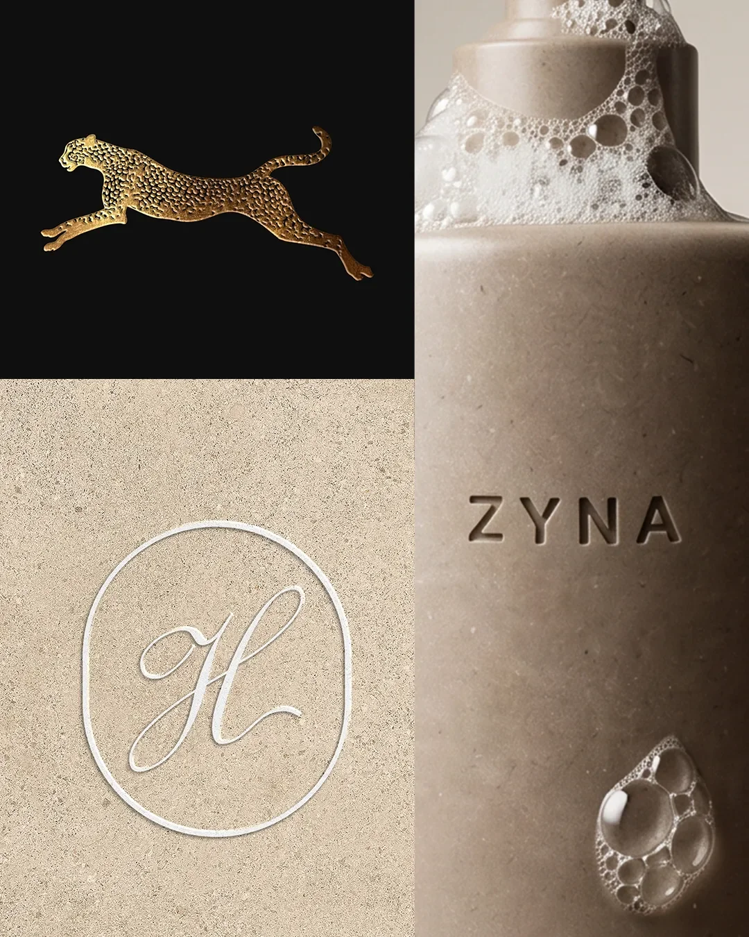
A customer reads a finish before they read your name. The weight of a foil mark, the depth of a deboss, a patch of gloss against a matte surface: each one tells them which category you belong to and how much care went into the product.
Every pack gets one moment of attention. A hand lifts the box, a thumb finds an edge, the eye settles on a single spot. The finish you place on that spot decides what the customer remembers, and everything else on the pack either supports it or competes with it.
That is why this guide treats finishes as a hierarchy. One hero finish, one supporting finish at most, and plain surfaces everywhere else. The plain areas are what make the hero finish look deliberate.
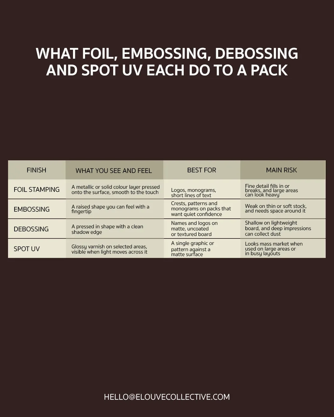
What Foil, Embossing, Debossing and Spot UV Each Do to a Pack
Here is the short version before we go through each finish in detail.
When Should Packaging Use Foil Stamping?
Use foil when the mark itself needs to catch the light. A logo, a monogram or a short line of text suits it best, because foil rewards solid shapes with room around them. Long paragraphs and delicate scripts are better left in ink.
The first decision is metallic or pigment foil.
Metallic foil comes in gold, silver, copper, rose gold and many finishes in between. It reflects light and changes as the box moves, so it signals ceremony and photographs well. It suits brands with a warm, classic or celebratory voice.
Pigment foil is an opaque colour with no metallic sheen, available in matte or gloss. It suits white lettering on a dark box, a precise brand colour that ink struggles to hold, and brands that want a refined surface without the shine of metal. Modern and quiet brands often find pigment foil sits better on the shelf.
Whichever you choose, test it on your actual board. Foil behaves differently on smooth, uncoated and textured surfaces, and we cover that further down.
What Is the Difference Between Embossing and Debossing?
Embossing pushes a design up from the surface. Debossing presses it down into the surface. Both use a metal die and a matching counter die, with heat and pressure, and both can be done blind, which means no ink or foil is added.
The two give different results. An embossed shape feels generous and sculptural, which makes it a good fit for crests, patterns and monograms. A debossed shape feels precise and restrained, and the shadow along its edge gives names and clean logos a calm, modern look.
Both can be paired with foil. A foil mark with a blind emboss around it is a classic combination, and a deboss with a foil fill gives a sharp, deliberate result.
Is Spot UV Suitable for Luxury Packaging?
Yes, with conditions. Spot UV is a glossy coating applied to chosen areas, usually against a matte or soft touch surface. Used sparingly, it creates a quiet effect that appears when the box tilts: a pattern, a border or a single graphic.
It stops working when it covers large areas. Gloss across a big surface loses its contrast, shows fingerprints and starts to look like a retail product rather than a considered object. Keep spot UV small, simple and set against a clearly matte background.
Light or Touch: The Simplest Way to Sort Your Options
Foil and spot UV work through light. Embossing and debossing work through touch. That single split helps you choose faster than any list of features.
On shelf, light carries the message, so foil and gloss show up under store lighting from across a room. In ecommerce photography, foil and spot UV also read well, while embossing and debossing can disappear under flat studio light unless the photographer uses a raking side light. At the unboxing, touch wins, because the customer is holding the pack and their hands notice everything.
If most of your sales happen online, make sure your hero finish reads in a photograph. If your product is sold in stores or given as a gift, give touch more weight.
Which Packaging Finishes Feel Premium?
No single finish feels premium by itself. The feeling comes from how finishes sit together and how much plain surface surrounds them.
This is where tactile hierarchy helps. It is the order in which a hand discovers a pack:
The base surface is felt first. Uncoated stock, linen texture or a soft touch laminate sets the tone.
The hero impression comes next. A deboss or emboss gives the fingertip something to find.
The detail arrives last. A fine foil line or a spot UV pattern rewards a closer look.
Design each layer to reward the one before it. The combinations that most reliably feel premium in the hand are a clean deboss on thick board, a blind emboss on textured paper, and a fine metallic foil on a matte surface. If you want to understand how these tactile textures combine with structural weight and interior geometry to elevate consumer perception, explore our comprehensive breakdown on what makes packaging feel luxury.
Balance and Hierarchy Decide Which Finish Leads
No finish belongs to a type of brand. A deboss can feel quiet on a thick matte box and ordinary on thin carton. Foil can feel ceremonial as a small mark and loud as a full wrap. What decides the result is balance: how much finish sits against how much plain surface, and which element the eye and hand meet first.
Set the hierarchy by answering three questions in order.
What should the customer notice first? Choose one element: the name, a monogram, a pattern or the surface itself. That element receives the hero finish.
How loud should it be? Volume comes from scale, coverage and contrast. A small foil mark on a large matte face is quiet. The same foil across the whole lid is loud. Your brand's voice sets the volume, and the same finish can serve either.
What supports it, and what stays plain? A supporting finish adds one more layer for the hand or the eye. Everything left over stays plain, because plain surface gives the finish its contrast.
Take a single foil logo. On a deep matte rigid box with an otherwise empty lid, it reads as measured. Surround it with spot UV, an emboss and a printed pattern and it has to compete with all of them. The finish is unchanged, the hierarchy is different, and so is the result.
This is also why restraint tends to win. A single deboss on thick board often outperforms a full foil wrap, because a fully foiled box has nothing quiet for the foil to stand out from. Contrast creates the luxury, and contrast needs plain space.
Decision Matrix
Start with what you want to lead, then use the last column to check the balance.
| What should lead | Hero finish often used | Supporting finish that balances it | Keep plain | Check the balance by asking |
|---|---|---|---|---|
| The name or logo | Foil, emboss or deboss | Blind emboss or a small spot UV detail | The space around the mark | Can your product be identified as your brand on a crowded shelf? |
| The feel of the pack in hand | Emboss or deboss | Pigment foil in a matching tone | The surface around the impression | Does the hand find the impression before the eye finds the detail? |
| Light and shine | Metallic foil | A deboss or blind emboss for depth | Most of the surface, so the shine has contrast | Is any other element competing for shine? |
| A detail that rewards a closer look | Spot UV or a fine blind emboss | A small foil mark | The name panel | Does the detail appear as the box tilts, or does it shout from across the room? |
If two rows both feel right, pick the one that matches how your customers meet the pack first: on a shelf, in a photograph or in their hands.
How to Combine Finishes Without Cheapening the Pack
The rule is hero plus support. One finish leads, one finish supports it, and the rest of the pack stays plain. More finishes do not add luxury. Each one adds detail, and detail reads as noise.
Some pairings work well together. A foil mark with a blind emboss around it gives shine and depth in the same place. A deboss with spot UV elsewhere on the pack keeps the two finishes in separate zones, so neither one fights the other. Because each specialized finish requires its own perfectly aligned vector layer for the manufacturer's tooling plates, you must ensure these elements are properly constructed within your packaging dielines and print ready artwork before submitting them to the factory.
Some pairings compete. Foil and spot UV on the same face are two shiny effects asking for the same attention. An emboss and a deboss at equal weight on one surface confuse the hand. Stacking foil, emboss, spot UV and soft touch on a single pack is the fastest route to the problem we opened with.
A practical limit helps: no more than two finishes on any one face, and only one of them loud. Give each finish its own zone, and leave generous negative space around it.
Registration
Registration is how closely each pass through the press lines up with the others. Foil over a printed shape, or an emboss around a foil mark, depends on tight alignment, and every press has a small tolerance, usually a fraction of a millimetre.
Design so a small shift does not show. Avoid placing a foil edge exactly against a printed edge, because any movement creates a visible gap or overlap. Either overlap the two clearly or separate them clearly, and ask your printer for their tolerance before you finalise artwork.
What Stays Consistent
Pick one finish to repeat across every product, such as gold foil on every box. Sizes, colours and supporting finishes can change from one product to the next while the foil stays. Over a full range, that repeated finish becomes something customers recognise, much like a signature colour.
It also simplifies production. Tooling, foil stock and supplier setup carry across products, which keeps costs steadier as the range grows.
Your Material Will Decide More Than Your Finish Does
A finish is a reaction between a process and a surface. The same die produces different results on different stock, and a printer's sample on a different board tells you very little. Always test on the real substrate.
Uncoated Stock
Uncoated stock takes a deboss beautifully, with soft shadows and a natural feel. Foil needs the right grade and pressure, because a porous surface can dull it. Spot UV sits poorly on raw uncoated paper and tends to soak in, so it needs a coated or laminated base.
Textured Paper
Linen, laid and felt papers add character, and their texture can break fine foil lines and flatten shallow embossing. Choose bold, simple shapes and test how deep the texture runs before you commit.
Rigid Board
Rigid boxes are the best canvas for deep deboss and emboss, because the board gives the impression something to hold. Finishes are usually applied to the wrapping paper before it is wrapped, and wrapping can stretch the paper. Keep finishes away from edges and folds, and choose paper strong enough that deep impressions do not crack at the corners.
Tubes
Tubes are curved and seamed. Foil and spot UV work well on them, while deep embossing is limited. Keep artwork away from the seam, and review a proof formed into a real tube rather than a flat sheet.
Cartons
Folding cartons use lighter board, so impressions are shallower. A deep deboss can show through on the inside or weaken a fold. Foil and spot UV perform well on cartons, and they ship flat, which keeps logistics simple.
Recyclability Considerations
Embossing and debossing add no material, so the board stays as recyclable as it started. Foil and spot UV add a layer, and soft touch or plastic laminates add a film. How much that matters depends on coverage, the type of foil or coating, and what your local recyclers accept.
Three steps help. Ask your printer for the exact foil or coating type, keep coverage small, and choose water based or aqueous coatings where they suit the design. Make any recyclability claim only if your printer can document it.
What Premium Finishes Cost and What Drives the Price
Four things move the price more than anything else.
Tooling. Foil, emboss and deboss each need a custom die, often with a counter die. This is a fixed cost paid before the first box is made.
Run length. Tooling is spread across the quantity, so the cost per box falls as the run grows.
Number of passes. Every finish is a separate pass through the press, with its own setup and handling.
Artwork complexity. Fine detail, multi level sculpted embossing and large foil areas cost more to make and are harder to get right.
Spend on the hero finish, placed where the customer touches or sees first. Save by dropping the supporting finish on secondary surfaces, reusing tooling across the range with a consistent finish, and simplifying artwork. For a small first run, one finish with one die is usually the smartest start.
Production Cautions: Four Mistakes Founders Make and the Fix for Each
Too Many Finishes
The fix is the hero plus support rule above. Cut back until one finish clearly leads.
Finish on the Wrong Element
Fine detail does not survive foil or embossing. As a working guide, foil lines thinner than about 0.5 pt and small text below about 6 pt risk filling in or breaking, and embossing needs thicker strokes and wider gaps still. These minimum line weights vary by printer, die type and stock, so ask for their specification sheet before you finalise artwork. Put the finish on a shape with presence, such as a logo mark or monogram, and keep body copy and fine descriptors in plain ink.
Artwork Not Built for the Process
Send each finish as its own vector layer, named by finish, using solid shapes. Foil cannot reproduce gradients or soft tonal shading, so avoid them. Ask your printer for a die template and follow it.
Approving From a Screen Render
A screen render shows what a finish should look like. A physical proof shows what it does. Ask for a proof on your real stock, with the real foil and the real impression depth. Check it in daylight and under the lighting where it will be sold, and photograph it the way your ecommerce team will. Approve it in writing before production starts.
A Finish Decision Checklist Before You Brief Your Printer
Write one sentence on what the customer should notice first.
Choose a single hero finish and the element it will sit on.
Choose a supporting finish only if the hero needs it.
Confirm your substrate, and test every finish on it.
Check minimum line weights against the printer's specification.
Decide what stays consistent across your range.
Settle your run size and where it will sit in the cost picture.
Ask about recyclability for every foil, coating and laminate.
Request a physical proof and approve it in writing.
FAQs: Premium Packaging Finishes
Can you combine foil and embossing?
Yes. Foil with a blind emboss around it is one of the most dependable pairings. The two need careful registration, so allow space between them and confirm tolerance with your printer.
Is debossing cheaper than embossing?
The cost is usually similar. Both need dies, and the price depends more on size, depth and artwork complexity than on the direction of the impression.
Does spot UV work on matte stock?
It works well on matte laminated or coated surfaces, where the contrast between matte and gloss is clear. On raw uncoated stock the coating tends to soak in and look patchy.
Which finish suits a small first run?
One finish with one die. A foil logo or a single deboss gives the pack a premium signal while keeping tooling costs contained.
Choose Finishes With Intention
The best packaging finishes are chosen early, tested on real materials and used with restraint. Elouvé Collective designs packaging for beauty, fashion, hospitality and lifestyle brands, from brand strategy through to production ready files. We help founders choose a hero finish, brief the printer clearly and review proofs before anything goes to press.
If you are planning a launch or a packaging refresh, get in touch and we will help you choose finishes with intention.
