
Typography can make a luxury brand recognisable before the logo appears. A considered system assigns clear roles to typefaces, spacing and hierarchy, then applies them consistently across packaging, print, digital channels and environments.
Take a pack, a menu or a web page and cover the logo. If you still know whose it is, the brand has built something valuable in its typography.
Many luxury founders put their budget into the mark and choose type late, once the layouts need text. The brands people recognise from a few lines of copy have usually given typography the same attention as the logo. This guide to luxury brand typography covers what type does for a premium brand, how recognition is built, how to choose and pair typefaces, and how to keep a type system consistent from packaging to web.
Why Typography Matters for Luxury Brand Recognition
Text appears on everything a brand makes. Product names, ingredient lists, menus, emails, delivery notes and the website all carry it. A logo appears on some of those touchpoints. Type appears on all of them, which makes it the most repeated asset a brand owns.
Type also communicates before anyone reads the words. Thin, widely spaced capitals suggest restraint and a high price. A heavy, tightly set grotesque suggests confidence and pace. Customers judge whether something feels premium within a second or two, and typography shapes a large part of that judgement. Because typography bridges the gap between how a brand positions itself and how it looks, balancing your foundational luxury brand strategy vs visual identity ensures your type choices reflect your actual market value.
Can typography become a distinctive brand asset?
Yes. A typeface used by thousands of brands cannot be distinctive on its own, but a specific combination of typeface, case, spacing, weight and scale can. When those choices stay fixed for years, customers start to link them to one brand.
How Type Builds Recognition Without a Logo
A wordmark is typography. Most luxury logos are a name set in a particular way, so the logo and the type system are one asset at different sizes. The useful question is how far that way of setting type can travel beyond the logo. It travels through a short list of traits.
| Trait | What it controls | What it signals |
|---|---|---|
| Letterform shape | Curves, serifs, stroke contrast, proportions | Heritage, modernity or warmth |
| Case | Capitals, lowercase or title case | Authority in capitals, ease in lowercase |
| Tracking | Space between letters | Calm when wide, energy when tight |
| Weight | Thickness of the strokes | Refinement when light, impact when bold |
| Scale contrast | Gap between the largest and smallest text | Confidence and order |
| Line spacing | Space between lines | Generous spacing reads as unhurried |
| Numerals | Style of figures in prices, dates and sizes | Attention to detail |
Two of these deserve extra attention.
Readability comes first. Fine weights look elegant on a large screen and disappear on a phone or a small label. A luxury typeface has to stay legible at the smallest size it will ever be used, on the lowest contrast background it will ever sit on. Tonal contrast matters as much as scale contrast here. Pale grey text on cream stock looks quiet in a mockup and unreadable in a shop.
Numerals are the detail most brands skip. Luxury brands print a lot of numbers, including prices, volumes, dates, batch codes and room numbers. Lining figures align with capitals and suit prices and tables. Old style figures sit inside lowercase text and feel more editorial. Pick one style, check that the typeface offers it, and use it everywhere.
Serif, Sans Serif and Display Typefaces for Luxury Brands
What fonts make a brand feel luxury?
No single font does it. Spacing, scale and restraint carry more weight than the typeface itself, and a well handled common font can look more expensive than a badly handled rare one. Each category does carry associations, though, and they help when you are building a shortlist of premium brand fonts.
Serif: Signals heritage, craft and an editorial voice. High contrast serifs such as Bodoni suit fashion and beauty. Sturdier serifs suit hospitality, wine and food.
Sans serif: Signals a modern, quiet confidence. Geometric sans serifs suit contemporary beauty and lifestyle. Neutral grotesques such as Suisse suit fashion and design led brands.
Display: Signals personality. Display faces work for a name, a headline or a short phrase and fail in long text, so use them in small doses.
Choose the category that matches the story the brand tells, then test the typeface at the real sizes it will appear in.
Luxury Brands Recognised by Type Alone
The examples below show different routes to the same result. Each brand has made a few typographic decisions and repeated them everywhere.
| Brand | Typographic decision | What it earns |
|---|---|---|
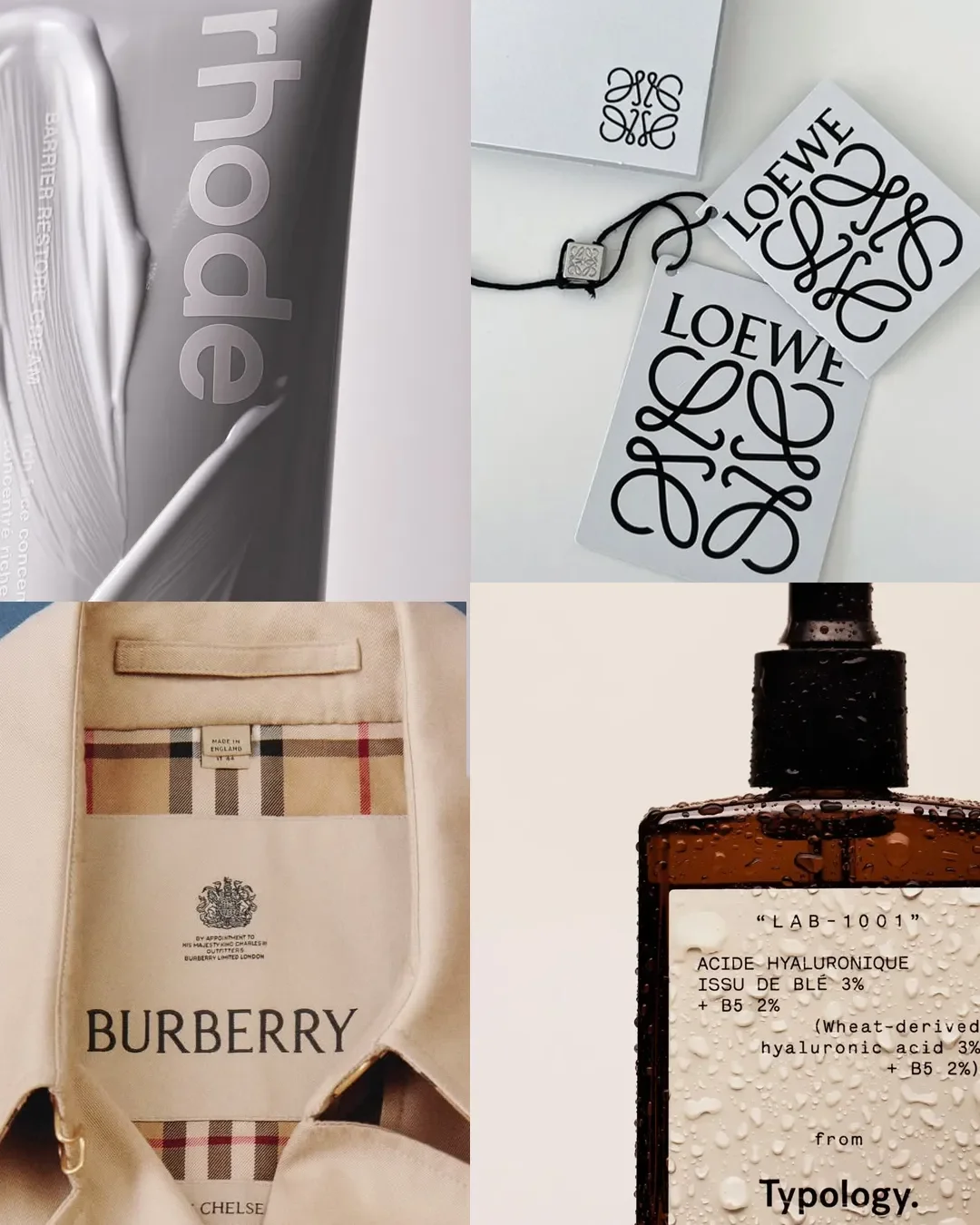
| Loewe | Tightly set capitals and a redrawn anagram monogram, introduced in 2014 with M/M Paris | A wordmark and monogram that look like no one else |
| Rhode | A lowercase wordmark with lowercase product names across packs, social and retail | A friendly, consistent voice that reads as a single brand |
| Typology | Plain sans serif labels that lead with the product name and active ingredient | Trust and clarity from type that does very little decoration |
| Burberry | A sans serif wordmark in 2018, then a return to a serif and the Equestrian Knight in 2023 | A lesson in what a brand loses when its type becomes interchangeable |
The Burberry example shows the cost of change. The 2018 sans serif wordmark was clean, and it also looked close to many other fashion houses that had made the same move. The 2023 return to a serif brought back a feature that belonged to the brand. A typeface that any competitor could use gives recognition away.
Custom, Licensed or Modified Typeface: What to Choose
There are three routes, and the right one depends on the stage of the brand. The figures below are indicative and vary by foundry and scope.
For an early stage brand, a licensed typeface from a respected foundry is the sensible start. Choose a less common one, then build distinctiveness through spacing, case and scale. A growing brand can commission modifications such as a redrawn wordmark or alternate letters, with the foundry's written permission. A custom typeface suits an established brand with several markets and a long horizon.
Check the licence before you commit. Print, website, app and social use are often priced separately, and licences can depend on the number of users or monthly page views.
Multilingual needs deserve a decision early. If the brand will sell in markets that use Arabic, Chinese, Japanese, Korean, Cyrillic or Greek, confirm whether the chosen typeface supports those scripts. If it does not, choose a companion typeface with a similar weight and tone rather than leaving it to a default.
How to Choose and Pair Typefaces for a Luxury Brand
How do brands choose typography?
Good choices usually follow the same sequence.
Start with positioning and price point. A quiet, high priced brand and a lively, accessible one need different type.
Shortlist three typefaces that fit the story.
Test them on real material: a label at actual size, a product page on a phone, a price list and a long email.
Check the licence, the numerals and the language support.
Choose one and write down the rules.
What should a brand typography system include?
A brand typography system is the written set of decisions that lets any designer or supplier set type the same way. Most luxury brands need three roles, and two typefaces are often enough to fill them.
| Element | What to define |
|---|---|
| Primary typeface | Used for names, headlines and key statements |
| Secondary typeface | Used for body text and descriptions |
| Functional text | Labels, legal copy, ingredients and numerals, often in the secondary typeface |
| Size scale | The sizes allowed and where each is used |
| Weights | The few weights that are permitted |
| Case and tracking | Where capitals are used and how wide they are spaced |
| Line spacing | Set for headlines and for body text |
| Numerals | Lining or old style, and the style used for prices |
| Fallbacks | Web fallback fonts and companion typefaces for other scripts |
| Examples | Approved layouts for packaging, web, print and email |
When you pair typefaces, let one lead and the other support. Combine a distinctive face with a quiet one, and choose faces with similar proportions so the page does not feel like two brands. Pairing a serif with a sans serif gives a clear difference in structure without adding clutter. Documenting these relationships alongside your logo usage and color rules is the foundation of a cohesive beauty brand identity system that looks unified across every platform.
How to Create a Luxury Impression With Typographic Hierarchy
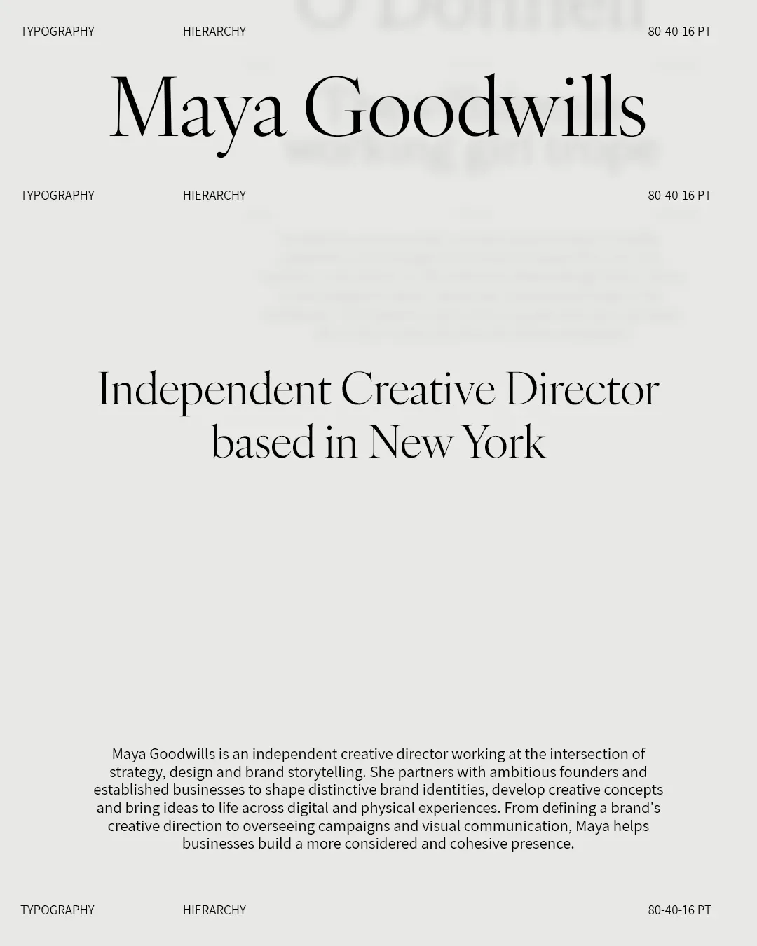
Hierarchy tells the reader what to read first, second and last. Luxury layouts usually have fewer levels and more space around each one. Small, quiet type set with room around it often looks more expensive than large, loud type, as long as it stays readable.
Use this checklist on any pack face, page or layout.
There is one clear first read.
No more than three text sizes appear on a single layout.
Margins and line spacing are generous.
Capitals are kept for short lines such as names and labels.
Wide tracking is applied to capitals only.
Secondary information is quieter but still passes a readability check.
Alignment is the same across the layout.
Prices and numerals use the same style everywhere.
How Typography Holds Up Across Packaging, Web and Print
A type system that works on a screen can fail in production. These are the places it breaks.
Packaging small print. Ingredient lists and legal copy have minimum sizes that vary by market, and fine strokes can fill in on textured stock. Foil and embossing need sturdier letterforms than ink does, so set a minimum size for any foiled or embossed text and ask the printer for their limits. Reversed text on dark packaging often needs a heavier weight. Always check a physical proof. Luxury packaging typography is tested on the actual material, because a screen proof will not show what the stock does to a thin stroke. Understanding what makes packaging feel luxury, from stock thickness to structural weight, will help you predict how your typography behaves when debossed or stamped onto a real box.
Web fonts. A web font needs its own licence and loads after the page begins to appear. Choose fallback fonts with similar proportions so the layout does not jump, and limit the number of weights to keep pages fast. Shopify themes often apply their own font settings, so check product pages, the cart and the checkout.
Email and documents. Many email clients ignore custom fonts and show a fallback. Design emails so they still look right in that fallback, and choose a safe pair for invoices and proposals.
Other scripts. Set a companion typeface for each language the brand uses, and check that accents, diacritics and numerals display correctly.
Three rules keep type intact across formats. Set minimum sizes for each format. Name approved fallbacks. Include a proofing step before anything goes to print.
How to Test Whether Your Typography Is Recognisable
You can run these tests this week.
The logo removed test. Hide the logo on a pack, a page and a social post. Ask five people whose brand it is.
The five second recall test. Show a layout for five seconds, then ask what the person remembers about the type and the mood.
The side by side test. Place your layouts next to three competitors with their logos hidden. Check whether yours can be told apart.
The squint test. Blur your eyes or step back from the screen. The order of importance should still be clear.
Common Luxury Typography Mistakes
Following trends. A fashionable typeface dates quickly and makes a brand look like everyone else using it.
Using too many weights. Each extra weight dilutes the look and makes consistency harder.
Letting teams and suppliers set their own spacing. Without shared rules, tracking, case and size drift from one touchpoint to the next.
Leaving default fonts on the web. A fallback that appears by accident breaks the impression built on packaging.
Having no written type rules. Consistency depends on a document that anyone can follow. If the rules live in one designer's head, they will be lost.
FAQs: Luxury Brand Typography
How many fonts should a luxury brand use?
Two is enough for most luxury brands, one for names and headlines and one for body text and functional copy. A third can be added for a specific purpose such as another script. More than that usually weakens recognition.
Can typography replace a logo?
Not entirely, since a logo gives a brand a fixed signature. Typography can carry recognition across the many touchpoints where the logo does not appear, and it works best when the wordmark is set in the same system.
Is a custom typeface worth it for a small brand?
Usually it is not an early priority. A licensed typeface from a good foundry, set with careful spacing and scale, gives a small brand strong results. Custom type makes more sense once the brand has several markets and a clear long term identity.
What is the difference between a wordmark and a logotype?
The terms are often used interchangeably. A wordmark is a brand name set in a distinctive way as the logo. A logotype is usually the same idea with an emphasis on custom lettering or letterforms made for the name.
Build a Distinctive Visual Identity
Typography is one of the clearest ways to make a luxury brand recognisable on every pack, page and menu. If your type system needs to be built, refined or written down, Elouvé Collective can help.
Get in touch to build a distinctive visual identity.
